NOVEMBER 10, 2020 / SARA GÓMEZ WOOLLEY / 0 COMMENTS / EDIT
Class Info
- Date: 11/10/20
- Meeting Info: Zoom Zoom Zoom… see below
To-Do Before Class
- Assignment 2, Editorial Illustration part 3 of 3 ,
- Limited Palate Color Final Editorial Illustration
- Sketchbook Exercise Week 9
- Reading Week 9
- Discussion Week 9
Topic:
Editorial Illustration & Point of View
Activities
Warm Up
- Add Ice breaker Activity
Discussion
- Wrap Up, Week 9
Review
- Editorial Illustration and Visual Metaphor
Critique
Assignment 2, Editorial illustration
Lab
Work in Class on Assignment 2, Editorial illustration:
Apply Feedback to Concept Sketches
Refine Concept Sketches into final art
Research and Sketch Important Visual Elements
Refine Color and Value Scheme
Begin Final Art
Lecture
Point of View
Review Assignments and Expectations for Next Week’s Class
Due Next Week
EDITORIAL ILLUSTRATION
OVERALL PROJECT: READ FULL DESCRIPTION HERE
Using any combination of Pencil, Ink and Digital techniques, create an Editorial illustration for the article / topic of your choice. Projects should be unique and communicate clearly, using the technique of visual metaphor. The illustration must be usable as a magazine cover image, therefore a vertical format is required.
Projects must include 3 limited palate COLOR ROUGHS, and the working palate for the final.
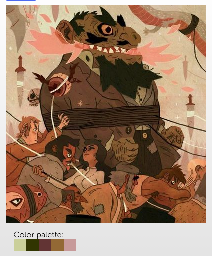
Assignment 2, Editorial Illustration Assignment 2, part 3 of 3
- Color Palate Ideas. (3 value/color roughs will be required for the final project.)
- Sketchbook Exercise Week 10 : NONE Work on Assignment 2
- Reading Week 11 : Using Color to Establish Focal Points (If you have not already done so complete this reading assignment.)
- Discussion: Please post an image of your final art from assignment 2. Please discuss how YOU have applied color theory, use of composition, and value to establish Focal Points in your illustration. Please explain how these focal points help the viewer to understand your intended reading of the image.


Recent Comments