Hello class-
As each of you is designing your concept sketches it is very important that you keep in mind the size and shape of the final art.
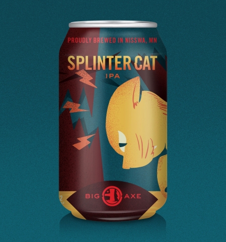
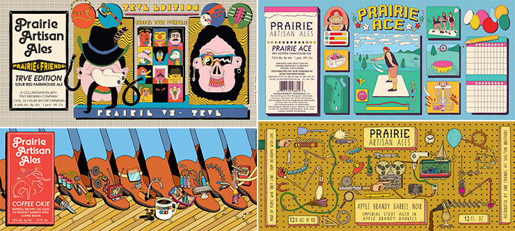
So the art created for a beer can like the one below, would be different than that created for a beer bottle or a wine label.
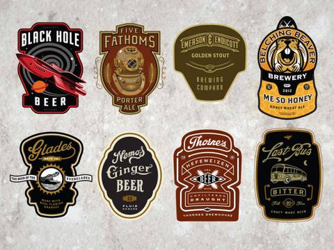
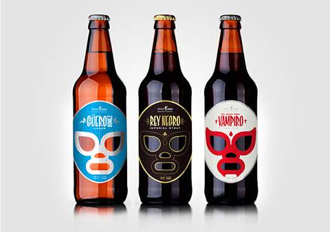
BE CREATIVE. A label might have a rectangular or square shape, but it DOES NOT HAVE TO. Not that the ones below do not. So when deciding on the overall shape, do what will make for the better and more unique overall illustration. The only rule is that it MUST
BE FUNCTIONAL. If you are not sure, use a photocopier and cut out your concept sketch and test it out on an actual bottle or box.
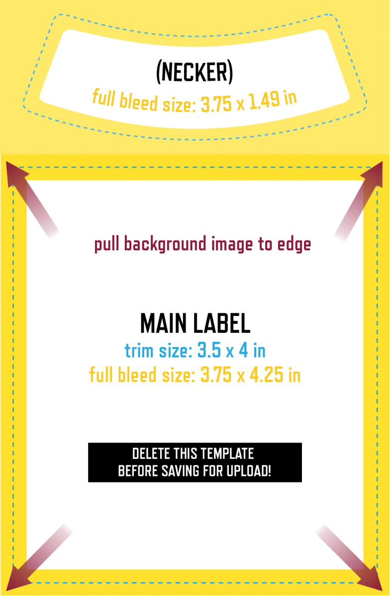
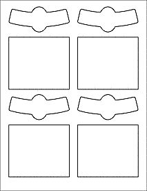
I’m including below some TYPICAL label templates as a helpful tool. They are meant to print on 8.5 x 11 paper. You don’t HAVE to use them. Look at creative illustrated packaging for inspiration. And really as long as it could actually work, the sky is the limit!
To get an idea of sizes:
TYPICALLY a rectangular Wine Label like these (theres also the little wrap label around the neck which you can choose to design or not!) are around 3.5″ x 4″
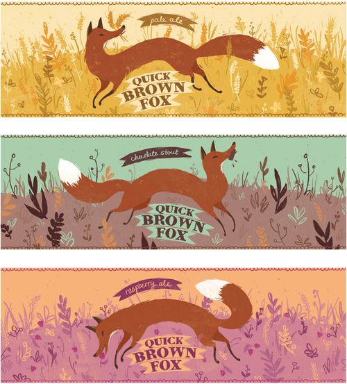
But you can also choose to design a wrap around image like these …
IT’S UP TO YOU. You don’t have to conform to these shapes unless you choose to.
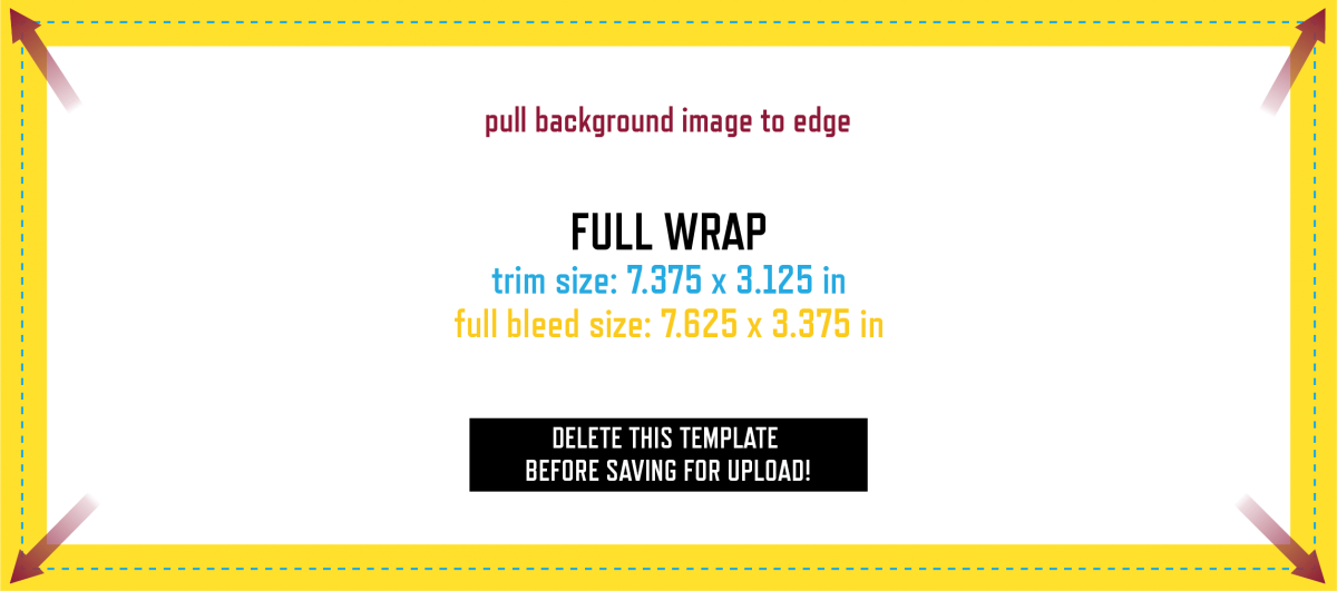
Beer labels are typically 2.5″ x 3.5″ for the most basic, and 7.375″ x 3.125″ for a wrap around. And again… this is your call. Wrap arounds will provide you a little more room to illustrate, but do what will work best with your design.
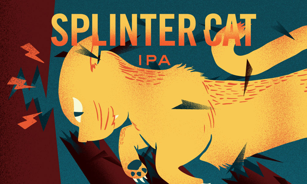
As for illustrated cans… which offer a larger space to play with, copy the proportions of the examples below as I was unable to find a template for you. And again, prioritize making some really creative and well illustrated images over conforming to the examples!



Recent Comments