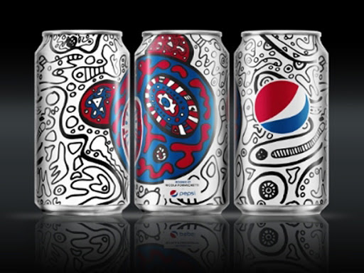
This is one of the Pepsi can designs from the Pepsi challenge. I chose this one because of how illustrative and trippie it looks. It’s like when I drink a can of Pepsi looking at this, it feels like I’m drinking a whole lot of inspiration. I’m sorry if it sounds cheesy but that’s just the way things are. However it is a bit too descriptive with its design. The Pepsi logo is still there, but most of the scribbles and other designs on the can are taken away from it at times. Of course the first thing you see when you open your eyes to see the can is the Pepsi logo of course which they succeeded in.
Category: Discussions (Page 2 of 31)
The lecture from week 11 and 12 definitely provide indispensable information in regards to narrative illustration. In week 11 we get to learn about the “big idea” in regards to making and breaking a scene and conveying the main message. I did appreciate the art used by both Humberto Ramos and Frank Miller, two of of my favorite artists. I do agree that the fact that an illustration should definitely give the feeling and emotional impact in which it’s trying to convey. I do like the point of view that is shown in week 12 and how we should consider our selves directors in regards to coming up with ideas. There are various ways of perspective in regards to drawing and that as well can make or break a scene. Eye level is also definitely essential as well.

My partner this week for this critique was my sister Maria Iacono. During the week she really focused on colors and line weight. She stated that she struggled the most with varying her line weight within the character design. With that in mind, I was able to help her out by suggesting to make certain lines thicker for example the lines in the hair could use some work. I also stated that she could make some lines thinner for example, the feather on the hat and the clothes. For her color palette on her character design she kept with the primary colors with a variety of different shades from those three colors. She stated that she wanted to keep the classic look of Pinocchio and she didn’t want to change the colors too drastically. I thought this was a good idea because Pinocchio is such an iconic character, especially the Disney version, which she is referencing, and it was good that she didn’t change too much because then it might not have been so recognizable. Overall I think my sister did well and had some things to fix that weren’t major but not minor either.


Recent Comments