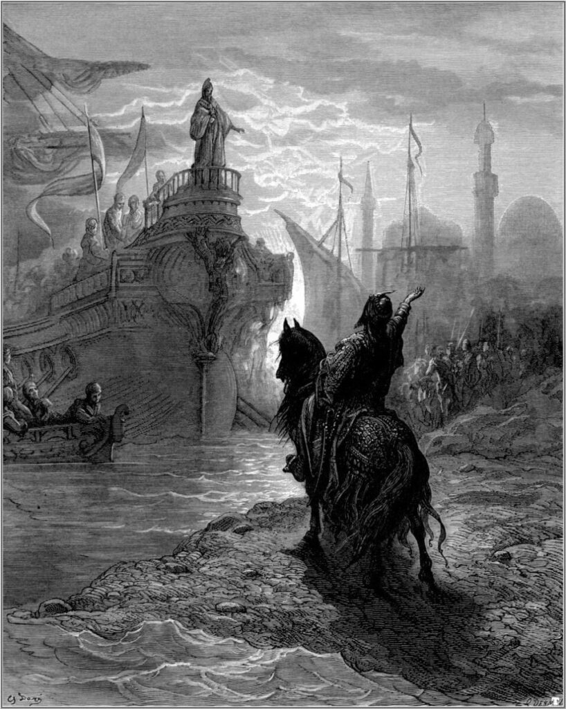
This illustration was done by Dan Dos Santos. This is what I call a badass illustration. The amazing use of value with the black gray and white showcases how much of an intense image this is. The man running the horse in all black showcases the deep connection he has with the other values as the gray it’s just generalized to make the black pop out more. The white is a contrast to the balance with the black to showcase the journey has just begun. The journey is to delight and to the light is the victory. It looks like a war is about to happen and it feels like I want to be a part of that said war with the guy riding on the horse. This is the most effective way because this illustration is telling a story and it makes it clear as to what story is being told.
Category: Course Activities (Page 1 of 57)
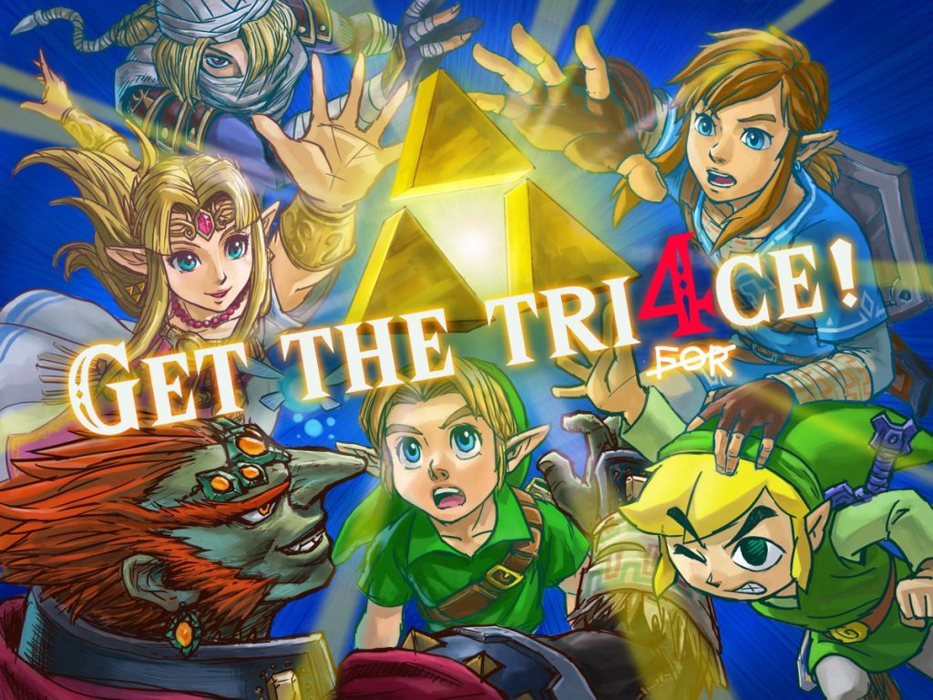
I chose this illustration from the official Zelda Twitter as it was used for promotion of the Super Smash Brothers Ultimate Game. The reason why I chose this because it is one of my favorite illustrations coming from Nintendo and there is a great use of balance within the set image. The balance of having two characters circle around and what the triforce and a text in the middle showing great balance. The reason why I consider them effective is because of how powerful the image looks and what kind of techniques this person used. He uses perspective as in the characters are more in the back and I reach their hands towards the triforce as like perspective. And the way I would use balance within my work is to draw up some characters and some shapes and to put one big character or one big shape in between like with this illustration right here. I really do like this piece since it’s a good illustration, a lot of power in between this and I love Zelda. Art done by Satoru Takizawa
Jillian Tamaki’s idea process involves a 7-step process. The first step is to get yourself interested, to be inspired and go deep within the thing you love for media. The second step is to collect the media that inspires you and have a place to keep them for references. The third step is to take the content and media seriously, make sure to write down notes in key words that come to mind When reading up on information. The fourth step is to take notes you wrote and to create a list of words and brainstorm them. This brainstorm will help you in many ways as adding keywords can help further your improvement and inspiration. The fifth step is to find and add the images to visualize your ideas and expand upon them. The six-step is to mix up all the content interior concepts. And the final step is the phone thumbnail sketches from the information you gathered along with your final sketches for your concepts.
I also perform steps just like Tamaki does but in a different way. I always look at cartoons and anime for inspiration and next thing you know I always draw them and I always get these pictures and study from them. I even study from Big artists and keep some of their styles for my own to make up my own. The reason for that is because I just know that nobody Can just create a style off the bat. That style is a combination of other artist styles all along.


Recent Comments