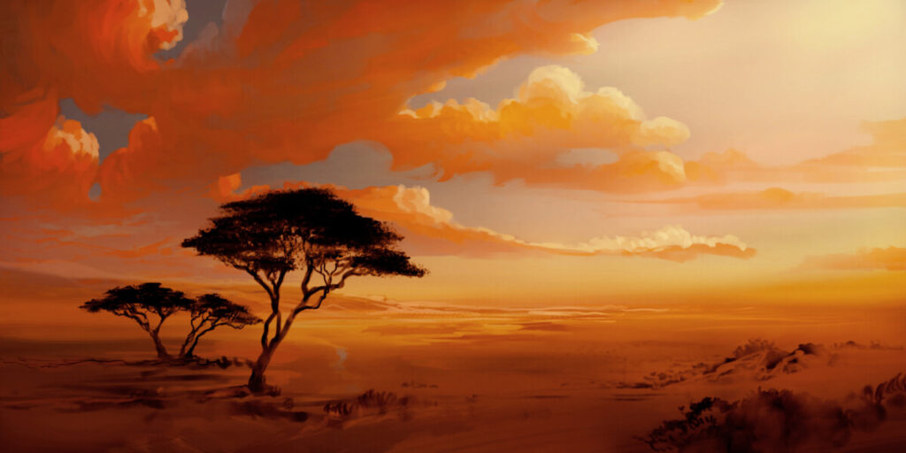
I found this artist named Philipp A. Urlich on Artstation, he makes a bunch of digital landscape painting. The colors scheme he used for this piece was complementary because he uses the colors orange and blue. The orange is the main color used in the piece while blue is used to create depth and spacing between the clouds and creating the sky. Also this piece is using a limited palette. The composition is also an asymmetrical piece. This is very pleasing to the eye because of the harmony of the colors working together along with the composition. The reason I picked this piece is because it instantly reminded me of my childhood and watching the movie Lion King.


Recent Comments