As I was creating the illustration, I was thinking about what colors I should use. The topic is BLM so I wanted to go complementary colors because I wanted to show little bit of tense due to contrasting colors but I would use one of those color to guide the focal point of the piece. So the colors I went with was yellow and purple with the third color red. The purple was for the black panther because when I looked up references for a black panther, that color is the one that usually came up which I think went well. I used the yellow for the frames of the glasses to symbolize the level of sophistication. By using this yellow for the frame of the glasses, it guides the eyes toward the main focus of the illustration. The handcuffs lead you toward the panther being choked by it. This expresses the idea of police brutality toward color people. I used an asymmetrical composition
Author: Kyle Sealy (Page 2 of 9)
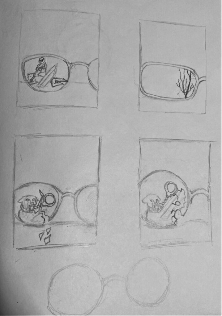
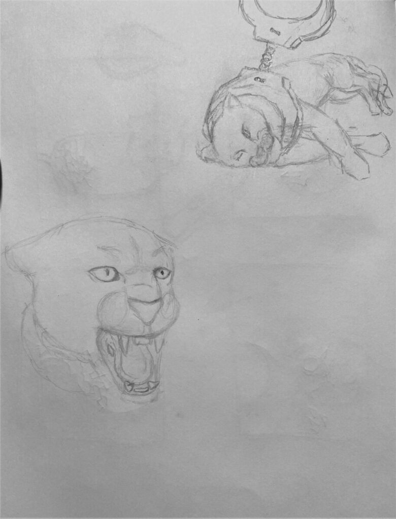
This is my final for the BLM topic I selected. The color scheme I went with was complementary colors using purple, yellow and red. My concept was to use the black panther as a symbol of color people and the handcuffs as a symbol of police brutality by the way it attach to the panthers neck. The glasses represent the intelligence of the many color people who are being assaulted by police because of the color of their skin. I wanted my focal point to be the glasses and what is on the reflection on the lens. The yellow and white leading you to the panther being detained. The crack in the glasses expresses the level of aggression toward people of color and destruction that it has created to many families.


Recent Comments