References I’ve used:
Author: Jia Wei Wang (Page 1 of 6)

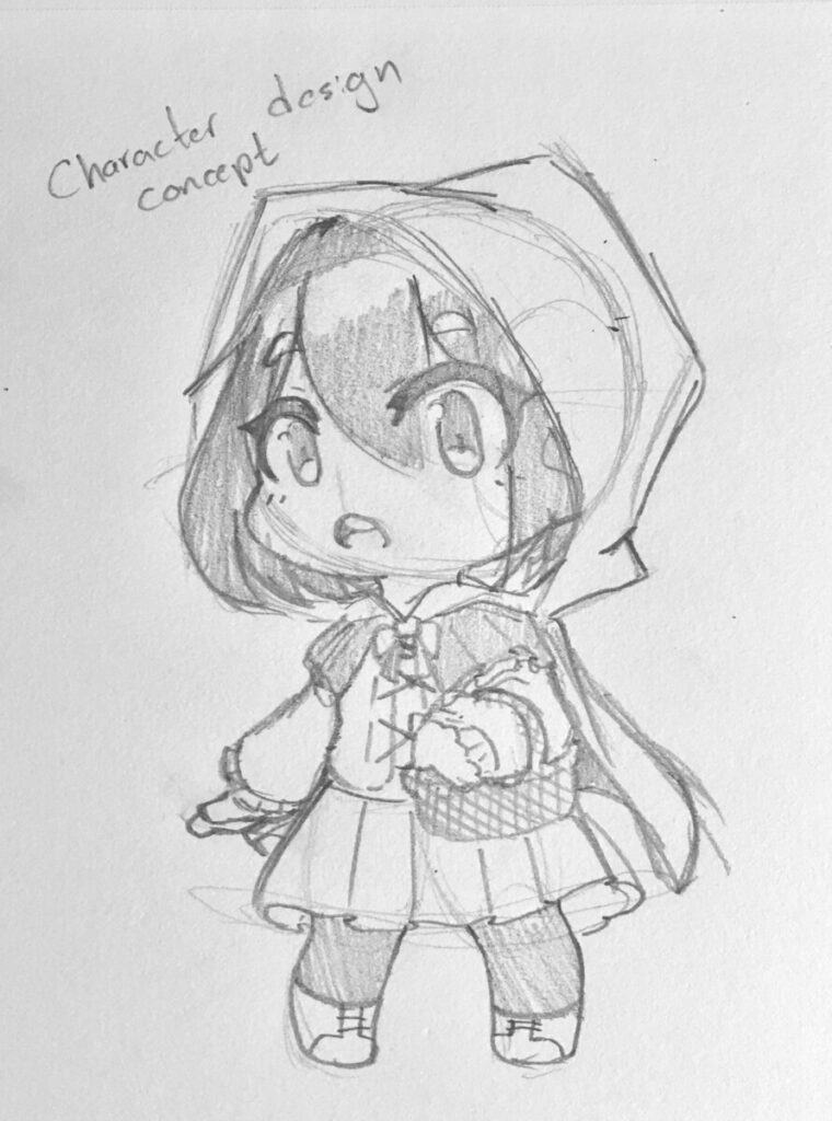
Here is a design concept of my Little Match Seller Girl. For reference, I’ve looked up some 18th-century winter fashion with the addition of looking up some character designs such as the little red riding hood. For this character concept, I gave her a hood and a winter jacket as you can see, in addition, gave her a little skirt, socks, and boot to fit the winter setting as the setting of the Little Match Seller is in winter in a Semi-urban setting. In addition I also made sure that my line art and the character design is consistent to the chibi look as my spin of the story is to make it chibi with a happy ending as I am not to fond of the ending from the original story.
In Frank Stockton and Point of View, it talks about how when creating a narrative illustration illustrator must ask ourselves such as “What is the character doing?”, “How do they feel about it?”, “How should the viewer feel looking at this scene?” and so on. It explains that these questions can help us figure out our layout and in addition point of view. In addition, it also explains how point of view can either enhance the artwork is used correctly or diminished if used incorrectly. Overall it also tries to explain how an illustrator needs to be able to visualize the whole scene and then picks out which points of view best represents the scene. For example, the movie poster for The BFG shows a leveled view of both the little girl in his hand and his whole body sitting down. When looking at this you can tell the giant is quite friendly thanks to him being leveled. However, if it is from a birds-eye view or worm-eye view it would instead make the giant look like an intimidating figure. Thus this shows how important point of view is when creating artwork!


Recent Comments