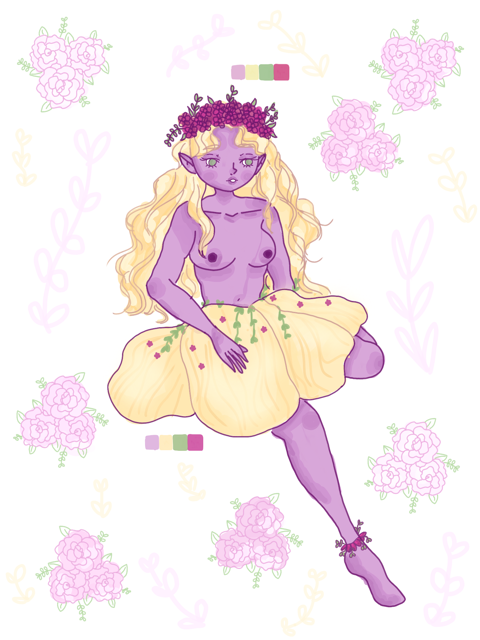
When i started working on this illustration my first thought was to pull out a color wheel and look at all the color combinations you could have. I came to the conclusion i disliked all of the color combinations. But purple and yellow i disliked the least so i decided to go with that. I wanted to change the tones because i really like working with muted colors rather than a fully saturated color so i opted for more of a pastel purple and yellow. I then added in the analogous colors, purples being a redish-purple and yellows being green. They were across from each other on the color wheel so i decided to put those in as smaller elements like the flowers and leaves. Overall i like how it came out but the yellow throws me off because the purple and yellow are kindve battling its too much contrast, which happens often with the complimentary colors. It was a fun experiment though because i limit my palettes very often.


Leave a Reply