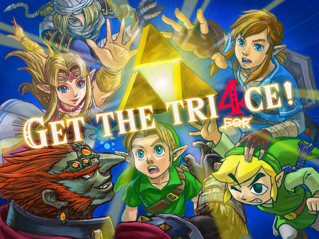
I chose this illustration from the official Zelda Twitter as it was used for promotion of the Super Smash Brothers Ultimate Game. The reason why I chose this because it is one of my favorite illustrations coming from Nintendo and there is a great use of balance within the set image. The balance of having two characters circle around and what the triforce and a text in the middle showing great balance. The reason why I consider them effective is because of how powerful the image looks and what kind of techniques this person used. He uses perspective as in the characters are more in the back and I reach their hands towards the triforce as like perspective. And the way I would use balance within my work is to draw up some characters and some shapes and to put one big character or one big shape in between like with this illustration right here. I really do like this piece since it’s a good illustration, a lot of power in between this and I love Zelda. Art done by Satoru Takizawa
About This Course
This course is a practical introduction to the field of illustration. Focus will be placed on
process work and professional practices, presented within contemporary and historical
context. Course includes projects and lectures in a variety of illustration genres.
Professor Woolley
Office Hours: Tuesday 12 – 2pm email for appointment
SJWoolley@citytech.cuny.edu
Recent Comments
OpenLab Help
Acknowledgments
This course is based on the following course(s):
Sharing
Logged-in faculty members can clone this course. Learn More!


Leave a Reply