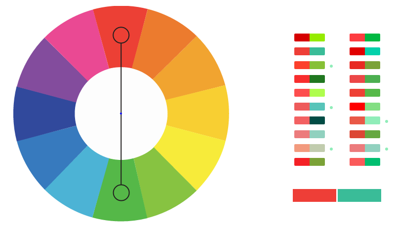

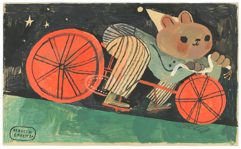
I chose to talk about a complementary color palette specifically the complementary colors red and green. Red and green can be seen all over in nature and in illustrations. Today I chose examples from both in nature and in art. These two colors can be very bad together I think when using them together for example, in typography. This is because they clash together and it’s not exactly the best combo to read because they are both so vibrant. However, even though they clash at times it can be super effective somewhere else like those two pictures I provided. You can also choose different tones and shades of those colors and have it work for you in whatever medium or industry you’re working in.
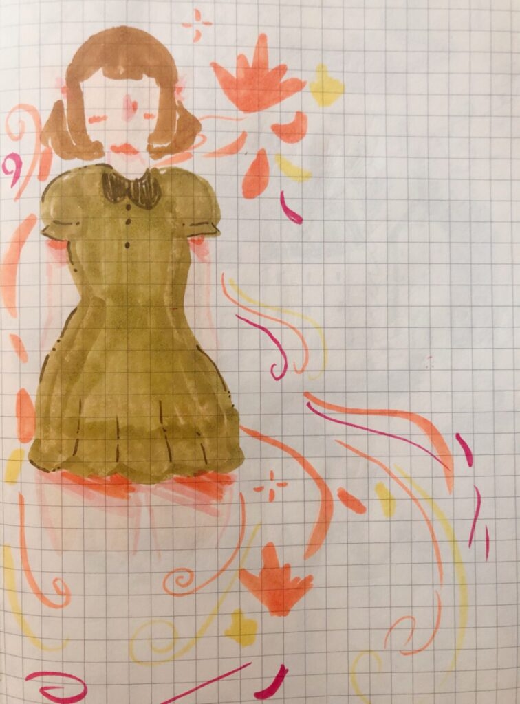
Here is an example of me using a complimentary color palette for a fall themed drawing.


Leave a Reply