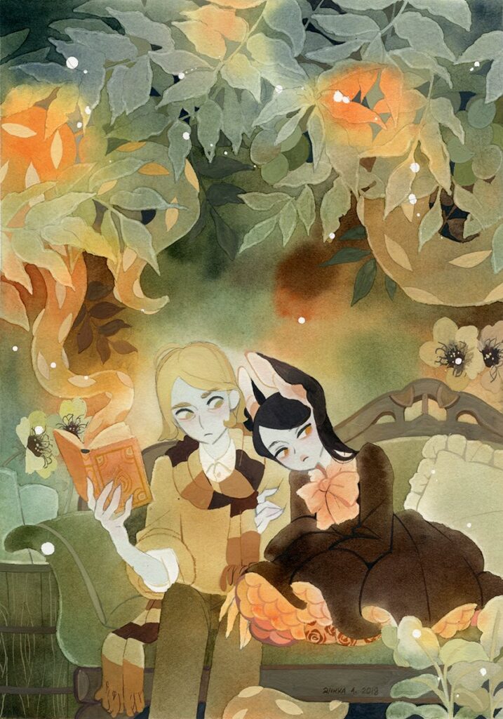
Here is an illustration done by RiikkaPaints on twitter. The type of medium she is using would probably be watercolor and gouache. I believe that the color technique she used is mostly complimentary of red and green with a few stand out colors. I think that she most likely mixed in dark greens and dark reds to create the darkish brown/reddish tone of her dress. She used mostly muted tones in this illustration with some colors being brighter than others for example the top of the image and the glowing plant in the bottom right. I believe this illustration is super effective in color because of not only the complimentary color palette but because of the medium she used. I think the watercolor allows you to create easy and free flowing colors and gradients without even trying and sets the mood/tone of the illustration. The color palette she chose also helps because it brings the illustration to life and works good together because it is complimentary.
Here is the link to more of her illustrations. She also has a twitter where she also posts these illustrations.


Leave a Reply