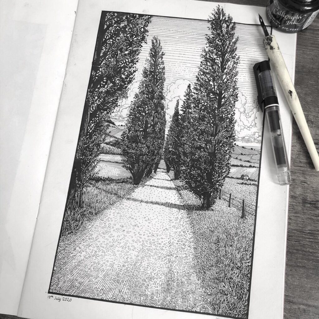
Here is an illustration done by Philip Harris on twitter. The medium that they chose to use, as seen in the photo, is using an inking pen and actually dipping their pen inside the ink. I chose this piece because I recently started following this artist and not only do I love their scenary inked illustrations but it is perfect for a value study/breakdown.
Harris has used the directional lines composition technique and slight asymmetry in this image. I say this because the directional lines are the road/path, they are two diagonal parallel lines going straight to the vanishing point of the image. Then there’s slight asymmetry because there is not the same amount of trees on both sides of the paths as well as having a fence on one side and not the other. These techniques are very effective because it reminds me of old master pieces, like classic landscape paintings. Also, there is light foreground, a dark midground, and a grey background. These values work well together and you can tell the artist really thought about value.


Leave a Reply