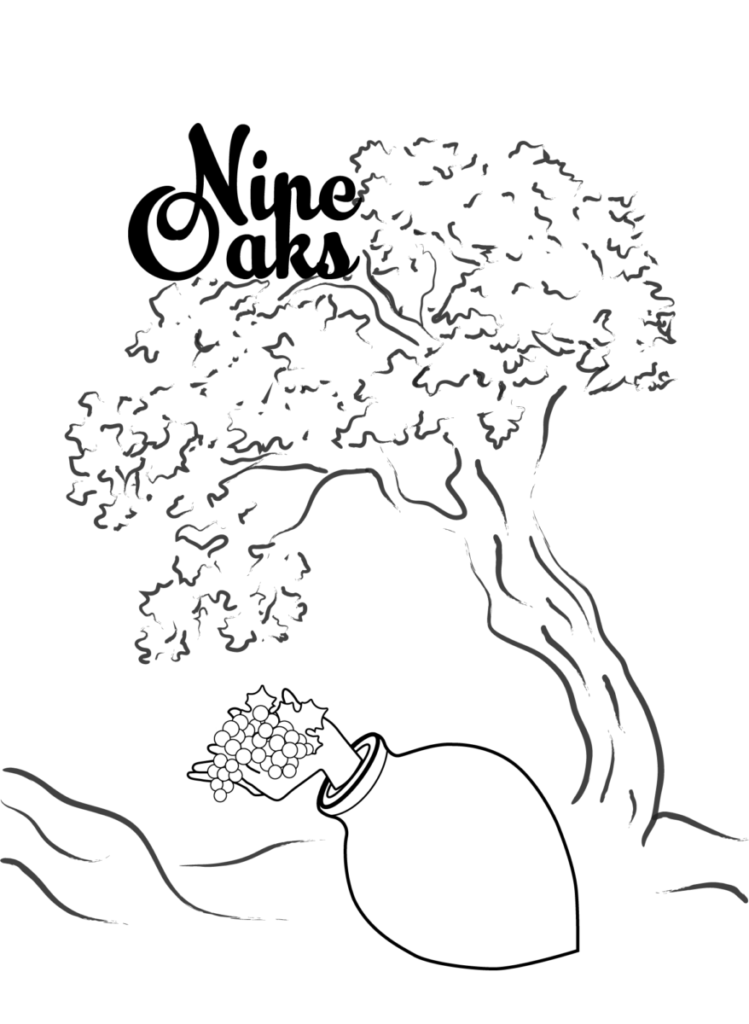
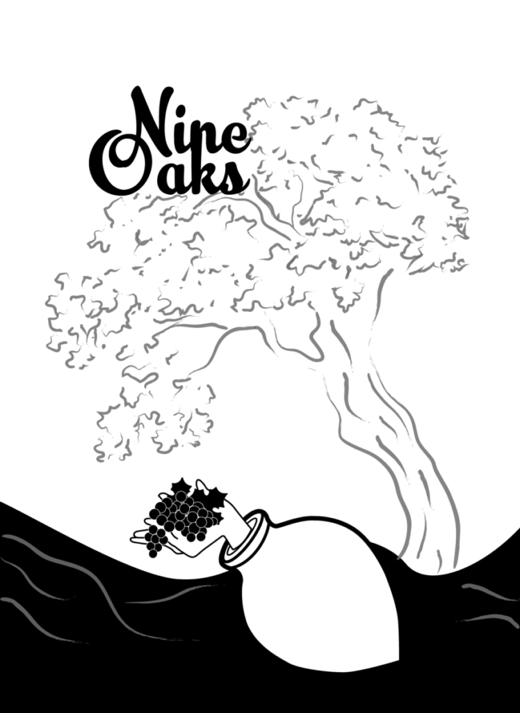
Hello! Here is my final art. Since the last class, I worked on the vat, the hand and cleaned up the oak tree. I also paid attention to the brush strokes and the thickness of the lines. The hand was the most challenging part of the design, as well as figuring out the relationship between the vat and the oak tree. I also played around with various values below.
VALUE STUDIES:
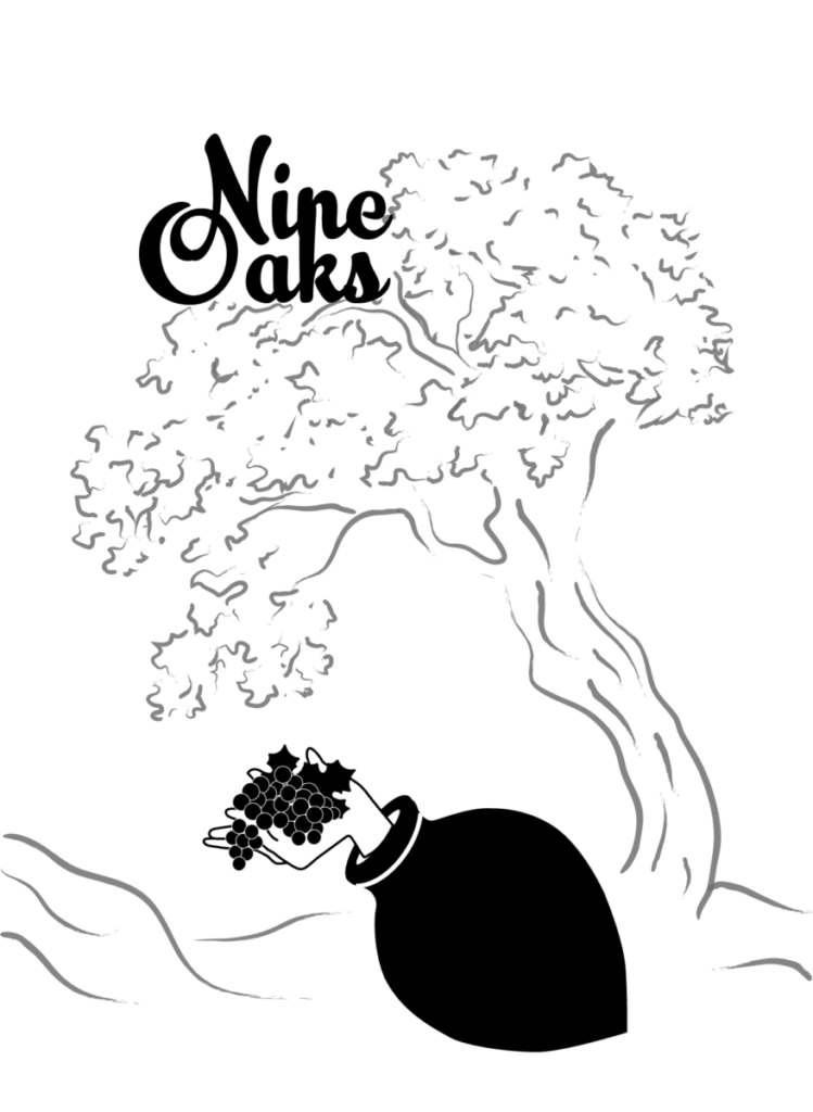
#1 – The focus is on the foreground where the vat and the typography lies. In the case of simple, minimalistic label design, this would work well because the typography (the name of the wine bottle) is a very important aspect.
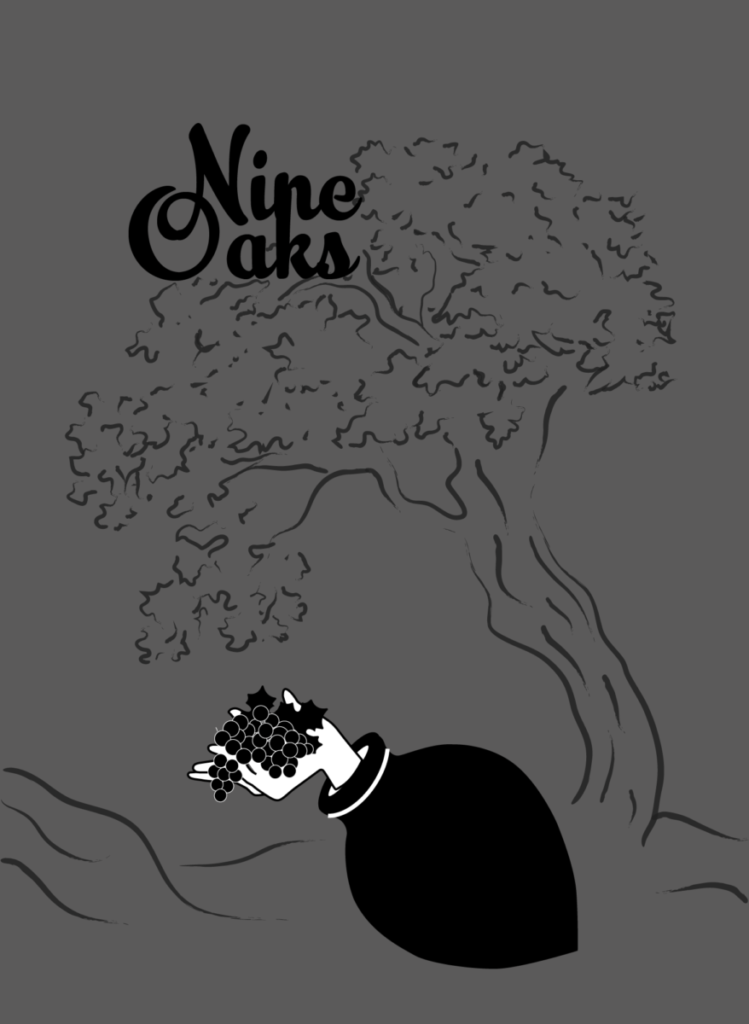
#2 – The focus here is directly on the hand holding the grapes. Although in this example, the focal point is very clear, this is not my favorite value variation.
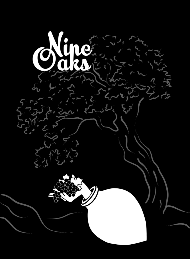
#3 – I’m in love with this variation as it provides high contrast and almost creates a nocturnal environment.
#4 – And lastly, I wanted to experiment with the ground and here is the fourth value study. I believe that this one a lot different from the previous ones but has its own groove to it, almost making the composition look taller than it actually is.


Leave a Reply