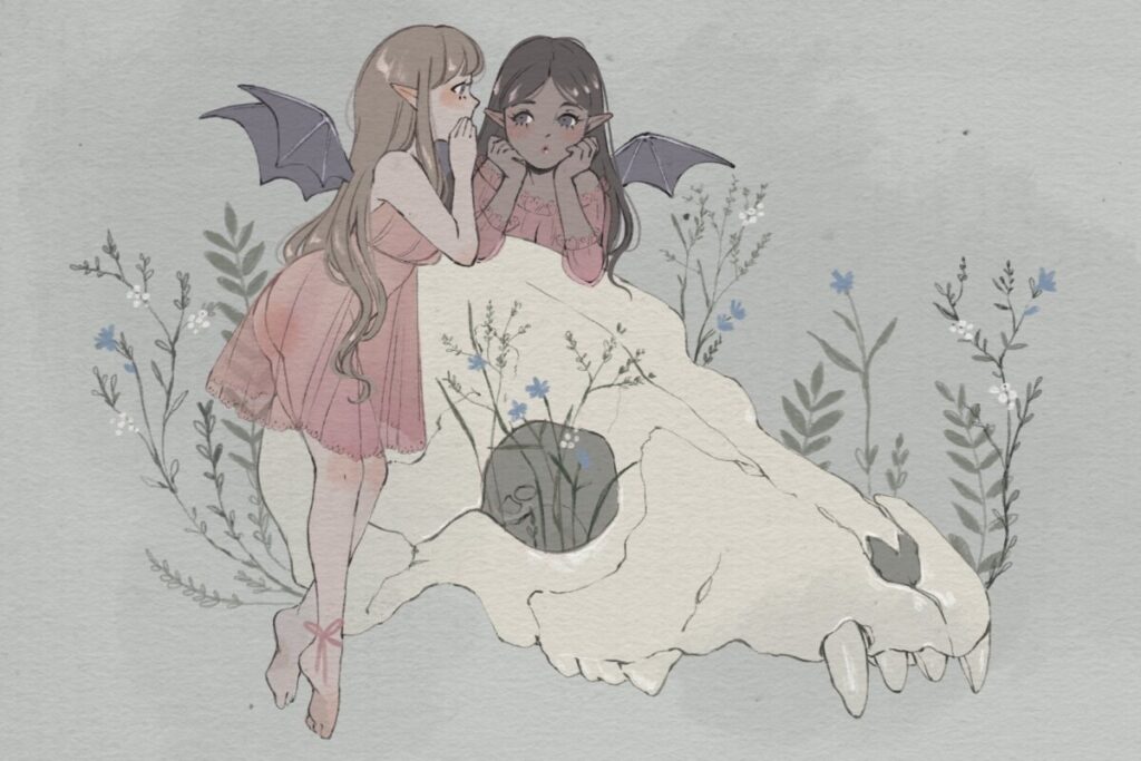
This piece was done by my favorite artist and her name is Karlovy Cross. She is a digital illustrator and she more than likely used digital media to create this piece. In this piece i noticed that she used the directional lines technique as seen most often in the Baroque period. One directional line would be at the skull and even the eye lines. It’s not as dramatic as the baroque style but it’s still there nonetheless. She also used the asymmetrical and symmetrical techniques in this drawing. This composition is very asymmetrical having both the female figures of one end of the skull. It’s an effective piece of art because the diagonal line leads your eye up to the two girls at the end. If the girls were on either ends of the skull I don’t think it would be as effective. I never really thought about composition as I’m trying. Or maybe I do and I don’t notice I do because I usually just focus more on character design rather than the whole thing which probably isn’t the best idea. I do like the use of the directional lines because they guide your eye throughout the picture without the viewer getting lost and I can definitely incorporate that into my drawings!


Leave a Reply