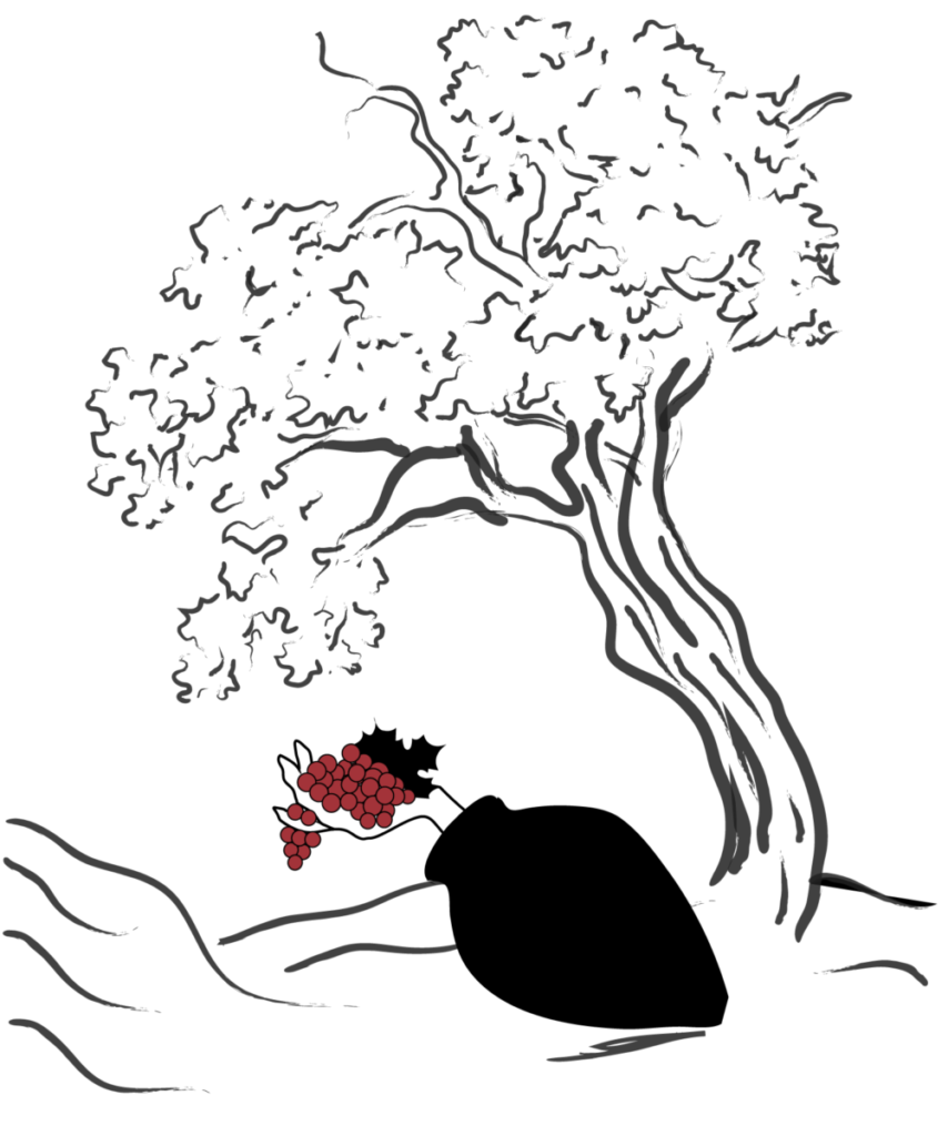
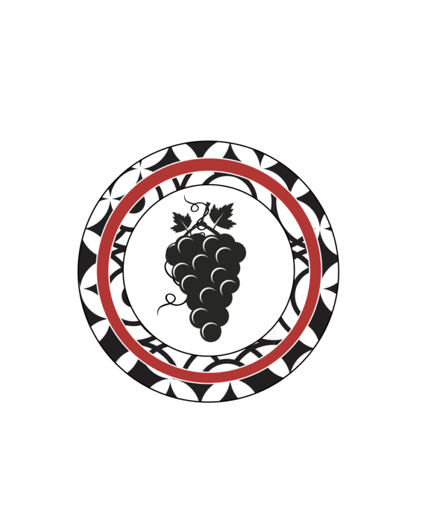
Here are two digital “sketches” of my favorite designs from the previous sketches. The group from the last class also agreed that these two were the strongest ones. Since I’m very comfortable with vector illustrations, I decided to go with that style. The one with the hand holding a grape needs more attention and I would be happy to receive the feedback. That also happens to be my favorite from these two.
I’m already thinking about the final label and am also planning on incorporating typography at the end.
The name of the wine bottle company is 9 Oaks.


Leave a Reply