
I chose to go with a very known quote from the children’s book, The Gingerbread Man. The quote is “Run, run, as fast as you can! You can’t catch me! I’m the Gingerbread Man!”. The reason I chose this quote is because mostly everyone has heard it before and knows how the story goes. The gingerbread man is running away and gets too cocky thinking no one will catch him. His over-confidence leads him to trust a fox who will carry him over a river but eats him instead.
Concept 1-
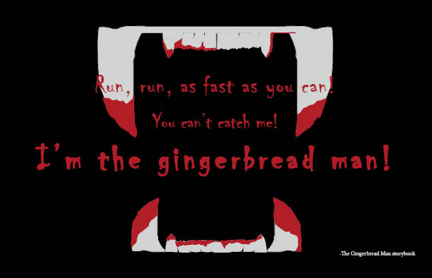
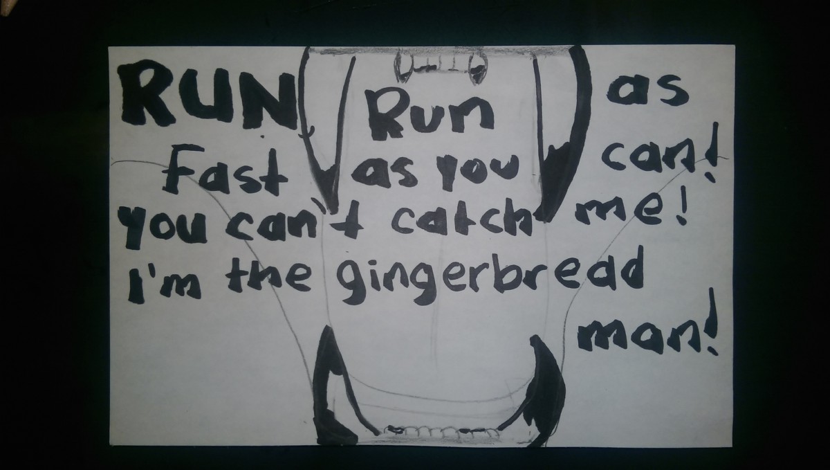
This was actually the first idea that came to mind. I thought the quote was from a children’s book so I wanted to make a fun, lighthearted story into something darker. The fangs are supposed to belong to the fox that ate the gingerbread man. The quote coming out of his mouth is taunting the gingerbread man for having said he could not be caught. The part “I’m the gingerbread man” is larger to make that the strongest/loudest part as if the fox was taunting the gingerbread man. I decided on black being the background color to create the perspective of the gingerbread man as he was going into the fox’s dark mouth. The teeth are a whitish, grayish color to contrast the black background and to guide the attention to the fangs faster. The font is chiller to make the letters seem scary and bloody. I used Pantone 7621 C as the color for the quotation letters.
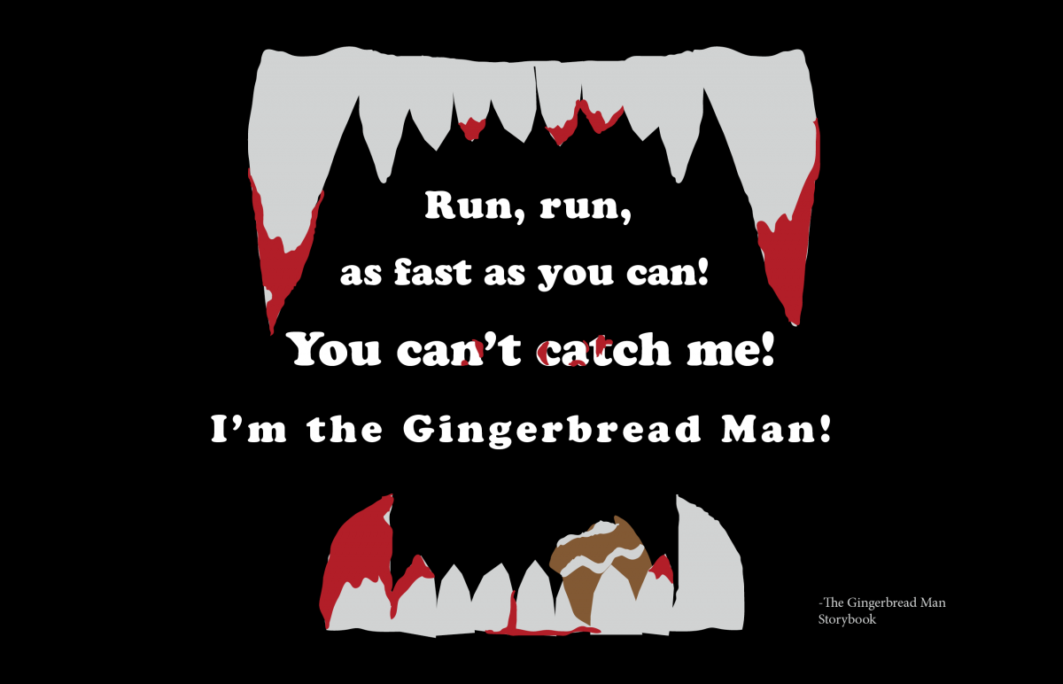
Concept 1- Final
In the final version of the postcard it was noted that the red color type was distracting so I changed it to white. The font is now Cooper STD. I went online to get a better idea of how a fox’s fangs look like and re-did the mouth area. I left the ‘you can’t catch me’ part of the quote a larger size to emphasize the irony of the gingerbread man actually being caught. I also added ‘blood’ droplets in that part of the quote. The only part of the gingerbread man I left was the leg, which i placed on the bottom right side of the mouth.
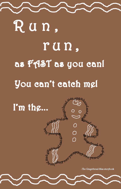
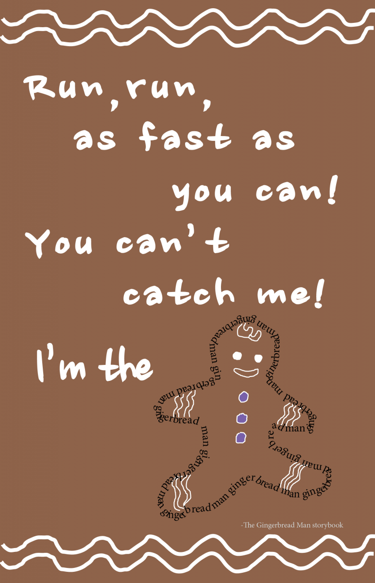
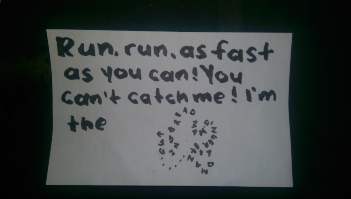
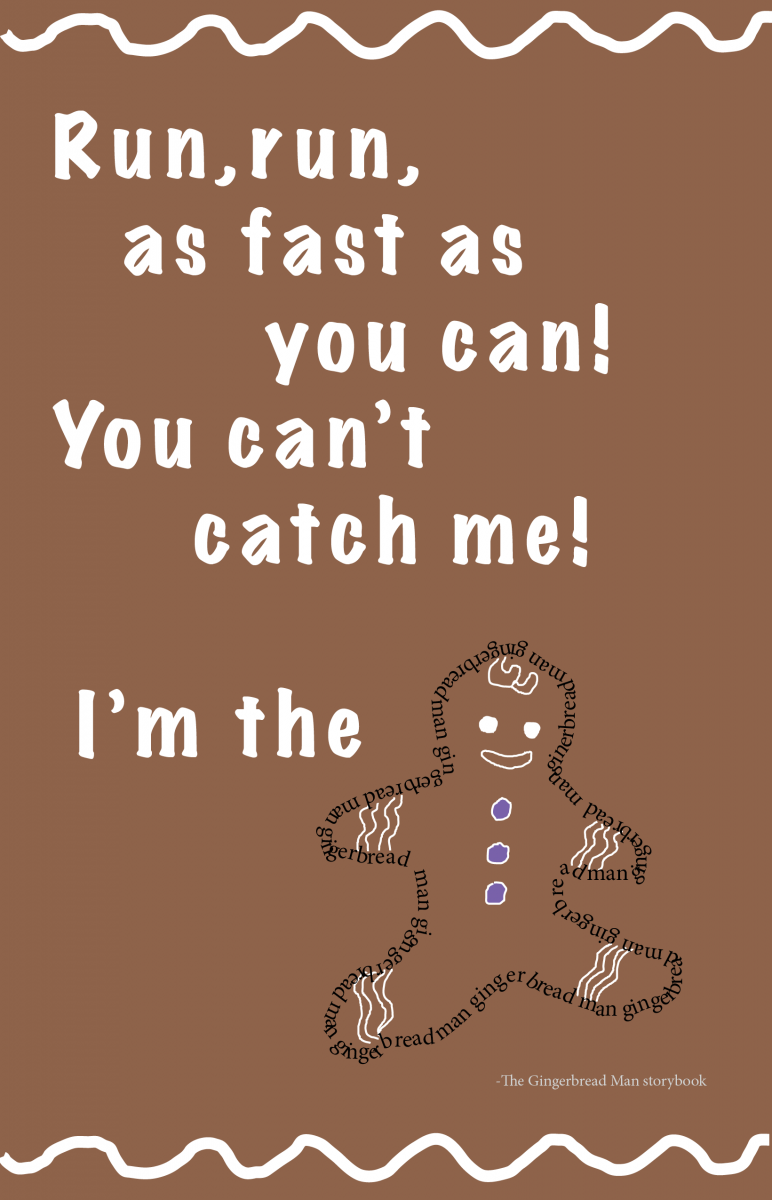
Concept 2-
The brownish color is meant to be similar to that of an actual gingerbread cookie. I chose the font and color because it reminds me of the frosting used to decorate the arms, legs and face of the cookie. It is kind of like a white swirling design similar to the letters which i also applied to the top and bottom of postcard. The font is Harrington. I emphasized the first word, “Run”, by using tracking to make it seem like the letters were running as well. I also made this word larger as well as the word FAST (in all caps) to emphasize their importance. Finally I let the image of the gingerbread man replace the actual word at the very end on the quote. I created the gingerbread man by creating a path with its shape and adding the text “gingerbread man” to represent itself as a graphic and letters.
Concept 2- Modification
The change I made to this visual quote was to write out the text using the pencil tool to give it a frosting effect. I left everything else close to the same.
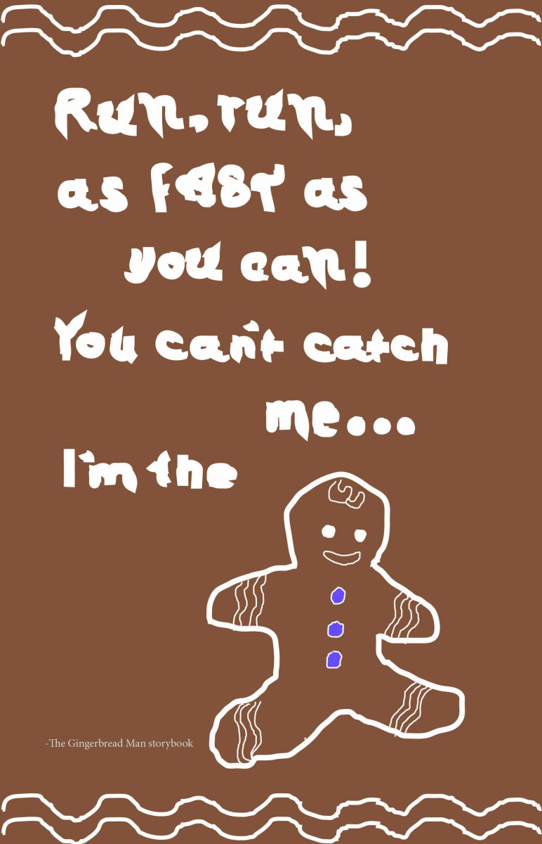
Creating the font with the pencil tool to resemble frosting was very interesting but it was too sloppy and made certain areas hard to read so i decided to use the Minion pro font. I converted it into an outline then set it to a 2.5 pt stroke to make it have the frosting effect. I also used the gingerbread man with the text wrap from the fist version, however this time he has no outline except for the words gingerbread man.
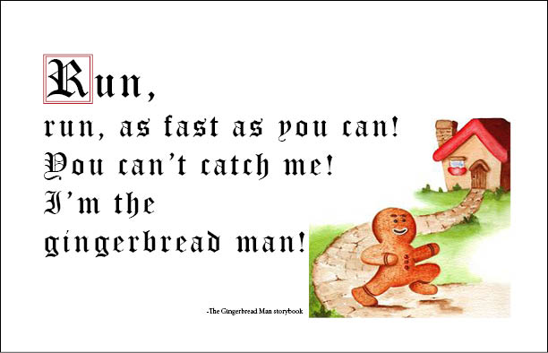
Concept 3-
This concept is closer to the actual storybook the quote originated from. I included a picture of what the story book looks like. I also wanted it to resemble an old fairy tale book so i selected the font Old English Text MT. My thought was to make the letter “R” similar to a drop cap so i enclosed it inside a red square and made it slightly larger. I also allowed a little kerning between the letters “R” and “U”. The margin i left as a black outline since i wanted to resemble a book.
Concept 3- Final
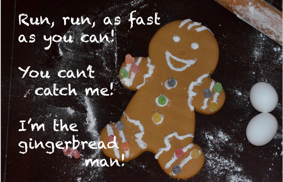
I decided to have a visual quote with a photograph so I am replacing the original concept entirely. In this new version I have a photograph of a gingerbread man cookie I made, lying on a table. The quote is to the left of the Gingerbread Man is in Chalkduster font. I selected this font because there is flour behind the gingerbread man, so i wanted it to look like the flour. This photograph is supposed to illustrate the part of the storybook where the Gingerbread Man was first baked.
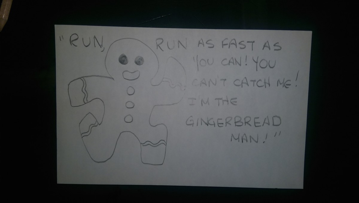
Sketches

