Ads Using Colors
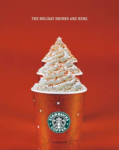
I chose this ad because the colors really caught my eye. The ad shows RGB colors. You see red and green colors. The colors here are an orange-red ones. These colors create the feeling of warmth. They also use red to represent the colder months because Christmas is known by its red colors. The white frothy part is a white that reminds me of snow. Overall the colors used achieve a winter feeling that make you crave a hot Starbucks drink.
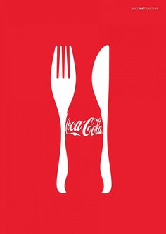
Another ad I thought communicated effectively through color is this Coca Cola ad. This specific red is the one used on all their products. By simply using the same color on this ad you instantly relate to the product. It is like having the actual soda right in front of you. This is a special patented color used specifically by Coca Cola. The way they use the white color is to create a fork and spoon with the negative space, leading to the idea of a Coke with your dinner.
“Husky Evolution”
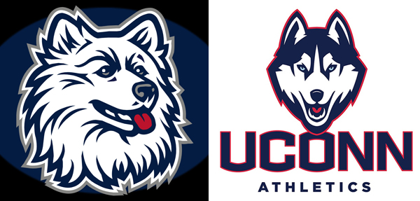
From reading the article “Husky Evolution” I saw that there were many people in the University of Connecticut that were not satisfied with their previous logo. Their previous logo was a husky that looked cute and sweet contrary to the tough and tenacious image that they see themselves as. I have always believed that a logo can make or break a product. It is the fist thing that people see and in those first few seconds can either catch or lose your attention. By updating, the new logo portrayed strength, aggressiveness, courage, determination. It is a more realistic husky since the other was outdated. It is very edgy and has the capacity to inspire strength to its team. By setting the “UCONN” abbreviation to represent the University of Connecticut, this is one set abreviation rather then every team having a random abbreviation. By using just “UCONN” the University now has a set identity and is more unified
“Quote chosen for Visual Quote Project”
For my quote, I chose “Run, run, as fast as you can, you can’t catch me, I’m the Gingerbread Man!”. This is from the storybook “The Gingerbread Man”. the reason I chose this quote its because it is very playful and I can have some fun with it. There is three different ways we have to portray our quotes and I have a lot of different ideas I can do.
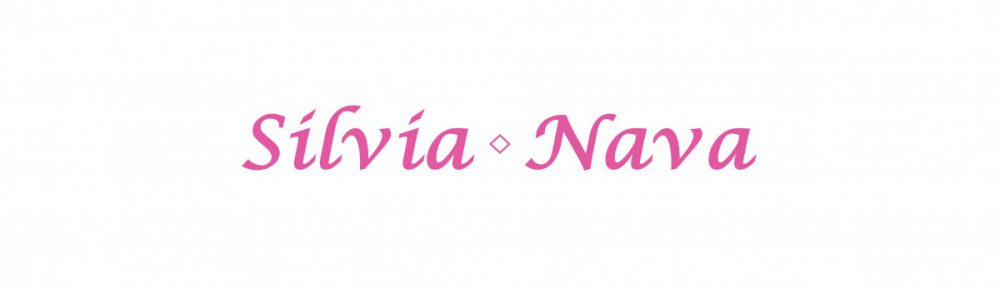
Create Banner for Openlab Site
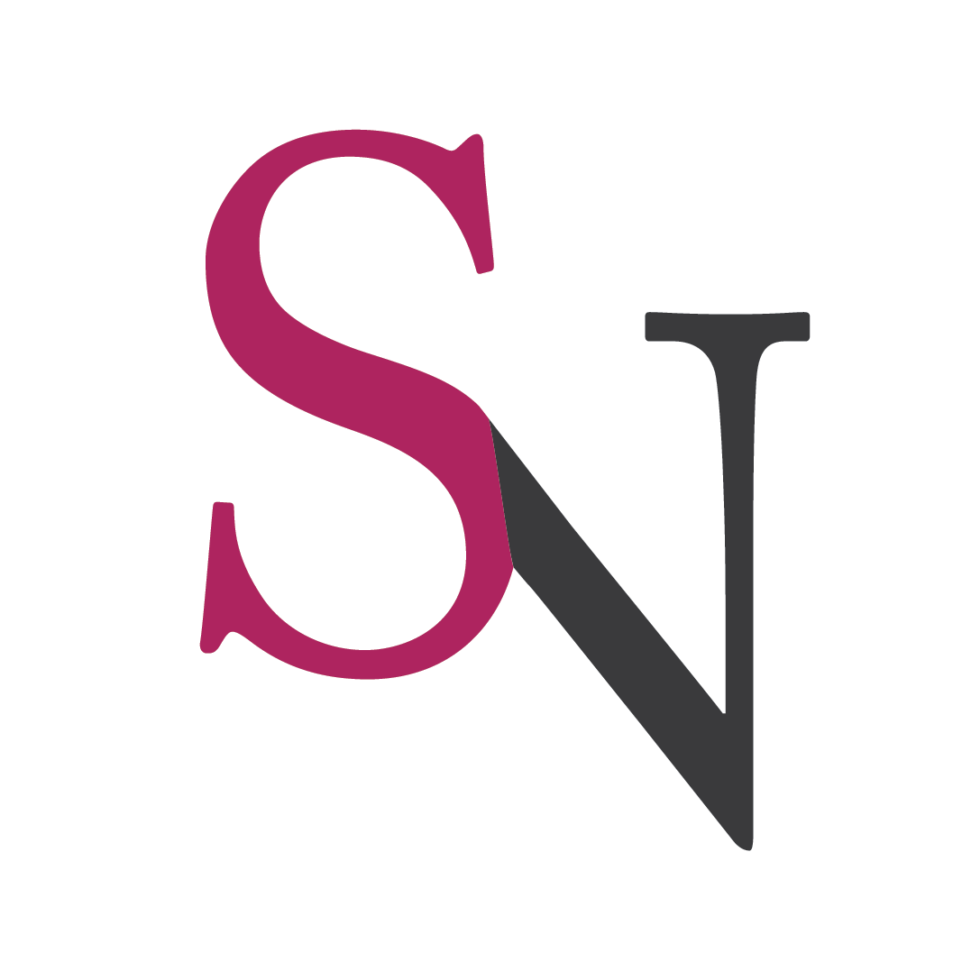
This is the updated version of my header. I created it with Adobe Illustrator. My first and last name are written in a script font. The letter S in my name is the same exact one from my logo. My logo is my two initials. S for Silvia and N for Nava. I created the letter S with bezier curves. The letter N i made by rotating, shrinking and flipping the letter S and positioning it in a way that the letter S and N overlap creating an infinity symbol.
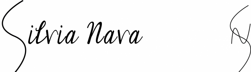
The background I selected was one I found on Pinterest: https://www.pinterest.com/pin/250301691764422668/. The design is a watermark drawing.
This is the banner i created for my open lab site. I created it with InDesign. It is a bit on the simple side but its elegant. I will change it for my logo once i finish developing it.