Field Trip- Cooper Hewitt Museum Nov. 2nd
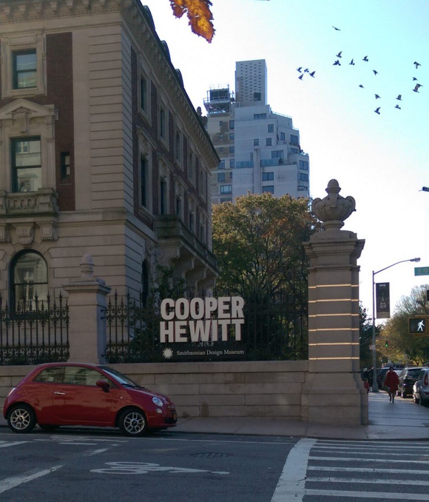
The Cooper Hewitt Smithsonian Design Museum is located in Manhattan on 91st street between 5th Avenue and Madison. The museum itself was founded in 1897 by the Hewitt sisters Sarah and Eleanor. The featured exhibits were Fragile Beasts, Energizing The Everyday and the Immersion Room. The whole museum is 3 floors and a basement area. I was impressed by the digital pen that they have available. With this pen we could save art that we liked with just a press to the scanning bar. We then were able to retrieve the artwork that we liked and could view more information on the piece. The museum has a café shop that has outdoor seating in its beautiful garden and has a gift shop as well.
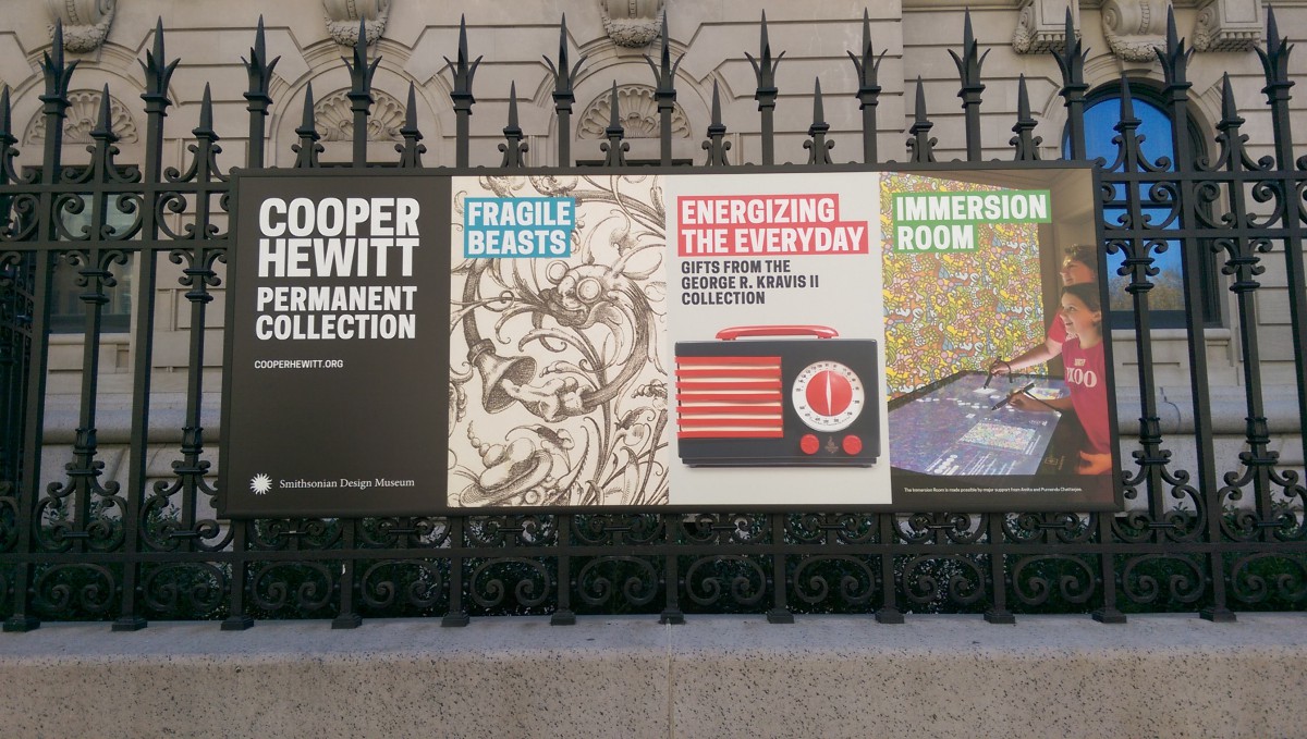
 Here are three of the exhibits that I liked in the Cooper Hewitt Museum:
Exhibit 1: Fragile Beasts
Print, Plate 17, New Grotesque Book, 1610 (Germany)
Medium: Engraving on laid paper
Size: Platemark: 15 x 18.7 cm, 18.5 x 23 cm
Designer: Christoph Jamnitzer
Gift of the Estate of David Wolfe Bishop
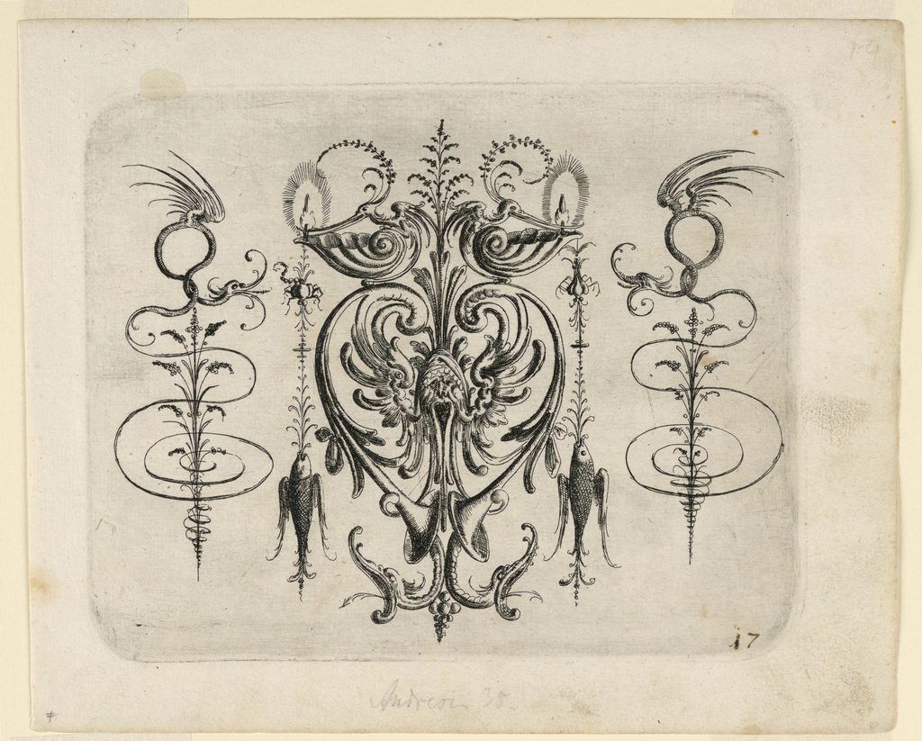 This Print (Plate 17) from the New Grotesque Book was one of my favorites in the Fragile Beasts exhibit. From far away what is seen is an elegant design, but up close you might be surprised to find beasts and made up monsters. To me this is a weird type of beauty, something so beastly looks graceful and beautiful. I believe that might be one of the reasons the exhibit is called Fragile Beasts. These words contradict each other in the same way that a grotesque, ugly monster can be fragile and beautiful. Using a magnifying glass we can zoom in to see the details made by the thin black line strokes. Beauty here is created by using symmetry, balance and proportion. Elements from nature and swirls are integrated with the beasts. The piece has what appears to be a screaming face at the center, surrounded by a heart that ends with two horns. Coming out of the horns are vicious looking snakes. Other animals in this piece are fishes, birds with a long beaks and winged dragon looking snakes. This grotesque style was used by Renaissance artists such as Raphael, Giovanni da Udine, Luca Signorelli and Bernardino Pinturrichio.
Exhibit 2: Wallpaper Printing Tools + The Immersion Room
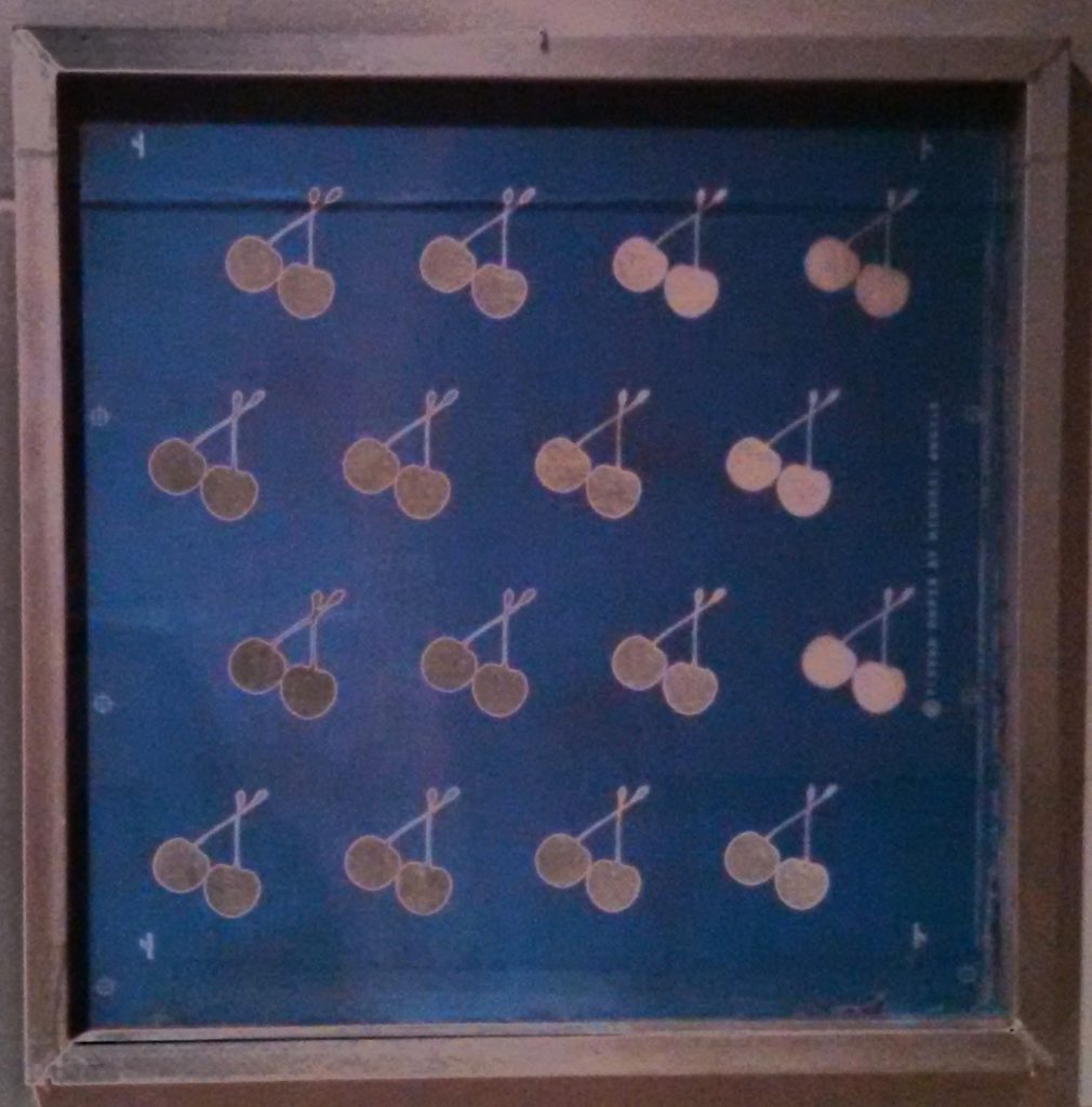
Silkscreen for printing Cherry Forever
Medium: Silkscreen in frame
Size: 36 x 36 inch
Designer: Michael Angelo, 1971
Made/ Gift by: Flavor Paper
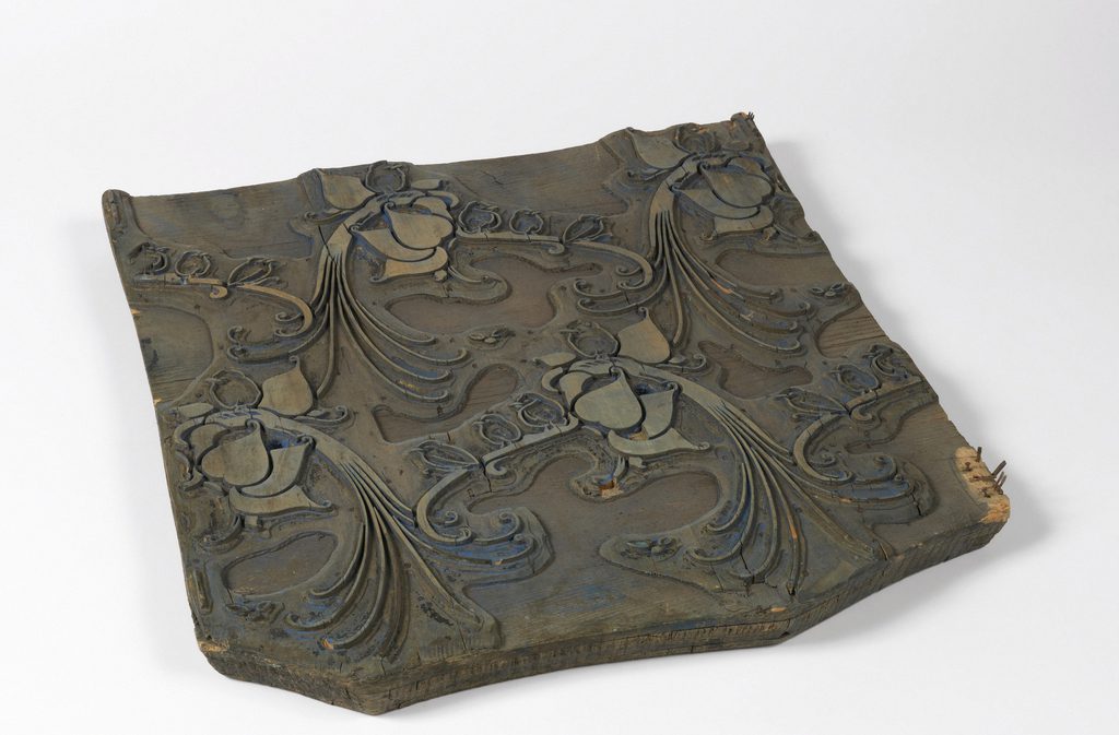
Medium: Wood, brass
Size: 54.5 x 48 x 4 cm
Purchase: Au Panier Fund, 1956
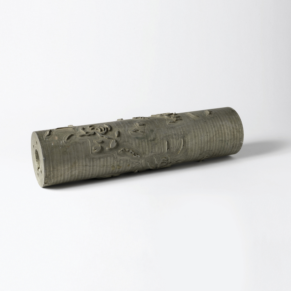
 Printing Roller (USA), 1945-80
Medium: Aluminum
Size: H x W x D: 14.5 x 58.4 cm
Gift of Seth Joseph Weine
 These three tools are very important because they are the start of how wallpaper was first produced. This silkscreen is one of the tools needed for wallpaper printing. This particular silkscreen is not the actual size that was used by Flavor Paper, but more like a model of what the silkscreen looked like. An interesting fact about the silkscreen is that it was used to make a Cherry Forever scratch and sniff wallpaper. I never knew that there were wallpapers that had scents or were scratch and sniff. The silkscreen was a blue type color and the cherries were placed at even intervals from each other and were a beige color.
The wood block was also essential for wallpaper production. It was created in France and was basically wood with designs carved into it. The wood block was then pressed into the paper and layers were created to make different colors. This wood block reminds me of the process wood block printing used to create early books. This technique eliminates the need to draw designs on the wallpaper by hand and creates a more precise wallpaper.
The printing roller is close to the wood block. This printing roller was created by American manufacturers as a way to machine-print wallpapers. These rollers were smaller in size which was great for small designs.
Wallpaper Projection Screen
Medium: Projection screen
Size: 2 Large projection screens from ceiling to floor
Made possible by support from Amita and Purnendu Chatterjee
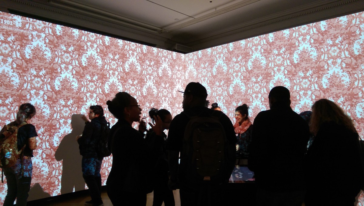
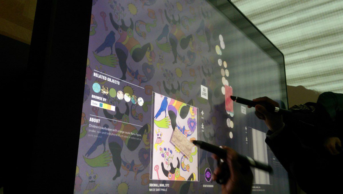 In the Immersion Room we were able to look at the wallpapers the museum has collected through projection screens. The projection screens took up two of the walls from ceiling to floor. This made it possible to see the wallpapers one after the other in a realistic way. There was a screen where a person could browse the different wallpapers and select which should be projected. The screen also had a feature that you could draw your own design and we were able to rotate, reflect, or change the wallpaper parts. All the wallpapers had different colors and designs.
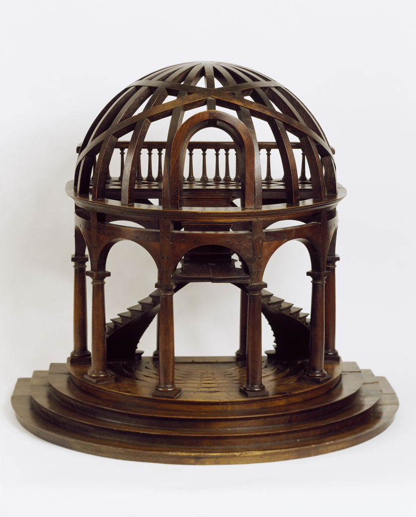
Exhibit 3: Dome-Shaped Architectural Staircase Model Mid-19th Century
Medium: Carved, planed, joined, inlaid, and turned walnut and beechwood
Size: H x W x D: 61 x 67.3 x 47 cm
Designer: Architectural staircase model
Gift of Eugene V. and Claire E. Thaw
This staircase model is a 17th century Italian style. The staircase and the architecture are outstanding. This model starts with four stairs that take you to the ground floor. Upon entering the building the staircase starts as two opposing flights of stairs. Having two staircases at each side is convenient and also creates a good visual balance. At the ground floor there is an empty space between the two flights of stairs. The two flights meet up at the center, uniting into one staircase that leads to the top floor. The top floor has a balcony that curves all around due to the dome shaped roof. The structure is supported by vertical columns. Models are important since they will provide a clear visual presentation of the work. They can be used to explain to a client how the project will look and changes can be made. This piece was created with a medium of what the actual work will look like.

