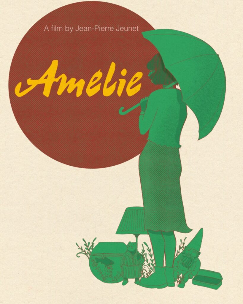
For my final project, I chose the film Amelie by French film maker, Jean-Pierre Jeunet. I decided for a clean and somewhat minimalistic design because the film itself is full of little intricate details, so the poster is just giving little hints of what it might be about, like the little items on the ground with the protagonist, Amelie. I decided I want to emphasize the title first hence the the yellow font color. The rest of the illustration are in red/green because this is the color scheme of the film itself. I also added little polkadots are design accent on her skirt and also on the circle as another aesthetic of the film itself…ie. Amelie tends to wear clothing with polkadot pattern.
Page 2 of 73
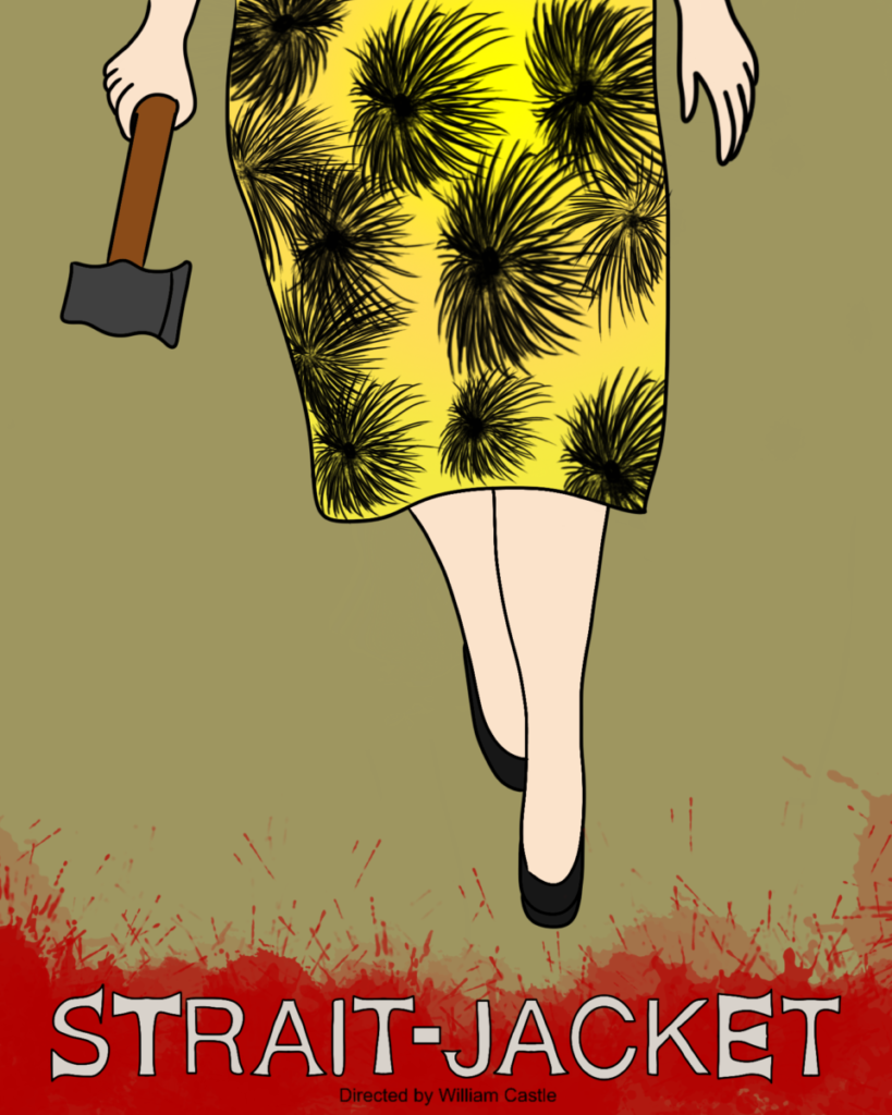
For my final piece I chose to focus on the first sketch I created which shows the killer from the waist down holding a axe in her right hand walking toward the audience. The background behind the movie title and the director is splattered with blood from the fallen victims. I drew out the movie title by hand and made the edges look like the end of an actual axe. I chose to fill my color palette with dull colors; with the exception of the color of the dress, rather than use bright colors. I feel as if using dark and dreary colors works well with the theme of the film. This film was shot in black and white and that made it harder to try and figure out what colors were used throughout the film. Personally I admire the approach because if it were shot in a different manner then it wouldn’t be as suspenseful as it originally was. In the film the director chose not to reveal the face of the killer and I went along with a similar approach and focused on the outfit. I liked how it came out and felt the need to not focus on the face and give away the ending to the viewer.
Recent Comments