Professor Diana Schoenbrun | COMD 3313 | SP22
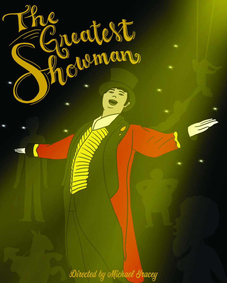
The process I took with this was really thinking about the movie and how the main character almost neglects some of the performers, so I used a silhouette look to have some of them in the background and then I put him in the spotlight. The hand lettering I did I felt was good for like a circus type of typography. The yellows and reds were a lot in the movie due to the outfit of the main character. A cursive type for the director I felt was necessary to pair with the title.

© 2024 COMD3313, Illustration 1
Theme by Anders Noren — Up ↑
The OpenLab is an open-source, digital platform designed to support teaching and learning at City Tech (New York City College of Technology), and to promote student and faculty engagement in the intellectual and social life of the college community.


Recent Comments