Professor Diana Schoenbrun | COMD 3313 | SP22

Category: Discussions (Page 2 of 3)

Basema ikhmayes week 6 Discussion

Meg Hunt on Behance

Meg Hunt

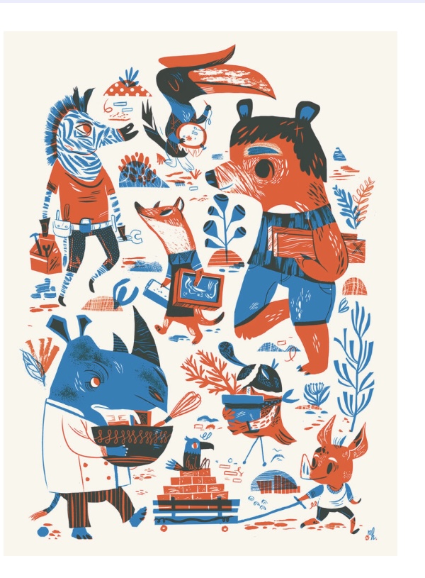
The number of colors used in this illustration are four, black, white, orange, and blue. The artists used two different color palettes in this illustration: Monochromatic and Analogous. The colors that were used from the Monochromatic palette are considered warm colors. And the colors that were used from the Analogous palette are considered cool colors. The artist also used white; however, white does not feature a traditional color wheel. This illustration was created by Meg Hunt, who lives in Portland, OR. Her first picture book (Interstellar Cinderella) was published in 2015. Also, In 2015, she received a Gold Medal from the Society of Illustrators for Illustrators 58, Uncommissioned category. I think her work is very effective because she mainly uses limited color palettes; however, she is still swamped, and it seems like she used a lot of colors, but in fact, she didn’t

Week 6 Discussion-Kayla W.

This work by Nicholas Moegly is one of my favorites from this artist. He plays with light in his work by using a monochromatic color technique with different tones of blue and the pop of yellow and orange to bring light to the piece. He might’ve used the process of drawing with pencil, then used ink pens to draw it out, and either digitally finished it with the color or used colored pencils. I feel like this technique is very affective as it draws your eyes to the lights because of the pop of colors. Below is his website and instagram:

http://www.nicholasmoegly.com

https://www.instagram.com/nicholasmoegly/

Nicholas Albanese Week 6 Discussion

Image

The artist of this image goes by Billie Snippet on their Instagram and Twitter. They are a South Korean artist working in illustrations, comics, and apparel. For their work, they love using limited color palettes such as the example shown above. While they didn’t show their process for this piece in specific, I believe that every aspect of this piece was created digitally. For this piece, we can see that Billie ended up going with a triadic color scheme of cyan, yellow and magenta with blue-green mixed in. The yellow of the jiang-shi’s tag as well as the yellow in the candle holders draw our eye to them. Cyan serves mainly as a background color and the color for darkers parts of the drawing like the character’s hair and the shadows of the piece. Magenta stands out from the primarily cyan background and gives form to the character through their clothing. The blue-green tone of the candles and the character’s skin serve as positive space and it allows our eyes to relax. I consider Billie to be very effective. Their use of limited color palettes and positive and negative space come together to create a piece that is appealing to look at and enjoy.

Listed here are links to Billie Snippet’s Twitter, Instagram as well as their collective apparel store, Uchuu Summer.

Twitter: https://twitter.com/birries
Instagram: https://www.instagram.com/bsnippet/
Uchuu Summer Store Website: https://www.uchuusummer.com/password
Uchuu Summer Instagram: https://www.instagram.com/uchuusummer/
Uchuu Summer Twitter: https://twitter.com/UchuuSummer

« Older posts Newer posts »