The show poster I saw recently was a docuseries called “Conversations with a killer: The John Gacy Tapes”, and I watched it because of the poster. It was about a serial killer and how he murdered 33 people and it had actual recordings about how he explained to the police what he did, and then claimed that he didnt do it, but he admitted to it anyway which led to them also finding all the bodies beneath his house while he was being questioned. The poster drew me in because it had a creepy look to it, and I like to watch things that are creepy or scary. It showed half of his face, and then half of his face with clown make up because he use to dress up like a clown and go to events. The wording of the title, which was in white, capitalized, san serif font, definitely drew me in too because of it stating that I would be listening to actual recordings of an actual killer. The story is very sad and creepy, and it was a 3 episode series.
Category: Discussions (Page 1 of 3)

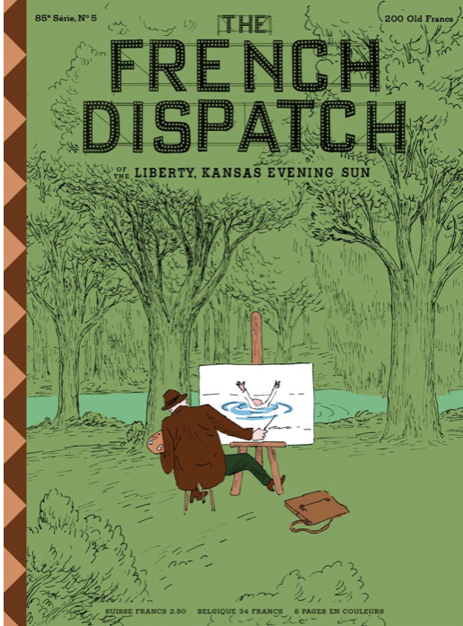
I feel like the intention of his work in this cover was to basically say how we can watch something happen and instead of helping, we might make something out of it. There’s about 5 colors used in this cover, most of it green where it causes your eye to focus on the middle of the subject. The feeling I get from this is a little dark feeling although the green gives a pleasant feeling, the illustration in the middle is sad to know that this is how society is sometimes. This reminds me of when people are fighting or about to get hurt, or any sad situation, in NYC and probably many other places, people take their phones out to record instead of helping or getting help for those people being recorded. And usually it can be for their own benefit of making money selling it to a news station, or posting it online to get many views and likes for a little 15 minutes of fame. Here the painter is benefiting from someone drowning by creating a painting they might sell or use for art.

This piece is made by illustrator, John Holcroft, and primarily consists of blue and red, along with whites and grays. The work above was made as an editorial illustration about how addictive ‘likes’ can be (seemingly on Facebook). I believe the limitation on the color palette helps propose the idea of the work more straightforwardly and possibly less distracting. It may also be because the colors are not in bright shades, rather more pastel or muted.
This illustration was found on the ”uncommissioned editorial work” section of his website which is: http://www.johnholcroft.com/
He’s also available on:
https://m.facebook.com/john.holcroftillustrator
https://twitter.com/john_holcroft_
https://www.instagram.com/johnholcroftillustration/?hl=en


Recent Comments