Professor Diana Schoenbrun | COMD 3313 | SP22

Category: Assignment Instructions (Page 4 of 14)

Deasia Grant final:A Touch of Evil

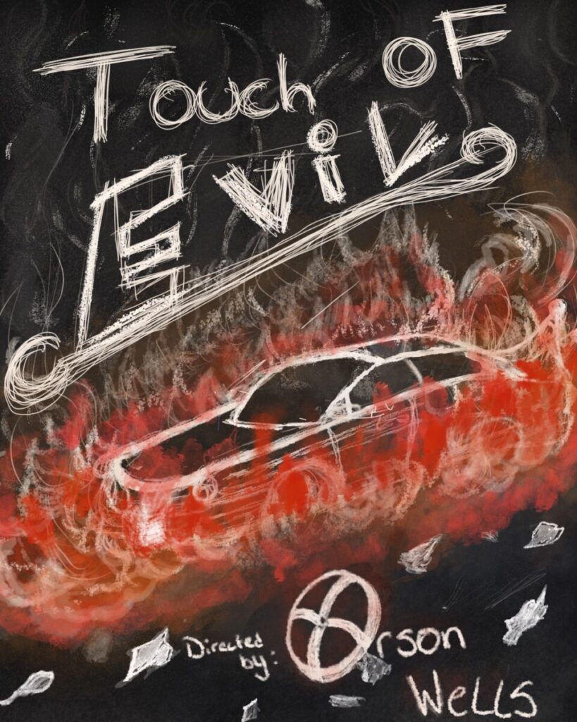
for this final, I went with the idea of a chalkboard drawing.I decided to make this poster based around the first few seconds of the film because that’s where it all started for all the main charters to be introduced it was hard deciding where to put the Orson wells and how to draw the reader’s eye to the lower side of the page. I made the O for Orson a wheel cap/rim and instead of keeping it white, I tinted it a light red to still give it that hot effect because it did just explode off the car. the other idea was to have the director’s name on a license plate but I didn’t really like how it came out I definitely like this design better.but overall I’m very happy with how this came out

Final Project Movie Poster-Kayla W.

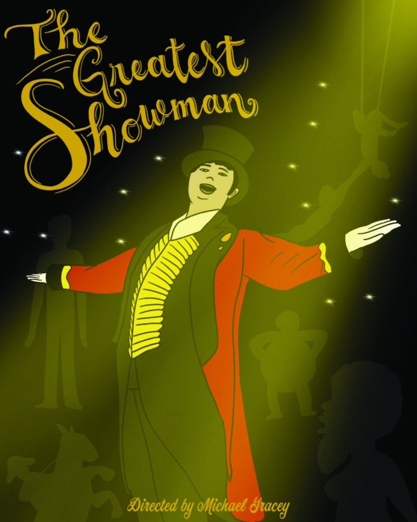
The process I took with this was really thinking about the movie and how the main character almost neglects some of the performers, so I used a silhouette look to have some of them in the background and then I put him in the spotlight. The hand lettering I did I felt was good for like a circus type of typography. The yellows and reds were a lot in the movie due to the outfit of the main character. A cursive type for the director I felt was necessary to pair with the title.

« Older posts Newer posts »