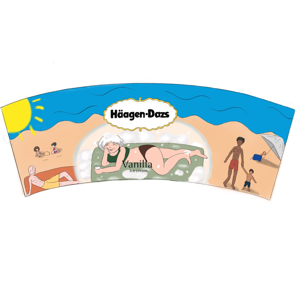


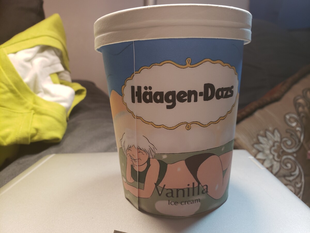
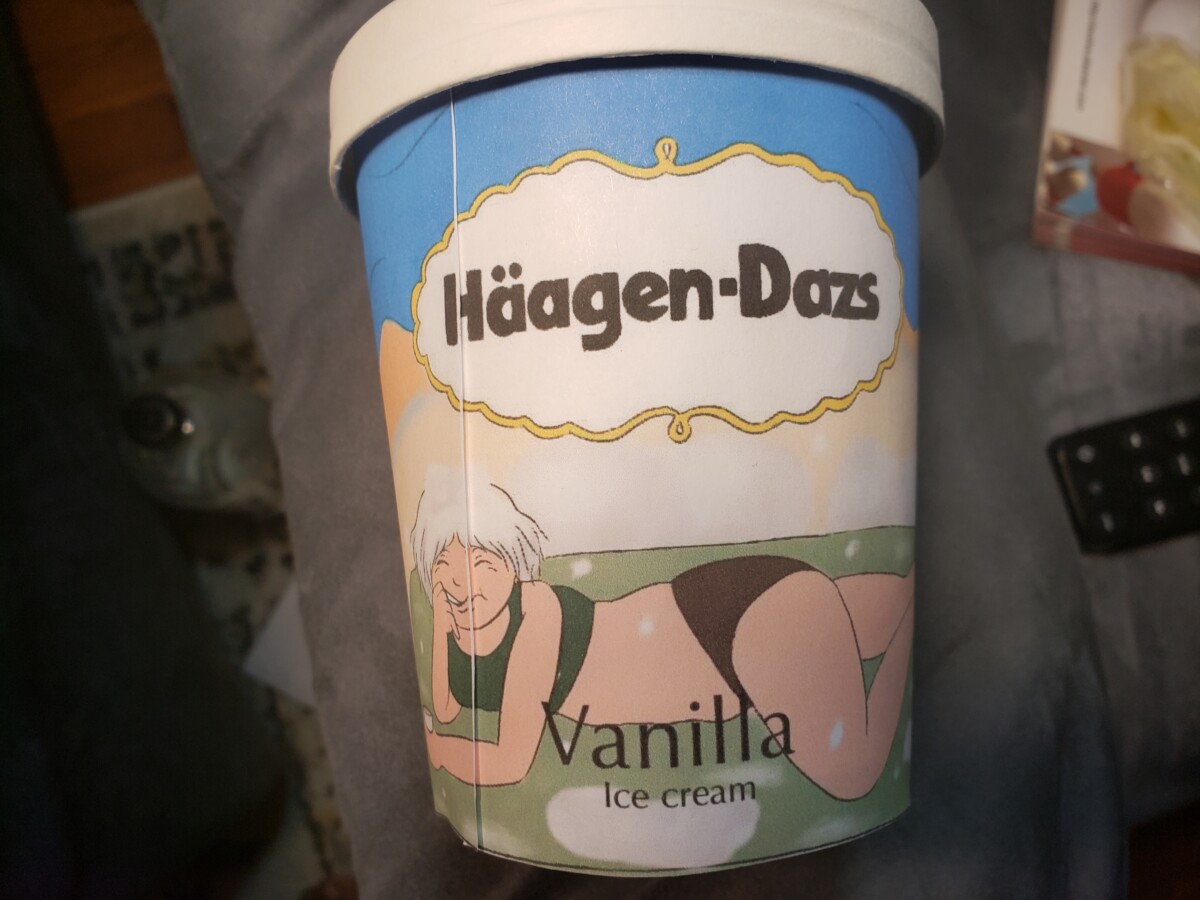
For color palettes, i chose to do 3 for a little more variety since it was hard for me to use certain color palettes without it looking weird in my opinion. The first palette is a personal palette, using colors that best fit the setting and using the colors of a vanilla flower for the girl in the middle. The second one is Monochromatic using black and whites. I found it weird using most colors since i felt like it gave it too much stimulation with the amounts of different things in the illustration and i feel like b&w made it look pretty nice and gave a cartoonish look. For the Last one i used analogous colors (yellow, green and orange) which is probably my least most confident one but it was nice to experiment. In the end i choose to stick with my personal palette since its the most im comfortable and confident with.


Recent Comments