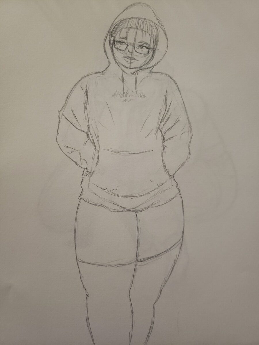
I am not great at doing fine outline since I have bad steady hands but I usually use microns for outlining and thats what I used for the top illustration. The bottom one i used an ink brush which was harder for me to make fine lines with.
Author: Tarique (Page 2 of 3)

When i color, i am usually attracted to very warm colors like yellow, pink, red etc. Vibrant colors like these can really pull you into a piece of art and can look attractive on anything like candy, food, fruits and other edibles. I would only use cold colors if i want to give a very heavy tone to something or to maybe mix the two when i want something complementary to make things pop. My attraction to warm colors could be linked to how much i liked candy growing up and my liking of the vaporwave aesthetic which also combined cold and warm colors.


Recent Comments