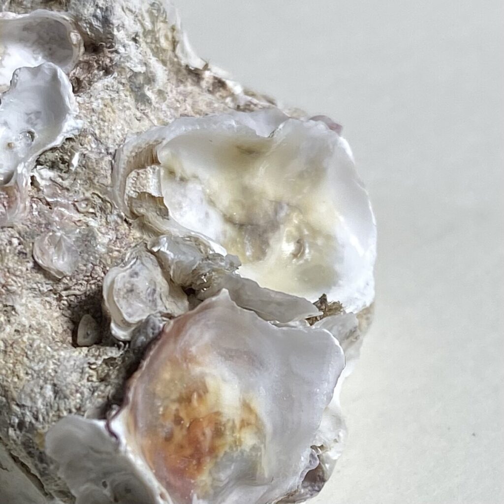

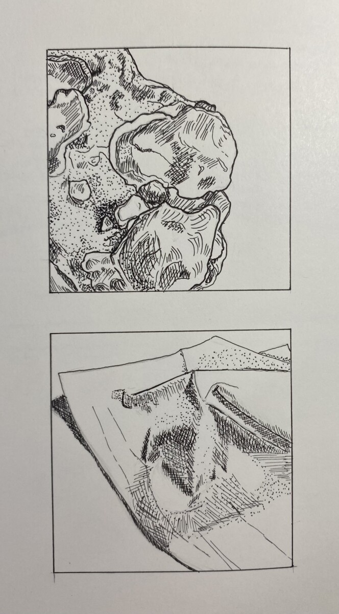
For these sketches, I chose a textured rock with shells on it and a tissue paper. I used Micron pens for the first exercise, mainly 02, and 03 for the hatching and outlines, and 01 for the stippling. For the second, I used only 005 and 01 since the material was a softer, therefore, using the lighter ink color.
Author: Jessie Zhang (Page 2 of 2)

This piece is made by illustrator, John Holcroft, and primarily consists of blue and red, along with whites and grays. The work above was made as an editorial illustration about how addictive ‘likes’ can be (seemingly on Facebook). I believe the limitation on the color palette helps propose the idea of the work more straightforwardly and possibly less distracting. It may also be because the colors are not in bright shades, rather more pastel or muted.
This illustration was found on the ”uncommissioned editorial work” section of his website which is: http://www.johnholcroft.com/
He’s also available on:
https://m.facebook.com/john.holcroftillustrator
https://twitter.com/john_holcroft_
https://www.instagram.com/johnholcroftillustration/?hl=en

For the top left, I used one single color to start off (pine green). The top right is two complementary colors, orange and blue. The bottom left, I used monochromatic colors of purple and then analogous for the bottom right (which consists of yellow, yellow-orange, and orange). In my opinion, I like the monochromatic more because even though they’re shades of one color, it still stands out. However, if the complementary colors definitely make it more clear and sharp with the contrast.


Recent Comments