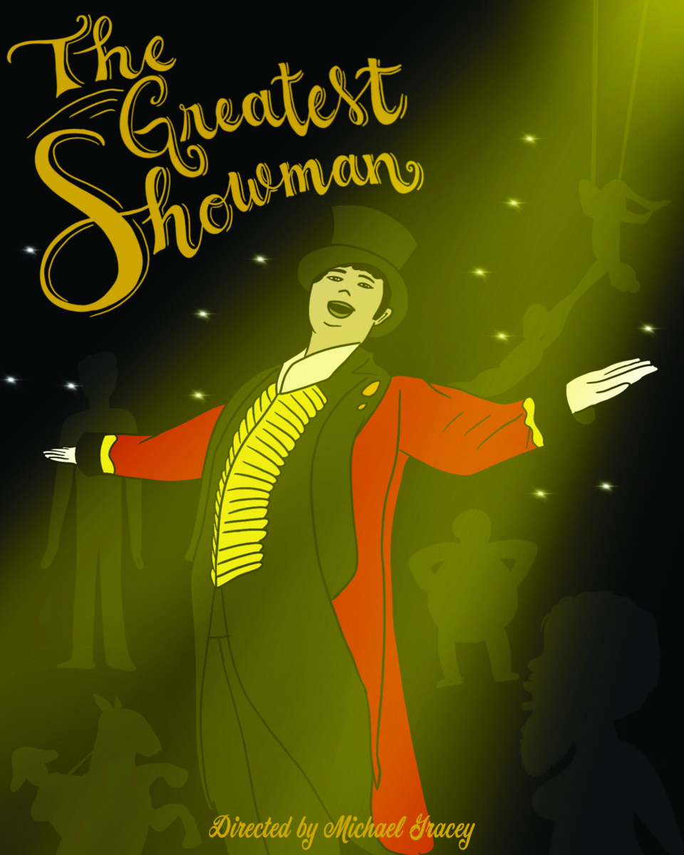
The process I took with this was really thinking about the movie and how the main character almost neglects some of the performers, so I used a silhouette look to have some of them in the background and then I put him in the spotlight. The hand lettering I did I felt was good for like a circus type of typography. The yellows and reds were a lot in the movie due to the outfit of the main character. A cursive type for the director I felt was necessary to pair with the title.


Leave a Reply