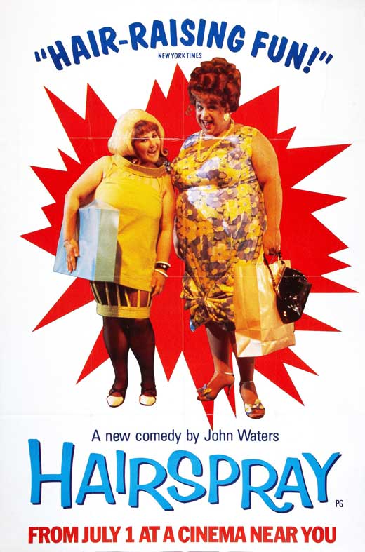
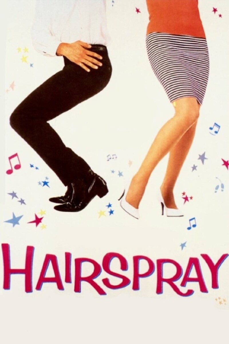
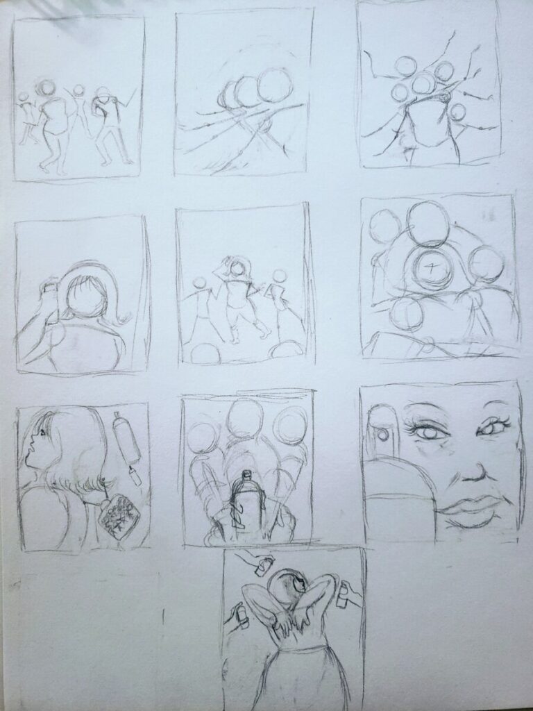
I decided to choose the movie HairSpray(1988) as the movie to do my poster for. As for the poster on top, the positives of it are that it shows two of the main characters at their highest point in the movie and their clothes show their freedom of expression. Its negatives is that besides their clothes, there is nothing else to pull the eyes in and if it gives an idea that the movie is all about these two but there is much more the movie focuses on. The second poster, the positives are that it really shows the energy that the show gives off with the dynamic position of the lower half of the two figures(Since the show is about dance). Otherwise, it too has a problem with just putting our only attention on the figures only and the figures themselves are too general when the movie has a specific target of characters. Now i don’t think these posters are terrible, but i believe mixing elements from these two posters, plus adding some more background would make the pinnacle poster for this movie.
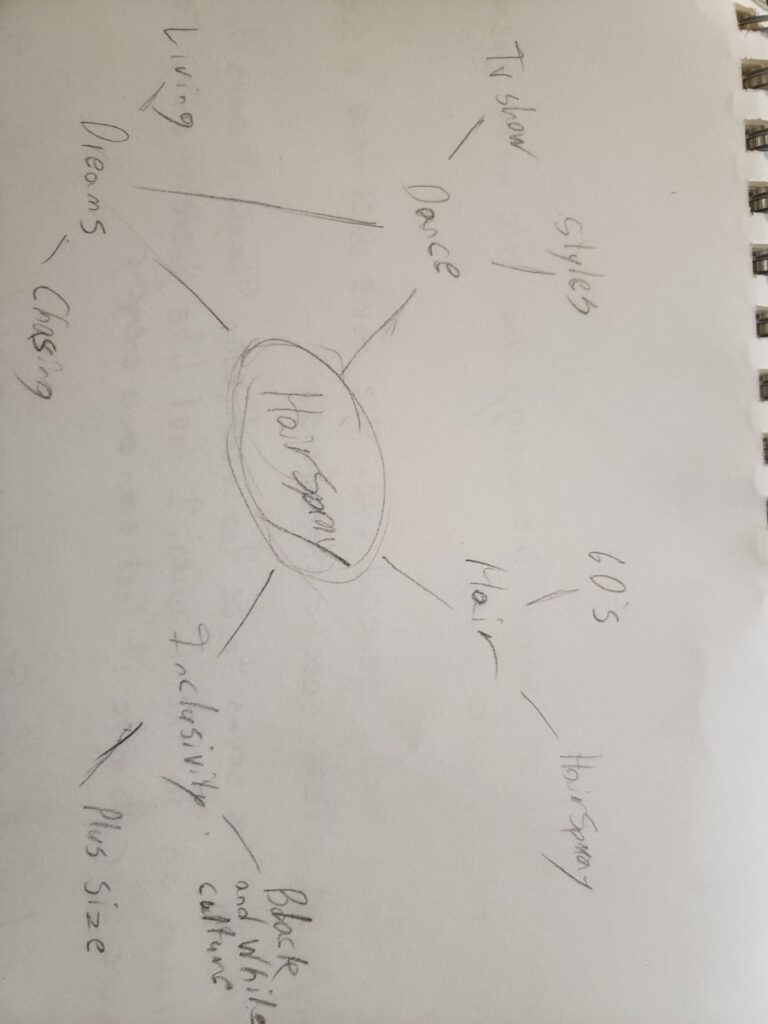
The Movie is about a plus size girl named Tracy Turnblad who lives in Baltimore and aspires to be a famous dancer on her favorite television dance show. After finally getting her big break and realizing exclusive the show was toward the black culture of dance and learning and appreciating it through them, she set out to bring inclusivity to the show and bring a fresh new look of diversity to Baltimore’s most popular dance show. The audience of this movie was probably young adults/adults of both black and white decent, as this movie was most likely made to bring these two groups together. You don’t need to be a fan of dancing or fancy hair to enjoy this movie because i sure wasn’t and i did.


Leave a Reply