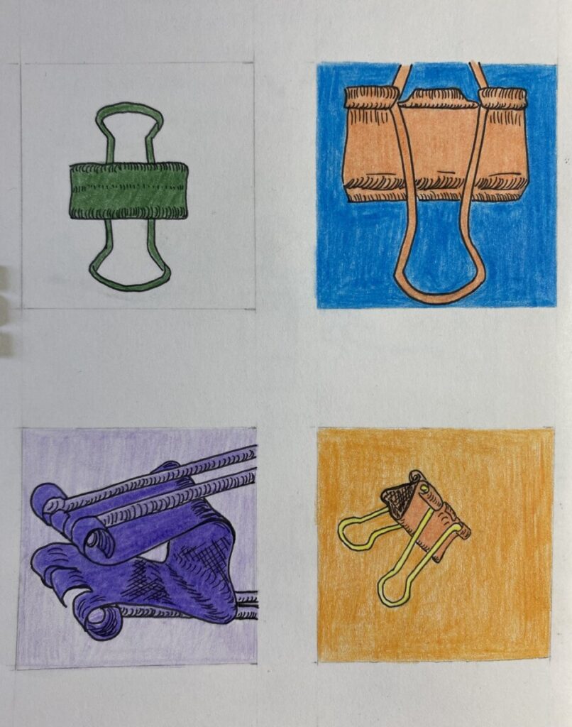
For the top left, I used one single color to start off (pine green). The top right is two complementary colors, orange and blue. The bottom left, I used monochromatic colors of purple and then analogous for the bottom right (which consists of yellow, yellow-orange, and orange). In my opinion, I like the monochromatic more because even though they’re shades of one color, it still stands out. However, if the complementary colors definitely make it more clear and sharp with the contrast.


Leave a Reply