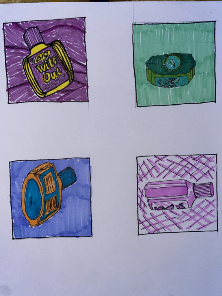
I used complementary colors for both of the drawings on the left, monochromatic for the top right, and one color on the bottom right. I feel like the yellow and purple, and the orange and blue complementary colors always look so well together. The monochromatic green one on the top right seems a little boring to me, but maybe its because of the angle at which I drew the bottle. And the one color of pink feels clean and pleasing to look at.


Leave a Reply