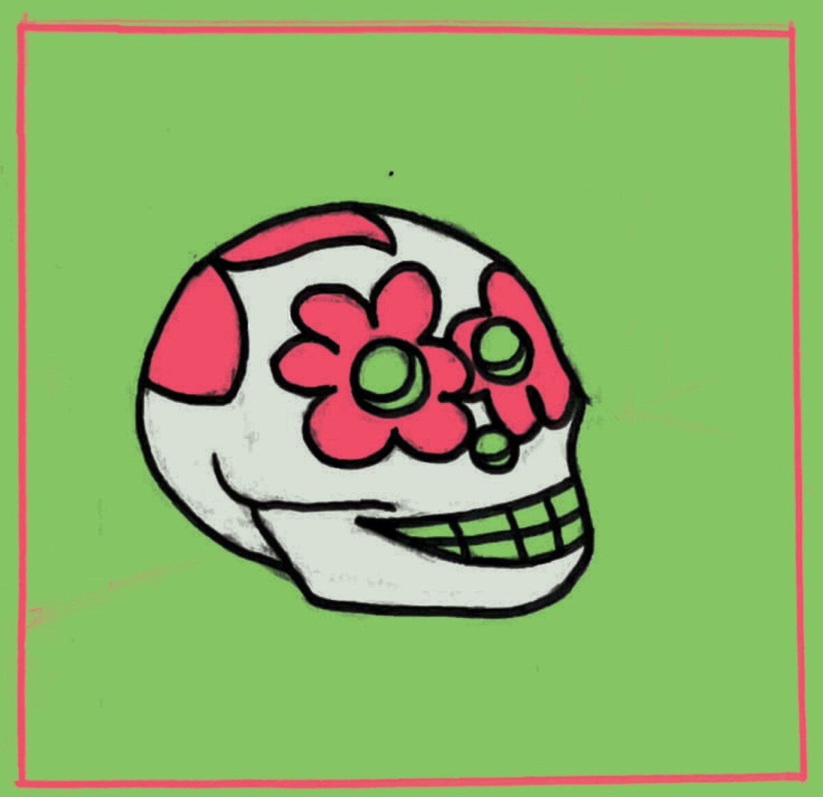
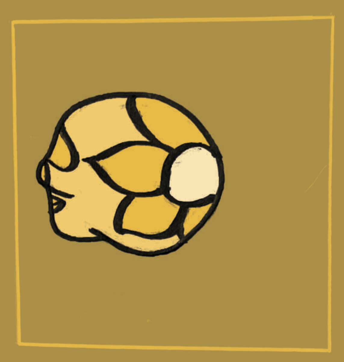
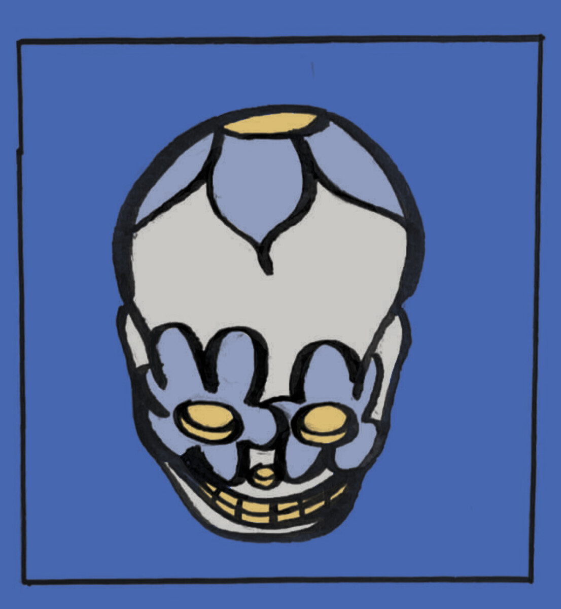
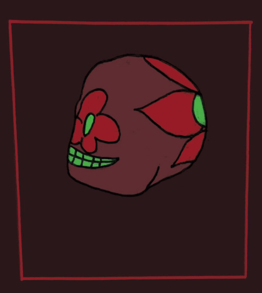
For each of these 4 sketches, I first sketched and inked them on paper before transferring them over to Photoshop where I adjusted the levels, made the lines darker and colored each of them digitally. For the first skull, I chose a triadic color palette. For the second, I chose a monochromatic color palette. For the third skull, I chose an analogous palette. For the fourth, I chose a complementary color palette. I personally feel that the third illustration was the most effective due to its limited palette and use of colors to draw attention to certain parts of the subject.


Leave a Reply