Seth Hematch

Seth Hematch is a shoe fanatic and photographer.  He focuses primarily on the collection and capturing of vintage nike sneakers.  He is untrained and has gained most of his skill through personal experience. He never considered photography as a viable career and therefore did not feel as if he need to be professionally taught.


His photographs are full of color and vibrancy as he manages to photograph the oddly colored vintage nike sneakers.  He successfully models his subjects with clothing according to color and style of the shoot. He also is very careful about choosing an environment to shoot and how that affects the experience and subject matter.  Through each shoe Hematch brings you to a new place and a new experience all on foot. That is what seems to be communicated through his well coordinated imagery.


The emphasis is on environment which I think is grave importance in shoe photography.  The shoes take you places and Hematch really brings you to locations of all sorts. Airmaxes on a mountain top and adidas runners in a swampy setting, Hematch follows his footsteps to many different and interesting environments.


Richard Foster

Richard Foster works in the commercial still-life world.  He photographs a lot of high end fragrance and luxury brands.  Foster uses shadow, shape, and color to emphasize the beauty and figure that a lot of these high end items have.  He uses light to help bring out the curves to a lot of transparent items like he does in the Bottega and Tom Ford campaigns.  The Bottega Perfumes use the patterns cast by light on the bottles to create an interesting and dynamic image. The light seems to be cast from above the perfume bottle but they still have strong outlines and very bright highlights that surround the bottle.  In the Tom Ford photographs waves and light are tastefully shown through the bottle giving off a very subtle but dramatic effect. The bottle lit from behind becomes the light source in frame and illuminates the logo and shape.


Without the light there is no bottle.  That is what comes to mind when viewing Foster’s images.  You realize that without the light, the shape of the bottle isn’t there, the contents, and shadows are nowhere to be found.  The bottle has no form without light. The Prada bottles Foster shot add to this. The pink lights that shine from the front and behind add mood and form to the bottles that now shine with a pink hue.  The lights also help draw the viewer to the focus in the image which are the Prada bottles.

Chris Brooks: Still Life Photography

Chris Brooks is a photographer who has shot still life and portraiture. He shot for a Jo Malone campaign, promoting a new line of fragrances. Brooks does an excellent job at capturing the unique features of each scent. He composes his shoot based on the ingredients that are used for each fragrance.

Brooks wants to bring attention to the ingredients that are in each scent, so he uses the actual ingredient in his photo shoot. Brooks also considers the color palette that he should use for each fragrance. There is a fragrance that specifically has ginger and nutmeg in it. Since that ginger and nutmeg are both similar colors, he decides to composite a warm/earth tone color palette to shoot this fragrance in the best possible way. He decides to shoot this bottle against a white background. The way he arranges the ginger behind the bottle, it allows for light to come through certain holes in between the ginger. It seems like there are two lights in use here. There is one main light that seems to be 45 degrees and a fill to bring out the ginger and nutmeg in the foreground and background.

Brooks also composed a shot for another one of Jo Malone’s fragrances. This fragrance has pomegranate in it. So he included pomegranates, some are whole; some are cut open. The photo is different from the ginger fragrance because of the color palette. This one is more dark and red. It is shot against a black background and also seems to use two lights. There is the main light off to the side and fill light to bring out anything that may get lost within the dark background.

Chris Brooks was very successful in capturing these fragrances. He personalized the shoot to each type of fragrance and included what was necessary to define the characteristics of each fragrance. The lighting successfully brought out elegant highlights on each bottle and ingredient that was shot.

Tim Wallace

Tim Wallace is an award-winning commercial photographer based in Manchester England. Tim is a transport or vehicle photographer and during his career he has worked for very popular and luxurious brands like Ferrari, Jaguar, Mercedes, Aston etc. His style is very dramatic with lighting, camera angles, the space and all of it works well together to enhance the beauty of the vehicle. Watching his video, I learned how to he works with one light at a time so he has more control and only when all the lights are how he wants, then he takes the shot. There is definitely lots of contrast which I think makes the image look dramatic. The highlights pop out and the shadow is darkened. The space itself is really beautiful and thought out. The space and the vehicle come together and work as one. The camera angle is very dynamic as well. With every piece it’s a different approach and I think that why you don’t get tired looking through his work. Every piece is different and exciting.  

Julia sent

Julia sent has a master’s degree in physics but she is well known as a still life photographer. She studied portrait photography with Joyce Tenneson and still life photography with Anna Tomczak but most of the skills she has are self-taught. Julia’s still life photography mostly consists of fruits, flower, and vegetables. Her style has distinct look to it. First thing is the dark background and she uses vibrant colors. It makes the subject pop out of the background. It’s fairly tight cropped but no part of the subject is cropped of the picture. The lighting is soft. It makes the exposure well balanced. It’s not too bright and not to dark either. Looking at few of her pieces it looks like the light is coming through the left-hand side and coming towards the right-hand side. It’s not lighting the background. This way the texture of the foreground is more visible and it creates a sort of 3d space. I love the style and the style is consistent throughout every piece.  

Art of the Mountains

The Art of the Mountains exhibition was incredibly beautiful. The large photographs were neatly framed and displayed. There were few pieces that I really liked during my visit. The first piece is called wolf Tooth Mountain of the Altyn-Tagh, 2005” by Li Xueliang. The shot was taken right after a downpour. The scape of the desert looks amazing. There is no sign of life there. There is just this vast desert and sky on the top. I like the contrast between the desert and the sky. The sky is filled with dark clouds but there is ray of sun lighting up the desert. There is balance between the two like hot and cold, good and bad. The harsh shadows in the mountains and background adds a dramatic mood.  


The second piece is called “Huangshan A124: Disciples of Buddha and Fairy Maiden Peak, 2004” by Wang Wusheng. This is a monochromatic photograph of dragon peak in Mount Huang. I’ve always been a fan of black and white photography because it looks moody and mysterious. This piece also gives off the same feeling if not more. I love the high contrast in the photograph. The high contrast has turned the foreground into a silhouette but the detail of the trees and jagged edges of mountains are crisp. The mountains appearing through the clouds look really beautiful. The photo itself looks very calming but also it looks mysterious like a scene from a horror movies.  


The third piece that I like is called “Return to Mountains No. 11, 2011” by Xiao Xuan’an and Yan Changjiang. The picture was taken in southern china. It’s a landscape of a dead forest. It looks like the nature itself is decaying. The birds sitting in the trees add a dark mood to the image. It looks mysterious and the monochromatic color makes it more serious. Feels like something horrific has happened in this place. I love how the hills and the mountains are faded in the background and you can only focus on this dead area that’s covering the foreground. I believe the photographer was trying to portray how modernization have taken over nature.  


Final project proposal

I am planning to do a ad campaign for guitar center for my finall project. guitar center is a company that sells all kinds of music instruments and products that has to do with music and entertainment. Guitar center was founded in 1959 by Wayne Mitchell. My approach is to do a still life shoot of different instrument. I want to shoot them all in a plexiglass to get the reflection. i want the lighting to be dramatic and in a way looks polished. I want the mood to be inspiring. I’ll add a short sentense on all the final piece that goes with the idea that is to inspire the artists.

Proposal for final shoot


Brand: Bvlgari Jewelry company. Bulgari S.p.A is an Italian luxury brand known for its jewelry, watches, fragrances, accessories and leather goods. Bvlgari was founded in Rome in 1884 by the silversmith Sotirios Voulgaris (Italian: Sotirio Bulgari) which also means Bulgarian. A single jewellery shop that has, over the years, become an international brand. The company has evolved into a player in the luxury market, with an established and growing network of stores. Its Major competitors in the luxury goods are big name brands like: Cartier being one of the biggest rivals, and Chopard, as one of the biggest competitors among other brands like Dior, Tiffany & Co and Graff. Bulgari is a brand that preserves its heritage, but It’s not strange to the young crowd. Bringing the Italian fashion to the Us with powerful influencers and eye pleasing ad campaigns.

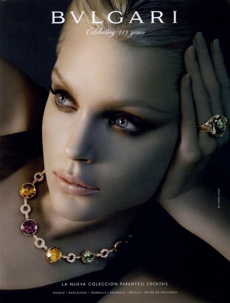
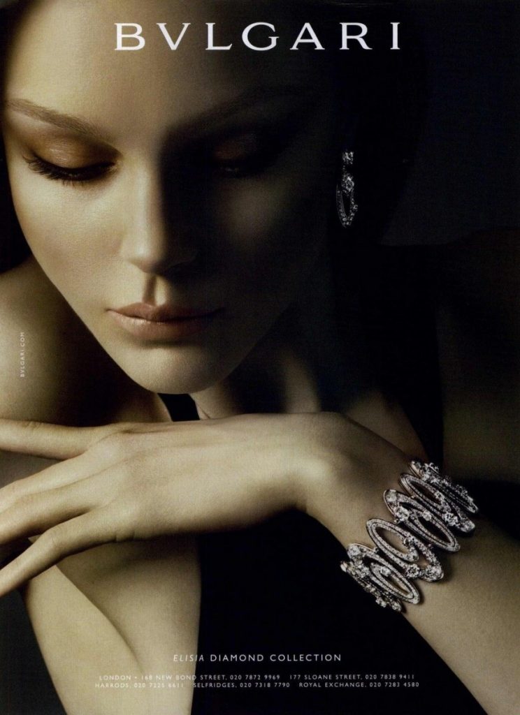
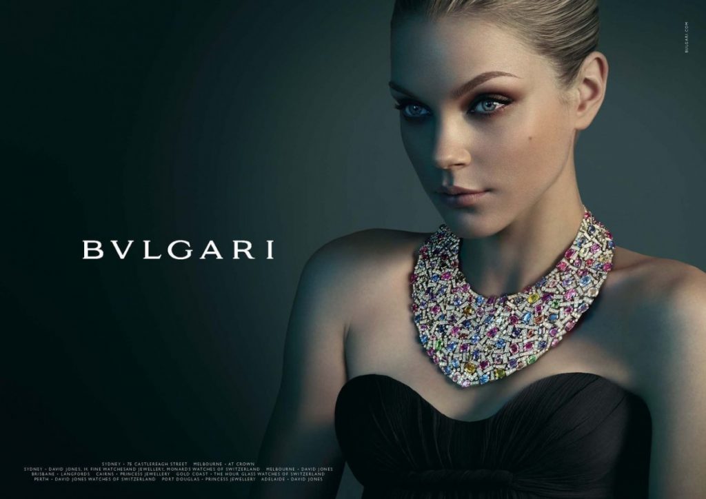
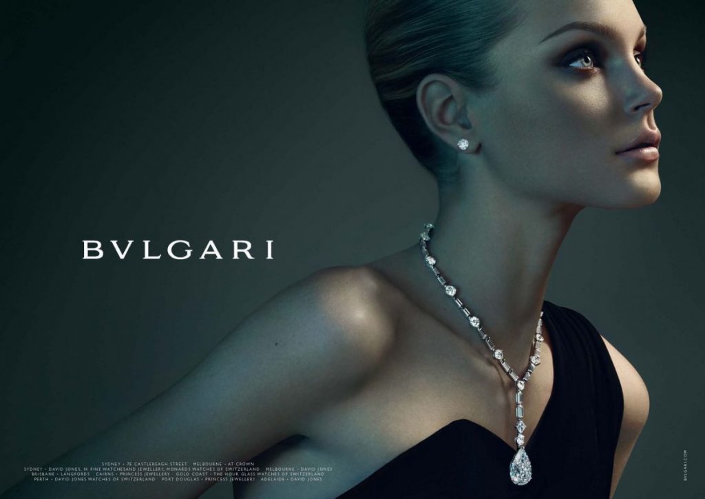
For my final project I would like to recreate the style or mood of  The “Parentesi” campaign by Bvlgari. This is a collection of high end portraiture showcasing their luxurious jewelry on beautiful women in a quite elegant design. 

The deliverables are tight cropped head shots for pendants and neck and hands for recklessness and rings. The lightning seem to be a combination of short light with  Rembrandt style but the jewelry that falls on the dark side seems to be highlighted to emphasize the product. The background appears to be illuminated with a spot light from behind the model creating a very smooth gradient fading dark towards the edges, this also creates separation of the model from the background. The mood color it’s a dark green for the background which also spills in the shadows tones of the model. The dark green reminds me of emeralds and beautiful stones which complements the luxury of the brand and jewels.The warm skin tones contrast the cold green, being the two predominant colors in the pallet.

***Shooting Plan***

Model  Female 25-35 years old, slim body, light, tan or dark complexion

hairstyle: slick back or tight up bun (or an hairstyle that leaves neck and ears clear)

Clothing: Black cocktail dress – Neckline (off the shoulder – Scoop Neck)

The shots are Medium to high crop so it could be a dress as well as an nice formal blouse. 

Props:  Jewelry: Necklaces, rings, earrings or pendants, Brazaletes

Make-Up:   Cocktail party formal wit a light dewy finish

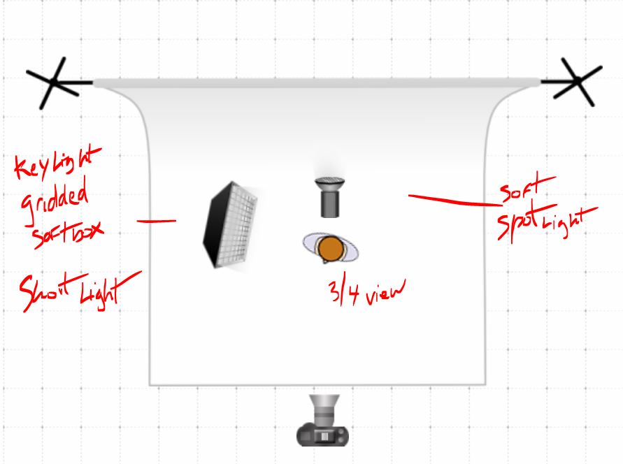
Shoot 1 (Monday 3rd ) – Lightning Diagram


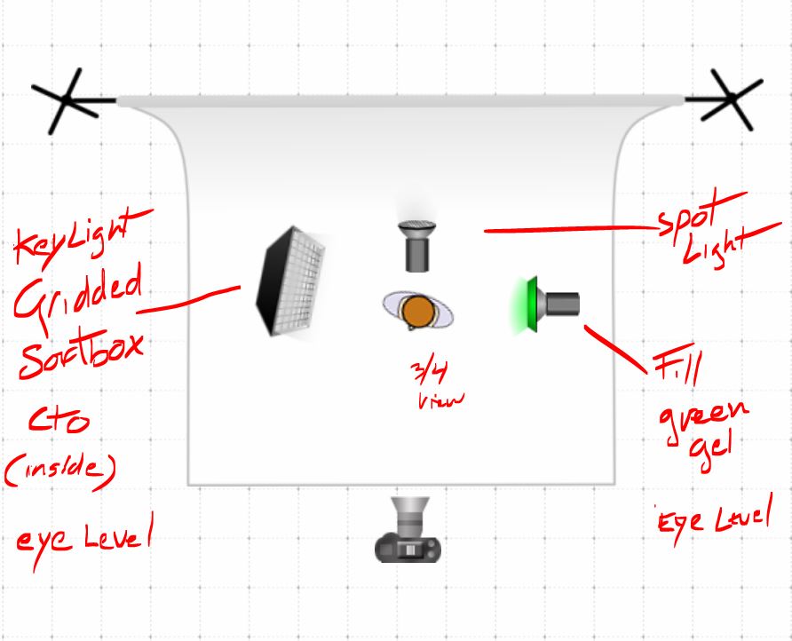
Background: color emerald green 

Possibly cto in the key light to emphasise skin tones!


Shoot 2 (Monday 10th )


Darker more neutral mood 

Final Project Proposal – Glossier

Glossier is a skincare and beauty company that breaks the norm of makeup being something used to conceal, something you need to make yourself feel beautiful. Their products are created to embrace the skin you’re in, to provide affordable, easy, everyday skincare and makeup. Their major competitors are Milk Makeup, RMS Beauty, Laura Mercier, Lilah B., amongst others. Their current advertising is very fresh, minimalistic, modern, and targets a young demographic. They use a diverse range of female models with different skin types.

Since the beginning of the semester, I knew I wanted to do something in beauty. I chose Glossier because this is the competition for most of the brands out there. This company skyrocketed very fast through their social media advertisements. I’d like to work for companies like Glossier, companies like this that have a core set of beliefs, that value the products/service they provide. Like most beauty campaigns, Glossier also uses front light. From looking at Glossier’s current and previous advertisement,  a pastel color backdrop is typically used (purple, pink, baby blue). Looking at Olson’s work for Glossier, he uses a baby blue backdrop and the models seem very free and happy. On the other hand, Jackson’s work for Glossier has the more traditional beauty shot approach. For the most part, the camera seems to be eye level or slightly below at some angles. When I shoot next week, I definitely want to incorporate both Olson and Jackson’s approach combining free, happy, and traditional. From looking at the shots with two people, they’re usually shot close up, cutting out parts of the face’s to fill in the frame leaving very little negative space. I am going to have a few friends come in to be my models. I am going to shoot them individually and in pairs. I’ve decided to photograph without the actual products from Glossier. I want to communicate the brand’s aesthetic and ideals with the models being the center of focus.

Final Project Proposal

For my Final Project I plan on selecting 3 pairs of Nike sneakers which will be used in a ad campaign following the style of vintage nike ads.  Each shoe will be photographed on their own in a studio setting on a white background along with their object counterpart. The 3 shoes will fall under three different sub-cultures, graffiti, skateboarding, and music (music production).  So for example one pair of Nikes will be photographed with a skateboard and so on.

For the other 3 images I want to shoot the lower half of someone wearing the shoes and they will be featured doing an activity or in an environment that corresponds with the specific shoes. The emphasis will still be on Nike’s “Just Do It” slogan and mentality but focus on other groups outside of the athletic nike image. Â