Author Archives: Jeremy

Seth Hematch

Seth Hematch is a shoe fanatic and photographer.  He focuses primarily on the collection and capturing of vintage nike sneakers.  He is untrained and has gained most of his skill through personal experience. He never considered photography as a viable career and therefore did not feel as if he need to be professionally taught.


His photographs are full of color and vibrancy as he manages to photograph the oddly colored vintage nike sneakers.  He successfully models his subjects with clothing according to color and style of the shoot. He also is very careful about choosing an environment to shoot and how that affects the experience and subject matter.  Through each shoe Hematch brings you to a new place and a new experience all on foot. That is what seems to be communicated through his well coordinated imagery.


The emphasis is on environment which I think is grave importance in shoe photography.  The shoes take you places and Hematch really brings you to locations of all sorts. Airmaxes on a mountain top and adidas runners in a swampy setting, Hematch follows his footsteps to many different and interesting environments.


Richard Foster

Richard Foster works in the commercial still-life world.  He photographs a lot of high end fragrance and luxury brands.  Foster uses shadow, shape, and color to emphasize the beauty and figure that a lot of these high end items have.  He uses light to help bring out the curves to a lot of transparent items like he does in the Bottega and Tom Ford campaigns.  The Bottega Perfumes use the patterns cast by light on the bottles to create an interesting and dynamic image. The light seems to be cast from above the perfume bottle but they still have strong outlines and very bright highlights that surround the bottle.  In the Tom Ford photographs waves and light are tastefully shown through the bottle giving off a very subtle but dramatic effect. The bottle lit from behind becomes the light source in frame and illuminates the logo and shape.


Without the light there is no bottle.  That is what comes to mind when viewing Foster’s images.  You realize that without the light, the shape of the bottle isn’t there, the contents, and shadows are nowhere to be found.  The bottle has no form without light. The Prada bottles Foster shot add to this. The pink lights that shine from the front and behind add mood and form to the bottles that now shine with a pink hue.  The lights also help draw the viewer to the focus in the image which are the Prada bottles.

Final Project Proposal

For my Final Project I plan on selecting 3 pairs of Nike sneakers which will be used in a ad campaign following the style of vintage nike ads.  Each shoe will be photographed on their own in a studio setting on a white background along with their object counterpart. The 3 shoes will fall under three different sub-cultures, graffiti, skateboarding, and music (music production).  So for example one pair of Nikes will be photographed with a skateboard and so on.

For the other 3 images I want to shoot the lower half of someone wearing the shoes and they will be featured doing an activity or in an environment that corresponds with the specific shoes. The emphasis will still be on Nike’s “Just Do It” slogan and mentality but focus on other groups outside of the athletic nike image.  

Richard Foster

Richard Foster works in the commercial still-life world.  He photographs a lot of high end fragrance and luxury brands.  Foster uses shadow, shape, and color to emphasize the beauty and figure that a lot of these high end items have.  He uses light to help bring out the curves to a lot of transparent items like he does in the Bottega and Tom Ford campaigns.  The Bottega Perfumes use the patterns cast by light on the bottles to create an interesting and dynamic image. The light seems to be cast from above the perfume bottle but they still have strong outlines and very bright highlights that surround the bottle.  In the Tom Ford photographs waves and light are tastefully shown through the bottle giving off a very subtle but dramatic effect. The bottle lit from behind becomes the light source in frame and illuminates the logo and shape.


Without the light there is no bottle.  That is what comes to mind when viewing Foster’s images.  You realize that without the light, the shape of the bottle isn’t there, the contents, and shadows are nowhere to be found.  The bottle has no form without light. The Prada bottles Foster shot add to this. The pink lights that shine from the front and behind add mood and form to the bottles that now shine with a pink hue.  The lights also help draw the viewer to the focus in the image which are the Prada bottles.

Tim Wallace

Tim Wallace is a UK based photographer who specializes in commercial photography.  His work can be described as dramatic and conceptual, which is often showed in the work he does with cars.  Wallace seems to know just how to capture a cars best side, and not just document it but get the feeling of what it is to drive the car to the viewer.  


With no two photos alike.  Wallace documents high-class and high speed vehicles in dramatic and exciting locations that really emphasize the places this car will take you.  Wallace seems to be able to photograph a lifestyle through still life car imagery. Also it looks as if a lot of preplanning goes into the photography that Wallace is doing.  The locations are scouted and everything is taken account for. Everything within the photo needs to highlight the emotion and feeling that the vehicle is giving off.


Wallace makes a car look like a beautiful sleek and exciting creature against the various backgrounds and locations that he scouts out.  The Ferrari a gentle beast creeps along cobblestone in an almost gothic and old castle-like setting. The light shining of the hood of the car that illuminates the pathway that the car takes.  Wallace’ work is dramatic and captures the true feel, emotion, and lifestyle that driving that particular car gives off. Whether is is a powerful race car, or a sleek and smooth porsche traversing an urban environment.  


Julia Sent

Julia Sent is most known for her work surrounding still life photography.  She photographs inanimate objects of all sorts as well as some living things/once living things.  Her photos are beautiful and ornately put together and somewhat strange. The objects being photographed are colorful and somewhat explode off of the dark background that is seemingly infinite.  


Her photographs all have this rough and natural feel and look to them.  The background being black adds to the natural feel since white seems to give a more sterile feel in my opinion.  The objects tend to be fruits, vegetables or possibly flowers, which is often mixed in with some old antique style items that give off this rough and retro feel.  One image which is simple yet very strange in its own way, features an old aged flower pot with wilting flowers, perched on a chess board that has an egg and pawn on it. The egg is the most purely white and smooth item in frame which adds for interesting contrast against everything else that has brown undertones.  


It is almost creepy in a sense.  Her work has a recurring theme of death, or at least wilting.  Dry fallen leaves, wilting flowers, and a fish head. The shadows and lighting really add for a display of natural beauty and imperfection that can be seen on the details of fruit, or the curled edges of the flowers.  


Art of the Mountain: Through the Chinese Photographer’s Lens

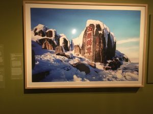
The Patriarch of the Five Sacred Mountains on Mount Tai, 2001 By: Yan Shi


This is a photo of a series of rocks atop a snowy mountain top.  The left side of the rocks are in light and feature chinese characters inscribed in them in a red color. The right side of the photo is in shadow which helps highlight the bright glowing red calligraphy that is carved into the left face of the rocks.  The photo itself is very clear and crisp which really captures the overall cold vibe of the photo. The photographer seems to be trying to capture the beauty of the characters in a natural landscape. The description of the photo states that the inscription on the rocks are an emblem for Mount Tai.  It is almost as if these inscriptions are sort of the entrance/peak of this mountain top. The rock sort of serves as the historical landmark that has had generations leave their mark on it.


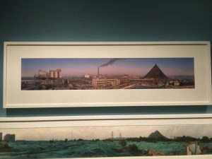
After the Painting “Autumn Colors in the Que and Hua Mountains” By: Hong Lei


I really like this photo and I think that’s because I enjoy photographs of industrial structures.  Metal structures are somewhat menacing and majestic in their own way. The photo is a panoramic view of an industrial factory complex. And it is pieced together from multiple photos to create the panoramic effect.   The sky has a purple and blue gradient that creates sort of a calm feeling to the photo which consists of a maze of metal, concrete and smoke stacks. There is one particular smoke stack in the center of the image that has smoke coming out dividing the image entirely in half.  It disturbs the light purple sky and interrupts the flow of the photo. That being said the smoke sort of represents how industry/industrialism interrupts the beauty of nature. Which is what I think the photographer is trying to emphasize through this photo. Nature is sacred and industrialism puts in danger the environment that people need to inhabit.  


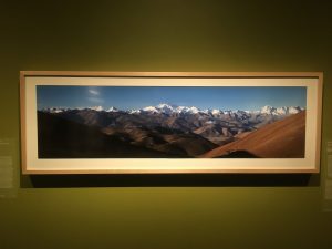
The Four Deities of the Himalayan Range, By: Zhang Anlu


This is an incredibly breathtaking image.  The photograph features a series of mountain scapes that go from a dark sandy brown all the way to snowy mountain tops.  The photographer seems to capture miles and miles of mountain tops all from the peak that they are perched on. The 4 Himalayan peaks are often not seen and I assume that is because of cloud coverage. However, Photographer Zhang Anlu manages to capture an exciting photo of a crisp cool mountain scapes that changes dramatically in light and dark shades.  The mountains create a sort of gradient of light and dark all the way until it hits the horizon line and blue sky. The photographer creates and almost unreal image. They bring you to an almost otherworldly environment through this image.

Phillip Lorca – Dicorcia Hustlers

Chris, 28 Years Old, Los Angeles, $30


This photo of Chris in Los Angeles has great composition.  Visually the photo is very interesting. Chris is sitting at what looks to be a balcony of a hotel or apartment complex which creates a very visually exciting portrait.  This photo isn’t the typical straight on portrait shot that you would focus on the subject. The photographer, Phillip Lorca uses the environment as much as the subject to create a visually exciting composition.  


The environment and position of the subject really sort of pushes a strong emotion.  The feeling you get from this photograph is sort of dreamy but also sad and hopeless.  Chris is sitting with his legs dangling off of the balcony and he is gazing at his feet in sort of a dreamy state.  However, it isn’t just him and his body language that communicate the dreaminess of the photo but the soft lighting and shadows that are created within the environment.  The leading lines from the balcony reading bring the viewers eye towards the green lighting that shines on the far building and past Chris.


It seems that Lorca took the photo from a similar position that Chris is sitting in, by hanging slightly on the outside of the balcony.  That being said he was able to capture a side profile with light casting on Chris’ face as he looks down at the parking lot. The use of the leading lines is important since it leads you from subject through environment which creates a very dimensional and interesting photograph.  Your eye is led around the image which gives it this open, airy and dreamy feel, really emphasizing this emotion of sort of a hopeless day dream that Chris seems to be in the midst of.


Beyonce/Demi

These two celebrity shots feature Demi Moore and Beyonce during their pregnancy.  The Demi Moore photo was taken by Annie Leibowitz and Beyonce’s by Awol Erizku.

To start off just by looking at the photos you notice that they both face a similar angle.  The left shoulder is pointed towards the camera and they are both looking over their shoulder at the camera.  I assume that the angle was taken in order to emphasize that both of them are pregnant. This of course becomes the focus of the photo and what is trying to be captured within the photograph.  

However look at both photos side by side you notice of course that the portrait of Beyonce is a lot more busy.  She is wearing a bra etc. and has flowers in the background. It seems that the way she’s dressed and the flowers sort of create this lively  and pure setting which really adds to the natural beauty of what the photo is about, birth.

On the other hand Demi’s photo is bare. Very literally.  She is nude and so is the background. In this case the photo has a very blank and open feel.  It very much centers around her as a new mother. It gives off this feeling that it is just her and her child.  During pregnancy it is truly just mother and offspring. That’s the center of focus, and that is what is given off here.

Both really surround the miracle of pregnancy and birth.  They just shine different light on specifics about pregnancy.  One being the natural and liveliness of birth (Beyonce) and the other being the center of the world, mother and offspring (Demi).


Mannion

Avedon’s portrait style seems to be very case by case.  Each photograph he is looking

for some individual characteristic that can be expressed within his subject.  Sometimes it is tight framing or even framing skewed to the left or right. It may be a wide full body shot or just a close up of one’s face, but all the images seem to really give character to the subject being photographed.  


Mannion uses photo to capture mood or emotion in a very similar way that Avedon did.  He shoots more in color which is interesting because it sort of looks like a evolved Avedon style.  Mannion uses similar methods to crop and frame his subjects. None of the photos follow the same equation.  It looks as if a different direction was taken for each portrait. Again Mannion uses his subject effectively and really brings out specific character traits in his portraits.  Not a single one of his subjects are posed or framed the same way because everyone is different and has a glow of their own that needs to be captured in its own light. In the portrait of Jay Z, Mannion really expresses Jay Z’s timelessness and sort of power that he holds as a hip hop icon.  The attire gives off a sort of “mob” aesthetic that emphasizes the sort of power dynamic that Jay-Z expresses. And of course the look and framing of him. His shoulders add to a strong center frame against a white background and Jay really jumps off the background as he floats towards the viewer.