Richard Foster

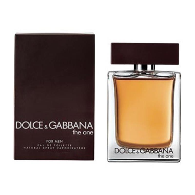
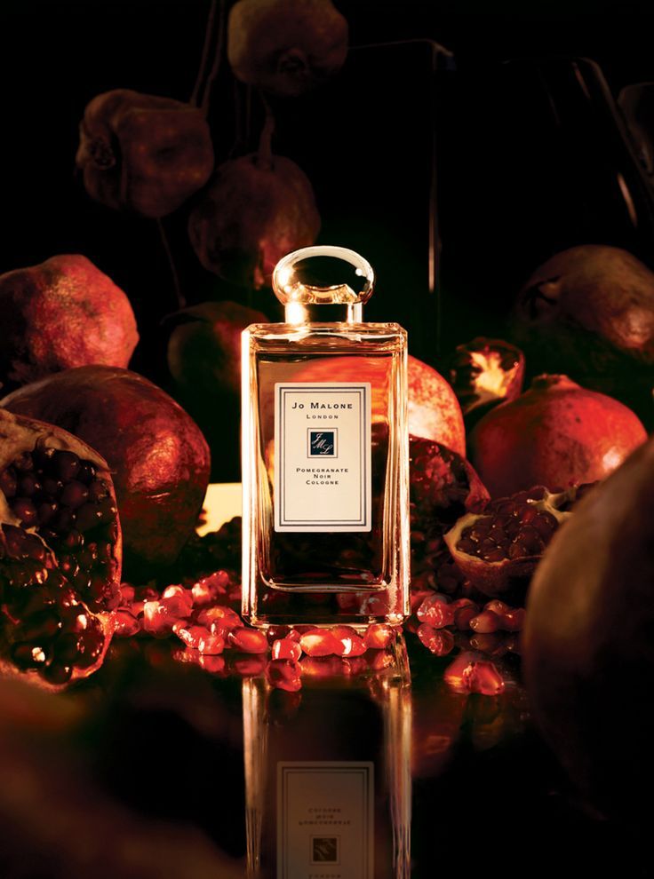
Richard Foster works in the commercial still-life world.  He photographs a lot of high end fragrance and luxury brands.  Foster uses shadow, shape, and color to emphasize the beauty and figure that a lot of these high end items have.  He uses light to help bring out the curves to a lot of transparent items like he does in the Bottega and Tom Ford campaigns.  The Bottega Perfumes use the patterns cast by light on the bottles to create an interesting and dynamic image. The light seems to be cast from above the perfume bottle but they still have strong outlines and very bright highlights that surround the bottle.  In the Tom Ford photographs waves and light are tastefully shown through the bottle giving off a very subtle but dramatic effect. The bottle lit from behind becomes the light source in frame and illuminates the logo and shape.


Without the light there is no bottle.  That is what comes to mind when viewing Foster’s images.  You realize that without the light, the shape of the bottle isn’t there, the contents, and shadows are nowhere to be found.  The bottle has no form without light. The Prada bottles Foster shot add to this. The pink lights that shine from the front and behind add mood and form to the bottles that now shine with a pink hue.  The lights also help draw the viewer to the focus in the image which are the Prada bottles.

Final Project Proposal

My proposal is i’m going to do a photoshoot for a adopt a dog for the holidays by using the dog that i’ll bring in. The lighting style i’m going to try to do is short light while the dogs have their mouth open because it would give a feel of cuteness and will make people want to adopt a pet. Another picture i’m will try to shoot is have a couple of boxes in the frame with the dog looking at the camera or slightly look away from the camera.

This is a photograph from Cruver Photography that i will try to recreate with my dog however my dog is a lot taller than this puppy so i’m going to try and see if i can get bigger boxes. My props will include a lot of Christmas themed items such as reindeer hat, wrapped boxes, etc.

Final Shoot: Dolce & Gabbana Campaign

This will be a photo shoot for Dolce & Gabbanna The One men’s fragrance. The intended audience is men who tend wear a more warm, oriental cologne. This will be a still life photo shoot. It will feature some warm and Earth tones. This will be an ad that will launched in Autumn. I will use Autumn leaves and fruits with branches and wooden textures. This is meant to be a serious or sensual tone. It is supposed to portray the masculinity and rustic nature of a man. Since that I will be photographing glass, I will shoot with the light behind the product and additional light or fill to bring out other objects in the composition. I will shoot with a dark and light background.

These images were shot by Chris Brooks. He is experienced in shooting portraits as well as still life. Some of his photos feature high contrast in colors and others are soft with low contrast. His work can be viewed here: https://chrisbrooks.net/list-of-works


Richard Foster’s Fragrance Campaigns

Richard Foster is a luxury still life photographer. He has worked with companies such as Tom Ford, Bottega, Stella McCartney, Prada and much more. His work is very elegant and minimalistic. Looking at his fragrance campaigns, each one of them is very dynamic and accentuate the shape and color of the bottle. For the Tom Ford campaign, there are two different fragrances. The first is a blue bottle in a rectangle bottle shape. The use of the diagonals on the background and platform compliment the diagonal made from the reflection of the bottle. As opposed to this one which is more rigid and sharp, the other Tom Ford fragrance (Jasmin Rouge) is more fluid and smooth. The bottle is red and shaped like a cylinder which means it has a smooth edge. He uses depth by bringing forth the main subject while semi-silhouetting the other bottle in the background.

For the Bottega Veneta campaign, he uses shadows and symmetry to form bug-like ‘wings’. The wings are pretty amazing because of the different layers in transparency that bring it to life. The wings look like they’re attached to the bottle, and angled in a way that makes it seem like the bottle is flying up. The beige color background compliments the small frosted clear bottle. The Stella McCartney campaign is shot at an angle above showing how the bottle is reflected in the light. Having a white background and platform allows the colors of the bottle to shine through. Also, because of the way the bottle is shaped, light is reflected in different angles. Lastly, the Prada campaign is shot using a rule of thirds. Using a dark/black background with this pink spotlight effect is interesting. The first spotlight is pointed towards the three products and the second is angled above pointing down. Using the pink spotlights was a nice touch because the packaging is pink and the fragrance bottles are orange. At the bottom of the bottle, you can see reflects of the pink light. He not only captures the beauty of each individual product/object through lighting but also through a product’s packaging as well.

Richard Foster is a highly sought after still life photographer because he truly brings out the beauty from each object. He takes the time to study his objects and explores how light shapes all the different aspects.

Richard Foster

Richard Foster’s is a photographer who has shot for clients such as Tom Ford, Bottega, Stella McCartney, and Prada. He shot for different fragrances under these famous brands. These brands are all known to be luxurious and upscale. So it was no surprise that their products be depicted as such. Foster was very successful at making the fragrances look sophisticated and luxurious. All the photos were elegant but in different ways. He was able to use the unique features of each fragrance bottle to capture a good photo.

Foster used color very well. He accentuated the vibrant pink color of the Prada bottle by adding the same striking color in the background and foreground. It looks like he may have used two lights to create the streaks of pink against a black background. He also placed the products to the left of the frame, making it a more interesting composition. I find his shoot for Bottega the most interesting because of the way he used light to create patterns around the product. This required many lights in different positions with no diffusion to create such patterns. The sharp shadows define the pattern even more and the placement of the product allows the full pattern to be shown in the frame.

His photos for Tom Ford also used sharp shadows. One shows sharp, angular shadows. There is a high contrast in the colors in both photos. The shadow that is cast by the blue bottle falls off to the side and is very angular. Foster used the reflection of the red bottle to show its elegance. His photo for Stella McCartney is stunning! He used the shape and color of the bottle to cast a very dynamic and pretty shadow. The pink and blue colors and cast in the shadow of the bottle. You can also see the cut of the bottle, similar to the cut of a diamond. This is a clever way to give off a luxurious feel.

Tim Wallace – Commercial Photographer

Tim Wallace is a photographer specialized in Commercial and Advertising photography of vehicles, aviation, and transportation media in a wide gamut. He has shoot for the most iconic brands through his career and is well recognized as a prominent figure on its line of work. He also has many photography awards among them Hasselblad not surprisingly as one his main tools to capture great detail in medium format.

The cars shot on studio have a dramatic and luxurious mood. The lightning is delicately place to remark volume and shape it’s almost as it were shooting the sensual curves of a woman’s body. It has that romantic low light lighting from a hotel lobby. The reflections on the windows are perfectly smooth and on the right brightness almost as they were drawn. In a nutshell every piece of detail in the car is brought up in the most subtle way that its pleasant to analyze without any harsh lights that can distract you in the process. The cars shot in location have a little bit more of a realistic approach. You can see the dirt or dust on the cars, this tells you they are not a toy and they are fast machines. The environment of some are a race track adding to the sense of speed. The skies are full of clouds and the weather is just right. The dramatic look accentuated in post production with clarity it’s just one more touch of its amazing work.

Some trucks are shoot on location to convey the sense of on the go. The the trucks are freeze on the spot while the pavement seems to have a motion blur to create the sense of speed. This could be done with a slow shutter speed and panning the camera along the truck when passing by. Or could also be done simply in post production. Either or  I think the message that conveys of power and speed are appropriate for the heavy machine. He also has some trucks shot on studio with a much more controlled light and with that neat and clean look that makes you wanna buy it just for collection and not make a scratch on it.

Julia Sent – Still Life

The work of Julia Sent seem to be a recollection of memories in space and time through objects or belongings. Her still’s feature an object with a story of sentimental value. A story she wants to show through her compositions and style. She also aids the composition with other props like fruits for a bawl, flowers for a base, or simply something completely unusual like crab legs on a cup. Her compositions are neatly arranged with just a few objects, yet the appear very organic and give you the sudden feeling they were just laying there and she caught them in their appropriate moment.

The lightning seems to be Rembrandt style coming from above at a 45 degree very similar to a soft window light. At first instance I thought they were lit with some kind of softbox, but looking closer to the details it seems this are completely lit with ambient light. My guess comes from the fact that in one of the pictures with glass you can seen a window in the reflections. For another instance I notice the photos carry a thick noise this could be because she is using a high ISO.

For some of the photos there’s a very marked horizon line and for others the horizon is gradually faded, merging the light foreground to the dark. The darkness of the background creates a smooth contrast with the colors of the subject’s in front. Accentuating the vibrance of colors without that saturated look. The result is a very emotional and antique mood, with an elegant profile.

This lightning style reminds me of the chiaroscuro technique from the Baroque movement from painters like Caravaggio, Rembrandt and such. I can say this is one of my favorite lightnings color contrast and moods.

Tim Wallace

Tim Wallace is a UK based photographer who specializes in commercial photography.  His work can be described as dramatic and conceptual, which is often showed in the work he does with cars.  Wallace seems to know just how to capture a cars best side, and not just document it but get the feeling of what it is to drive the car to the viewer.  


With no two photos alike.  Wallace documents high-class and high speed vehicles in dramatic and exciting locations that really emphasize the places this car will take you.  Wallace seems to be able to photograph a lifestyle through still life car imagery. Also it looks as if a lot of preplanning goes into the photography that Wallace is doing.  The locations are scouted and everything is taken account for. Everything within the photo needs to highlight the emotion and feeling that the vehicle is giving off.


Wallace makes a car look like a beautiful sleek and exciting creature against the various backgrounds and locations that he scouts out.  The Ferrari a gentle beast creeps along cobblestone in an almost gothic and old castle-like setting. The light shining of the hood of the car that illuminates the pathway that the car takes.  Wallace’ work is dramatic and captures the true feel, emotion, and lifestyle that driving that particular car gives off. Whether is is a powerful race car, or a sleek and smooth porsche traversing an urban environment.  


Julia Sent

Julia Sent is most known for her work surrounding still life photography.  She photographs inanimate objects of all sorts as well as some living things/once living things.  Her photos are beautiful and ornately put together and somewhat strange. The objects being photographed are colorful and somewhat explode off of the dark background that is seemingly infinite.  


Her photographs all have this rough and natural feel and look to them.  The background being black adds to the natural feel since white seems to give a more sterile feel in my opinion.  The objects tend to be fruits, vegetables or possibly flowers, which is often mixed in with some old antique style items that give off this rough and retro feel.  One image which is simple yet very strange in its own way, features an old aged flower pot with wilting flowers, perched on a chess board that has an egg and pawn on it. The egg is the most purely white and smooth item in frame which adds for interesting contrast against everything else that has brown undertones.  


It is almost creepy in a sense.  Her work has a recurring theme of death, or at least wilting.  Dry fallen leaves, wilting flowers, and a fish head. The shadows and lighting really add for a display of natural beauty and imperfection that can be seen on the details of fruit, or the curled edges of the flowers.  


Tim Wallace – Commercial Photography

Tim Wallace is a commercial photographer who is known for his work with motor vehicles. He has worked with many automotive brands to capture vehicles in the best possible environments with the best possible lights. His car photos all have a distinct look to them. He is able to bring out the best features of the car by placing it in an environment that conceptually captures the look of the vehicle. Wallace is very successful at showing a car that is in motion as well as one that is not.

Wallace’s use of lighting allows for a very sleek look and feel to all his photos. You can see that he depends on the light he uses to capture the perfect mood for each car. The different lightings will express the individual aesthetic of each vehicle. For some, he uses very soft light to give off very soft shadows. This is done with more luxurious brands. Other times he shows more sharp shadows to give off a different feeling. One example of this is with the racecars that he photographs. He also photographs racecars and trucks in motion. The environment of each photoshoot is also very well thought out. Every type of car that photographs is shot in a suitable environment that allows for a successful product shot.