Monthly Archives: December 2018

Seth Hematch

Seth Hematch is a shoe fanatic and photographer.  He focuses primarily on the collection and capturing of vintage nike sneakers.  He is untrained and has gained most of his skill through personal experience. He never considered photography as a viable career and therefore did not feel as if he need to be professionally taught.


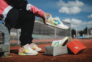
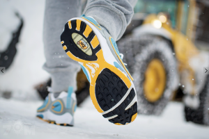
His photographs are full of color and vibrancy as he manages to photograph the oddly colored vintage nike sneakers.  He successfully models his subjects with clothing according to color and style of the shoot. He also is very careful about choosing an environment to shoot and how that affects the experience and subject matter.  Through each shoe Hematch brings you to a new place and a new experience all on foot. That is what seems to be communicated through his well coordinated imagery.


The emphasis is on environment which I think is grave importance in shoe photography.  The shoes take you places and Hematch really brings you to locations of all sorts. Airmaxes on a mountain top and adidas runners in a swampy setting, Hematch follows his footsteps to many different and interesting environments.


Richard Foster

Richard Foster works in the commercial still-life world.  He photographs a lot of high end fragrance and luxury brands.  Foster uses shadow, shape, and color to emphasize the beauty and figure that a lot of these high end items have.  He uses light to help bring out the curves to a lot of transparent items like he does in the Bottega and Tom Ford campaigns.  The Bottega Perfumes use the patterns cast by light on the bottles to create an interesting and dynamic image. The light seems to be cast from above the perfume bottle but they still have strong outlines and very bright highlights that surround the bottle.  In the Tom Ford photographs waves and light are tastefully shown through the bottle giving off a very subtle but dramatic effect. The bottle lit from behind becomes the light source in frame and illuminates the logo and shape.


Without the light there is no bottle.  That is what comes to mind when viewing Foster’s images.  You realize that without the light, the shape of the bottle isn’t there, the contents, and shadows are nowhere to be found.  The bottle has no form without light. The Prada bottles Foster shot add to this. The pink lights that shine from the front and behind add mood and form to the bottles that now shine with a pink hue.  The lights also help draw the viewer to the focus in the image which are the Prada bottles.

Chris Brooks: Still Life Photography

Chris Brooks is a photographer who has shot still life and portraiture. He shot for a Jo Malone campaign, promoting a new line of fragrances. Brooks does an excellent job at capturing the unique features of each scent. He composes his shoot based on the ingredients that are used for each fragrance.

Brooks wants to bring attention to the ingredients that are in each scent, so he uses the actual ingredient in his photo shoot. Brooks also considers the color palette that he should use for each fragrance. There is a fragrance that specifically has ginger and nutmeg in it. Since that ginger and nutmeg are both similar colors, he decides to composite a warm/earth tone color palette to shoot this fragrance in the best possible way. He decides to shoot this bottle against a white background. The way he arranges the ginger behind the bottle, it allows for light to come through certain holes in between the ginger. It seems like there are two lights in use here. There is one main light that seems to be 45 degrees and a fill to bring out the ginger and nutmeg in the foreground and background.

Brooks also composed a shot for another one of Jo Malone’s fragrances. This fragrance has pomegranate in it. So he included pomegranates, some are whole; some are cut open. The photo is different from the ginger fragrance because of the color palette. This one is more dark and red. It is shot against a black background and also seems to use two lights. There is the main light off to the side and fill light to bring out anything that may get lost within the dark background.

Chris Brooks was very successful in capturing these fragrances. He personalized the shoot to each type of fragrance and included what was necessary to define the characteristics of each fragrance. The lighting successfully brought out elegant highlights on each bottle and ingredient that was shot.

Tim Wallace

Tim Wallace is an award-winning commercial photographer based in Manchester England. Tim is a transport or vehicle photographer and during his career he has worked for very popular and luxurious brands like Ferrari, Jaguar, Mercedes, Aston etc. His style is very dramatic with lighting, camera angles, the space and all of it works well together to enhance the beauty of the vehicle. Watching his video, I learned how to he works with one light at a time so he has more control and only when all the lights are how he wants, then he takes the shot. There is definitely lots of contrast which I think makes the image look dramatic. The highlights pop out and the shadow is darkened. The space itself is really beautiful and thought out. The space and the vehicle come together and work as one. The camera angle is very dynamic as well. With every piece it’s a different approach and I think that why you don’t get tired looking through his work. Every piece is different and exciting.  

Julia sent

Julia sent has a master’s degree in physics but she is well known as a still life photographer. She studied portrait photography with Joyce Tenneson and still life photography with Anna Tomczak but most of the skills she has are self-taught. Julia’s still life photography mostly consists of fruits, flower, and vegetables. Her style has distinct look to it. First thing is the dark background and she uses vibrant colors. It makes the subject pop out of the background. It’s fairly tight cropped but no part of the subject is cropped of the picture. The lighting is soft. It makes the exposure well balanced. It’s not too bright and not to dark either. Looking at few of her pieces it looks like the light is coming through the left-hand side and coming towards the right-hand side. It’s not lighting the background. This way the texture of the foreground is more visible and it creates a sort of 3d space. I love the style and the style is consistent throughout every piece.  

Art of the Mountains

The Art of the Mountains exhibition was incredibly beautiful. The large photographs were neatly framed and displayed. There were few pieces that I really liked during my visit. The first piece is called wolf Tooth Mountain of the Altyn-Tagh, 2005” by Li Xueliang. The shot was taken right after a downpour. The scape of the desert looks amazing. There is no sign of life there. There is just this vast desert and sky on the top. I like the contrast between the desert and the sky. The sky is filled with dark clouds but there is ray of sun lighting up the desert. There is balance between the two like hot and cold, good and bad. The harsh shadows in the mountains and background adds a dramatic mood.  


The second piece is called “Huangshan A124: Disciples of Buddha and Fairy Maiden Peak, 2004” by Wang Wusheng. This is a monochromatic photograph of dragon peak in Mount Huang. I’ve always been a fan of black and white photography because it looks moody and mysterious. This piece also gives off the same feeling if not more. I love the high contrast in the photograph. The high contrast has turned the foreground into a silhouette but the detail of the trees and jagged edges of mountains are crisp. The mountains appearing through the clouds look really beautiful. The photo itself looks very calming but also it looks mysterious like a scene from a horror movies.  


The third piece that I like is called “Return to Mountains No. 11, 2011” by Xiao Xuan’an and Yan Changjiang. The picture was taken in southern china. It’s a landscape of a dead forest. It looks like the nature itself is decaying. The birds sitting in the trees add a dark mood to the image. It looks mysterious and the monochromatic color makes it more serious. Feels like something horrific has happened in this place. I love how the hills and the mountains are faded in the background and you can only focus on this dead area that’s covering the foreground. I believe the photographer was trying to portray how modernization have taken over nature.  


Final project proposal

I am planning to do a ad campaign for guitar center for my finall project. guitar center is a company that sells all kinds of music instruments and products that has to do with music and entertainment. Guitar center was founded in 1959 by Wayne Mitchell. My approach is to do a still life shoot of different instrument. I want to shoot them all in a plexiglass to get the reflection. i want the lighting to be dramatic and in a way looks polished. I want the mood to be inspiring. I’ll add a short sentense on all the final piece that goes with the idea that is to inspire the artists.