Category Archives: Inspiration

Final Project Proposal – Glossier

Glossier is a skincare and beauty company that breaks the norm of makeup being something used to conceal, something you need to make yourself feel beautiful. Their products are created to embrace the skin you’re in, to provide affordable, easy, everyday skincare and makeup. Their major competitors are Milk Makeup, RMS Beauty, Laura Mercier, Lilah B., amongst others. Their current advertising is very fresh, minimalistic, modern, and targets a young demographic. They use a diverse range of female models with different skin types.

Since the beginning of the semester, I knew I wanted to do something in beauty. I chose Glossier because this is the competition for most of the brands out there. This company skyrocketed very fast through their social media advertisements. I’d like to work for companies like Glossier, companies like this that have a core set of beliefs, that value the products/service they provide. Like most beauty campaigns, Glossier also uses front light. From looking at Glossier’s current and previous advertisement,  a pastel color backdrop is typically used (purple, pink, baby blue). Looking at Olson’s work for Glossier, he uses a baby blue backdrop and the models seem very free and happy. On the other hand, Jackson’s work for Glossier has the more traditional beauty shot approach. For the most part, the camera seems to be eye level or slightly below at some angles. When I shoot next week, I definitely want to incorporate both Olson and Jackson’s approach combining free, happy, and traditional. From looking at the shots with two people, they’re usually shot close up, cutting out parts of the face’s to fill in the frame leaving very little negative space. I am going to have a few friends come in to be my models. I am going to shoot them individually and in pairs. I’ve decided to photograph without the actual products from Glossier. I want to communicate the brand’s aesthetic and ideals with the models being the center of focus.

Richard Foster

Richard Foster works in the commercial still-life world.  He photographs a lot of high end fragrance and luxury brands.  Foster uses shadow, shape, and color to emphasize the beauty and figure that a lot of these high end items have.  He uses light to help bring out the curves to a lot of transparent items like he does in the Bottega and Tom Ford campaigns.  The Bottega Perfumes use the patterns cast by light on the bottles to create an interesting and dynamic image. The light seems to be cast from above the perfume bottle but they still have strong outlines and very bright highlights that surround the bottle.  In the Tom Ford photographs waves and light are tastefully shown through the bottle giving off a very subtle but dramatic effect. The bottle lit from behind becomes the light source in frame and illuminates the logo and shape.


Without the light there is no bottle.  That is what comes to mind when viewing Foster’s images.  You realize that without the light, the shape of the bottle isn’t there, the contents, and shadows are nowhere to be found.  The bottle has no form without light. The Prada bottles Foster shot add to this. The pink lights that shine from the front and behind add mood and form to the bottles that now shine with a pink hue.  The lights also help draw the viewer to the focus in the image which are the Prada bottles.

Richard Foster’s Fragrance Campaigns

Richard Foster is a luxury still life photographer. He has worked with companies such as Tom Ford, Bottega, Stella McCartney, Prada and much more. His work is very elegant and minimalistic. Looking at his fragrance campaigns, each one of them is very dynamic and accentuate the shape and color of the bottle. For the Tom Ford campaign, there are two different fragrances. The first is a blue bottle in a rectangle bottle shape. The use of the diagonals on the background and platform compliment the diagonal made from the reflection of the bottle. As opposed to this one which is more rigid and sharp, the other Tom Ford fragrance (Jasmin Rouge) is more fluid and smooth. The bottle is red and shaped like a cylinder which means it has a smooth edge. He uses depth by bringing forth the main subject while semi-silhouetting the other bottle in the background.

For the Bottega Veneta campaign, he uses shadows and symmetry to form bug-like ‘wings’. The wings are pretty amazing because of the different layers in transparency that bring it to life. The wings look like they’re attached to the bottle, and angled in a way that makes it seem like the bottle is flying up. The beige color background compliments the small frosted clear bottle. The Stella McCartney campaign is shot at an angle above showing how the bottle is reflected in the light. Having a white background and platform allows the colors of the bottle to shine through. Also, because of the way the bottle is shaped, light is reflected in different angles. Lastly, the Prada campaign is shot using a rule of thirds. Using a dark/black background with this pink spotlight effect is interesting. The first spotlight is pointed towards the three products and the second is angled above pointing down. Using the pink spotlights was a nice touch because the packaging is pink and the fragrance bottles are orange. At the bottom of the bottle, you can see reflects of the pink light. He not only captures the beauty of each individual product/object through lighting but also through a product’s packaging as well.

Richard Foster is a highly sought after still life photographer because he truly brings out the beauty from each object. He takes the time to study his objects and explores how light shapes all the different aspects.

Richard Foster

Richard Foster’s is a photographer who has shot for clients such as Tom Ford, Bottega, Stella McCartney, and Prada. He shot for different fragrances under these famous brands. These brands are all known to be luxurious and upscale. So it was no surprise that their products be depicted as such. Foster was very successful at making the fragrances look sophisticated and luxurious. All the photos were elegant but in different ways. He was able to use the unique features of each fragrance bottle to capture a good photo.

Foster used color very well. He accentuated the vibrant pink color of the Prada bottle by adding the same striking color in the background and foreground. It looks like he may have used two lights to create the streaks of pink against a black background. He also placed the products to the left of the frame, making it a more interesting composition. I find his shoot for Bottega the most interesting because of the way he used light to create patterns around the product. This required many lights in different positions with no diffusion to create such patterns. The sharp shadows define the pattern even more and the placement of the product allows the full pattern to be shown in the frame.

His photos for Tom Ford also used sharp shadows. One shows sharp, angular shadows. There is a high contrast in the colors in both photos. The shadow that is cast by the blue bottle falls off to the side and is very angular. Foster used the reflection of the red bottle to show its elegance. His photo for Stella McCartney is stunning! He used the shape and color of the bottle to cast a very dynamic and pretty shadow. The pink and blue colors and cast in the shadow of the bottle. You can also see the cut of the bottle, similar to the cut of a diamond. This is a clever way to give off a luxurious feel.

Tim Wallace – Commercial Photography

Tim Wallace is a commercial photographer who is known for his work with motor vehicles. He has worked with many automotive brands to capture vehicles in the best possible environments with the best possible lights. His car photos all have a distinct look to them. He is able to bring out the best features of the car by placing it in an environment that conceptually captures the look of the vehicle. Wallace is very successful at showing a car that is in motion as well as one that is not.

Wallace’s use of lighting allows for a very sleek look and feel to all his photos. You can see that he depends on the light he uses to capture the perfect mood for each car. The different lightings will express the individual aesthetic of each vehicle. For some, he uses very soft light to give off very soft shadows. This is done with more luxurious brands. Other times he shows more sharp shadows to give off a different feeling. One example of this is with the racecars that he photographs. He also photographs racecars and trucks in motion. The environment of each photoshoot is also very well thought out. Every type of car that photographs is shot in a suitable environment that allows for a successful product shot.

The Work of Tim Wallace

Tim Wallace is a commercial photographer that specializes in locomotives. He’s worked with a range of clientele such as Aston Martin, Lexus, Ferrari, etc. He is known for his strong lighting ability and use of his environment. He is able to work on location as well as in the studio. From looking through his car photography, they all seem to have a similar style. His use of lighting and location give off a sense of drama. Being that he shoots cars and trucks, he really captures the idea that this object is in motion. Whether it is in his studio shots or shots on location.

His use of shadow and reflection provide a sense of dimension that the car isn’t just some flat object. The way the lighting hits the metal adds this airbrushed look that makes the car feel luxurious, sleek and sophisticated. His shots on location are pretty amazing. Each is perfectly set for the particular type of car being shot. Some of the photographs with the dark background really bring light to the car. Your eye is immediately drawn to the car and its fine details. These photographs are very well composed and are aesthetically pleasing to look at. I am really big on cars and always go to the auto show every year at the Javits Center. After looking at Tim’s work, I admire cars even more.

Still Life Work of Julia Sent

Julia Sent is a still life photographer. She works with produce, objects, and artifacts. Her photographs may seem like these random pieces put together but they each tell a different story. Objects are part of our everyday lives, some hold memories or experiences. We usually develop attachments to objects that hold some sentimental value, and I think it’s beautiful that Julia illuminates those ideals in her photography.

Julia’s photographs are very simple, very well composed and shot low key/eye level. They each fit the frame quite nicely with a good amount of negative space. The lighting helps to bring forward the little details on each object. In most of her photos, there seems to be a key light used and a fill light used. The key light is on the right side of the objects. Each object doesn’t overpower each other, they are combined well that each object holds its own. In the photos, each set up is set on a flat surface, usually with some dark, textured fabric. The backdrop is black, the darkness highlights the different naturally vibrant colors of some of these objects, especially the produce. My two favorite are the Scalped Pomegranates and the Lychee. In the one with the pomegranates, you can see the detailed clusters of those gem-like seeds. The rich, berry red/burgundy color contrasting against the dark background really stands out.

The lychee one is interesting because not many people know what lychee is or let alone what it actually looks like. I like that she only had 3 of them peeled/de-shelled. I like the comparison between what it looks like peeled and what it looks like not peeled. On the outside, you have this brownish red color with a rough looking texture and on the inside, you have this white, plump, smooth deliciousness. Your eye is immediately drawn to the peeled ones because it is white and it stands out from the darkness. It kind of has this idea that you can’t judge a book by its cover. You wouldn’t have thought this would be what it looked like on the inside if you’ve never had it.

Julia Sent – Still Life Photography

Julia Sent is photographer known for her work in still life photography. Most of her photos are inspired by Dutch still life paintings. She composes her photos using objects that have vibrant colors. Most of her photos are either of flowers, kitchen utensils, fruits, and vegetables. Her photos are stunning. She usually shoots against a dark background. The dark background really allows for the objects to stand out. The objects are arranged and are in the center of the frame. Some compositions fill the whole frame, others don’t.

It seems that Julia Sent uses very soft light when shooting. You can see there are no harsh, sharp shadows on any of the objects that she photographs. For the most part, there seems to be only one to two lights used. Some of her photos use just one front light and some use an additional fill light to bring out some objects that would have gotten lost. Some photos also show just one light placed at 45 degrees of the camera. Sent’s photo looks very much like a Dutch still life painting, she mimics the lighting and colors found in most of these paintings.

Art of the Mountain: Through the Chinese Photographer’s Lens

Art of the Mountain: Through the Chinese Photographer’s Lens is a beautiful exhibition located at the China Institute. The exhibition features various photographers who captured various mountain range. Although all the photos displayed were very well composed, three of them in particular, stood out to me the most.

The first photo is Minyak Gangkar in the Last Night of the Sun by Zhang Anlu. The mountain photographed is a sacred mountain in Tibet. Zhang Anlu informs viewers about its dangerous and mysterious reputation. When I saw this photo the first thing I noticed was the contrast in colors. The mountaintop is a beautiful warm tone against a very cool sky. The mountain is easily separated from the sky due to the fact that orange and blue are complementary colors. Anlu also captured the part of the mountain that isn’t lit by the Sun. I assume he waits for the perfect moment to capture the fog that passes through this mountain. This is very smart because the fog compliments the mysterious nature of this mountain. The textures and grooves of the mountain are also shown by the snow that covers it. This is a very beautiful photo that is very well composed by Anlu.

The second photo that stood out to me was Huangshan A054 by Wang Wusheng. I think this is a beautiful photo simply because of the strong, dark organic shape against and very muted background. This photo reminds me of a sublime painting. The naked tree branch leads your eyes out into the mountains that stand behind it. The mountains are a lighter gray tone with fog surrounding it. I think the photographer may have wanted to capture other aspects of nature that surround these mountains such as trees. It almost gives off a feeling of mystery and serenity due to the rugged shape of the branch and calm fog that’s surrounds everything. I like this because the photographer manages to take your eyes to the mountains without making it the main subject of the photo.

Lastly, Peach Blossom Colony by Yang Yongliang. This photo is very interesting because it was manipulated by the artist to further develop his intended message. I think there are two subjects to this photo: the woman and the mountains. The woman is wearing a white dress and seems to be walking towards the mountains in the distance. The most interesting thing about this photo is when you look at it from a distance, it looks like a very calm scene. However, the closer you look, the more details you will start to notice. What I noticed were the mountains. The mountains are actually constructed from buildings. Some residential, some corporate. This is obviously done to spread a message. The photographer wants to show his viewers how society overtakes all the nature that is around us. All that is natural is slowly being destructed and more man-made materials are taking the place of nature. This photo is black and white. I think this is a very smart choice because it gives off a serious tone of voice which is what is needed for this pressing issue.

Art of the Mountain: Through the Chinese Photographer’s Lens

The pieces from exhibit Art of the Mountain: Through the Chinese Photographer’s Lens at the China Institute Gallery were all very well composed and beautifully shot.

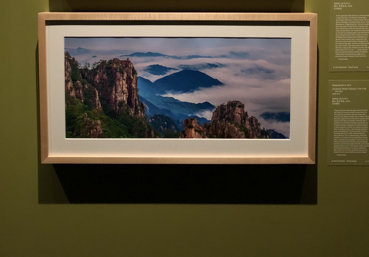
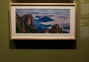
The first photograph I chose was Huangshan: Monkey Enjoying a View of the Sea, 2012 by Zhang Jiaxuan. The first thing I noticed from this photograph was the rich blue color from the mountains and the sea of clouds. It wasn’t until I carefully looked at the photo that I saw this monkey looking figure on the top left. After reading the description that goes along with this photograph, it turns out that it’s not an actual monkey but actually a huge rock. This reminded me of the Monkey King. Those of you, who aren’t familiar with the tale he is a fictional character born from a stone who is immortal, possesses strength and speed, is able to transform and has a staff. Zhang wanted to capture this magical sea of clouds because it makes you feel as if you were in the sky, that it isn’t a sea on earth, but a sea in heaven. It is interesting to hear that because the Monkey King wanted to be amongst the gods as an equal but was never recognized as one, so he rebelled. In this photograph, it is kind of like the monkey king looking into the distance at heaven, a place he longs to be a part of but can’t reach.

Addressing the composition of this photograph, there is a rule of thirds, the monkey rock on top of the peak in a third of the frame. Based on the angle of light hitting the sides of the mountains, the light is coming from the right. There is a sense of depth, the mountain on the bottom right of the photo being in the foreground, the monkey on top of the peak mid-ground, and the sea of clouds in the background.

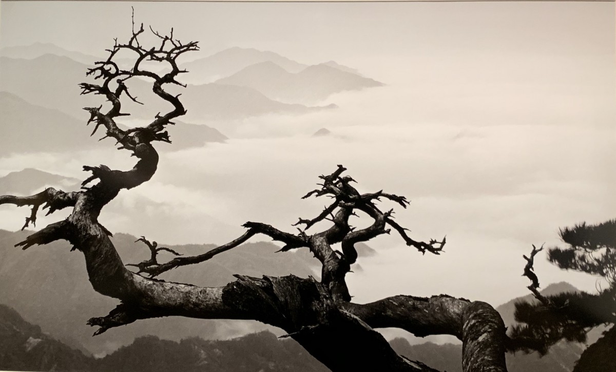
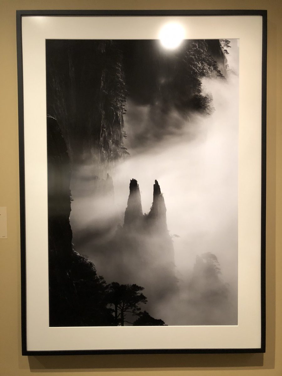
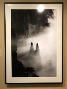
Another photograph I chose was Huangshan A093, 1991 by Wang Wusheng. This was taken at Paiyunting, Xihai area, Mount Huang. The composition of this photograph is in black and white. It looks like a scene taken right out of Jurassic Park with no signs of human life and uninhabitable. The mountain in the middle of the photo reminds me of a tuning fork. There is a strong contrast between dark and light. The misty fog seems to illuminate the details on the mountains, the trees hanging alongside, and the peak on the ‘tuning fork’ looking mountain. There is also a sense of foreground, mid-ground, and background. The trees on the bottom left of the mountain are the foreground, the two peaks in the midst of the fog in the middle ground, and the rest of the mountains and fog in the background. The ‘tuning fork’ peak could even be interpreted as an entrance to a different world but that might just be my imagination.

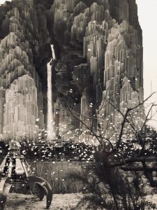
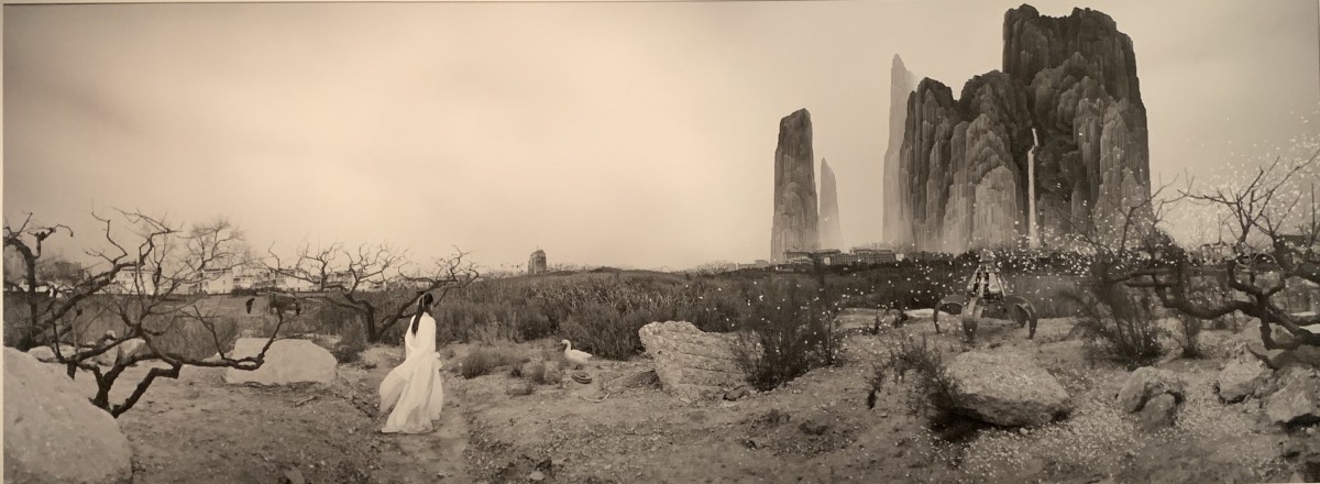
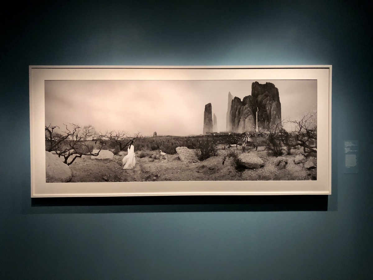
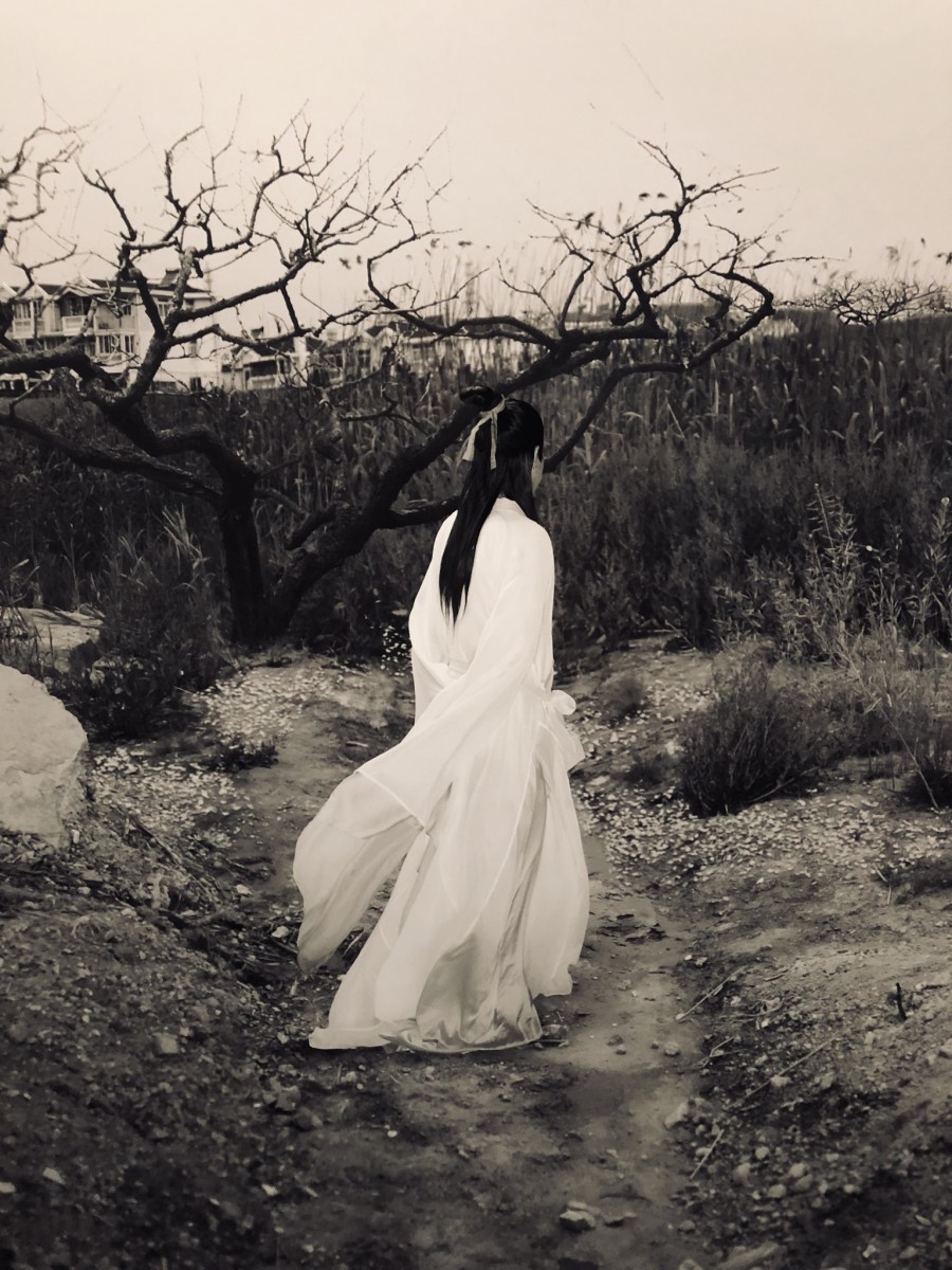
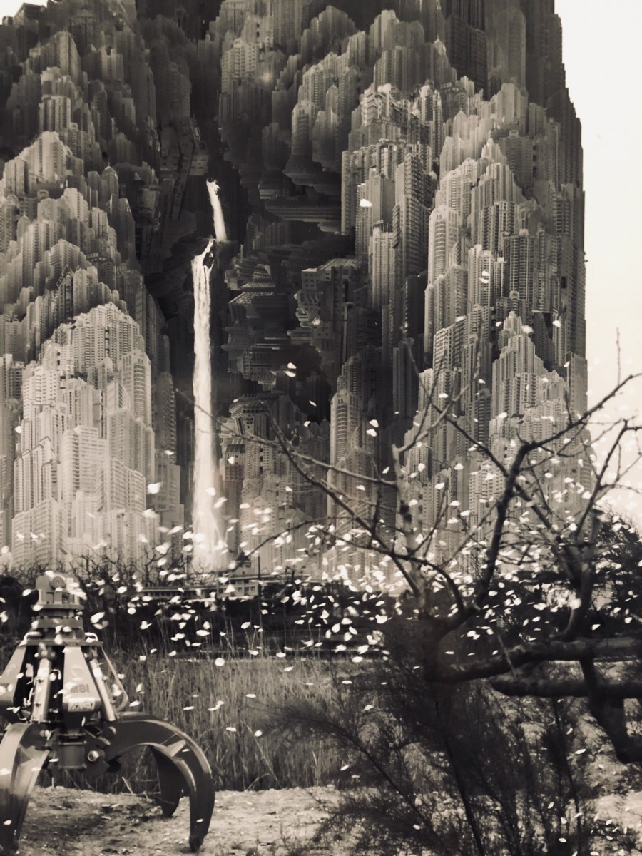
Lastly, the one that peaked my interest the most was the photograph titled Peach Blossom Colony, 2011 (Series: Peach Blossom Colony No. 1) by Yang Yongliang. The subject of Yang’s Peach Blossom Colony originates from Tao Yuanming’s “Record of the Peach Blossom Spring” fable in prose form about a fisherman who finds a secluded utopia. The subject of this photograph is the woman on the left wearing white. She is standing in what appears to be a deserted wasteland. To the right, you see scattered blossoms, a piece of machinery and in the back, you see these mountains. However, if you look up close these mountains are actually buildings collaged together to form the shape of the mountain. To the left behind the withering trees, you see what looks like suburb housing along with two other people. There were two directions the woman could have gone in, the one with the more peaceful secluded society or the modern, fast-paced society. By the way her body is positioned, she appears to be heading in the direction of the scattered blossoms and modern buildings.

In the foreground you have the woman standing in the barren wasteland, in the middle ground are the paths, and the background is the two different societies. The angle this is shot at seems kind of like a panoramic view. There is a composed direction to looking at this photograph; your eye automatically goes to the woman wearing the white dress because of the strong contrast. Then your eye follows her direction toward the scattered blossoms and onward to the mountains. Yang’s intended message is that in the development of today’s society, materialism and consumerism have progressively taken their toll on the life of mankind. What was once green forests are now concrete reinforced with iron bars. Seen from afar, his photograph seems very peaceful. When you take a closer look, you see the details and elements of modernization.