Tim Wallace is an award-winning commercial photographer based in Manchester England. Tim is a transport or vehicle photographer and during his career he has worked for very popular and luxurious brands like Ferrari, Jaguar, Mercedes, Aston etc. His style is very dramatic with lighting, camera angles, the space and all of it works well together to enhance the beauty of the vehicle. Watching his video, I learned how to he works with one light at a time so he has more control and only when all the lights are how he wants, then he takes the shot. There is definitely lots of contrast which I think makes the image look dramatic. The highlights pop out and the shadow is darkened. The space itself is really beautiful and thought out. The space and the vehicle come together and work as one. The camera angle is very dynamic as well. With every piece it’s a different approach and I think that why you don’t get tired looking through his work. Every piece is different and exciting.
Author Archives: Prasan Gurung
Julia sent
Julia sent has a master’s degree in physics but she is well known as a still life photographer. She studied portrait photography with Joyce Tenneson and still life photography with Anna Tomczak but most of the skills she has are self-taught. Julia’s still life photography mostly consists of fruits, flower, and vegetables. Her style has distinct look to it. First thing is the dark background and she uses vibrant colors. It makes the subject pop out of the background. It’s fairly tight cropped but no part of the subject is cropped of the picture. The lighting is soft. It makes the exposure well balanced. It’s not too bright and not to dark either. Looking at few of her pieces it looks like the light is coming through the left-hand side and coming towards the right-hand side. It’s not lighting the background. This way the texture of the foreground is more visible and it creates a sort of 3d space. I love the style and the style is consistent throughout every piece.
Art of the Mountains
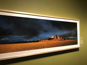
The Art of the Mountains exhibition was incredibly beautiful. The large photographs were neatly framed and displayed. There were few pieces that I really liked during my visit. The first piece is called wolf Tooth Mountain of the Altyn-Tagh, 2005” by Li Xueliang. The shot was taken right after a downpour. The scape of the desert looks amazing. There is no sign of life there. There is just this vast desert and sky on the top. I like the contrast between the desert and the sky. The sky is filled with dark clouds but there is ray of sun lighting up the desert. There is balance between the two like hot and cold, good and bad. The harsh shadows in the mountains and background adds a dramatic mood.
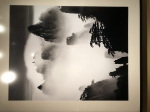
The second piece is called “Huangshan A124: Disciples of Buddha and Fairy Maiden Peak, 2004” by Wang Wusheng. This is a monochromatic photograph of dragon peak in Mount Huang. I’ve always been a fan of black and white photography because it looks moody and mysterious. This piece also gives off the same feeling if not more. I love the high contrast in the photograph. The high contrast has turned the foreground into a silhouette but the detail of the trees and jagged edges of mountains are crisp. The mountains appearing through the clouds look really beautiful. The photo itself looks very calming but also it looks mysterious like a scene from a horror movies.
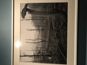
The third piece that I like is called “Return to Mountains No. 11, 2011” by Xiao Xuan’an and Yan Changjiang. The picture was taken in southern china. It’s a landscape of a dead forest. It looks like the nature itself is decaying. The birds sitting in the trees add a dark mood to the image. It looks mysterious and the monochromatic color makes it more serious. Feels like something horrific has happened in this place. I love how the hills and the mountains are faded in the background and you can only focus on this dead area that’s covering the foreground. I believe the photographer was trying to portray how modernization have taken over nature.
Final project proposal
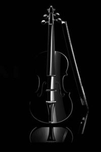
I am planning to do a ad campaign for guitar center for my finall project. guitar center is a company that sells all kinds of music instruments and products that has to do with music and entertainment. Guitar center was founded in 1959 by Wayne Mitchell. My approach is to do a still life shoot of different instrument. I want to shoot them all in a plexiglass to get the reflection. i want the lighting to be dramatic and in a way looks polished. I want the mood to be inspiring. I’ll add a short sentense on all the final piece that goes with the idea that is to inspire the artists.
Philip Lorca Dicorcia
Philip Lorca Dicorcia is an American photographer. The series of Hustler was done during 1990s. The series was funded by the government. Dicorcia drove around Hollywood to find male prostitutes for his series and instead for sex, he paid them to take pictures. Although the photos in this series looks natural and candid, everything was taken into consideration by Dicorcia. The location, the posture of the models, the light, composition. And even though these photos look beautiful they have a story to tell. Each photo tells story of a young individual that came into Hollywood to find opportunity but sold themselves to provide pleasure. I like the picture of 28 years old Chris from Los Angeles, California. He was paid $30 for the picture. I like the cinematic feel of the picture. It has the beautiful perspective of the motel going toward the back. The posture and the place of the subject is also really powerful. It has a sort of depressed and lonely mood. The lights look really beautiful. It looks like the light is coming from the front and it lights up the edges of the subject’s face. It also puts the subject in focus. The shadow of the subject and railing from the light also look pleasing. Although the picture is staged, it depicts the reality of these young male prostitutes who came into Hollywood looking for oppurtunity.
Richard Avedon
Demi Moore and Beyonce
I think there’s more difference than similarities between Demi Moore’s and Beyoncé’s maternal shoot. First is the time these were shot. They are almost two decades apart. Demi Moore’s photo is simple and minimal but it is very strong. It’s only the subject’s nude body and the plain background. There is no distraction. I like lighting as well. It highlights the different areas of here body and it’s easier to see on a bare skin. This photo was controversial at the time because this photo was taken in 1991 and the world was completely different than how it is now. They thought different and this was basically new to them. Especially how women were viewed back then and this photo broke the norm. This photo would’ve been easily accepted today. May be if the photos were switched with its time, it would’ve matched. Beyoncé’s photo isn’t strong as Demi Moore’s to me. Beyoncé has lots of props and there are lots of colors which creates distraction but I like the playfulness. I like the composition and the pose. I like that the subject is centered on this photo and it works well and the light is equally distributed. On Demi’s photo, she’s is off centered and it is quite pleasing to the eye in this composition. Her pose is perfect. I like that she tilted her head up a bit and didn’t look straight in the camera. This picture looks even better in the vanity fair magazine.
Yusuf karsh and Nadav Kander
Yousef Karsh is known to be one of the greatest portrait photographer of 20th century. He shot portraits of many renowned celebrities, leaders and scientists. He worked with large format cameras. He used tungsten lights during his shoot because it was easier for him how the photo would come out before he even shot the picture. He only worked with one assistant wherever he was because he didn’t want anybody to disturb his concentration to his subject. He preferred to take portraits of people in their own environment where they can be natural. He would then consider the subjects body languages, gestures and facial expression to capture their personality in the picture.
Nadav Kander is another Known Portrait photographer born in 1961. His works appear in popular magazines like time, rolling stone, New York time. His idea of keeping the props and background simple matches with Yousef Karsh. Looking at his work, they don’t look like regular portraits. They have a underlying creative idea. They look more of a fine art portraiture. The use of lighting are very dramatic because of the harsh shadows.
I like Sir Winston Churchill portrait by Yousef Karsh. I read the story behind this photo thought it was quite interesting. Yousef Karsh perfectly snapped this portrait right after he snatched Churchill’s cigar. The picture came out perfect. The pose, the expression, the lights is on point. I like how the light is focused on the face with a shadow on the edge of his face.
I like Barack Obama’s portrait by Nadav Kander. I like the black and white contrast. It adds drama and mysterious mood. This portrait doesn’t approach the subject for what everybody knows him as but approaches in personal level more like who he is as a regular man.
Dawned bey – Class pictures
Dawoud bey has a simple yet sophisticated style when it comes to his portrait photography. Sophisticated as in his uses of the poses, lighting, expression, and composition which gives a very natural feel with a bit of drama. In his series of class pictures, the subjects cover most of the composition with a softly blurred background that gives a hint of the place where the picture was taken. He doesn’t shoot his subjects on a flat background. Each of the pictures on this collection has a space behind the subject which gives viewers a sense of perspective.
The expression on each of the subject is quite unique. Each expression tells a different story. Their expression also directs the mood of the picture. Their expression and their poses add drama to the picture. Dawoud bey said he had only 45 minutes to work with the students so he had to think through everything quickly. At the start of 45 minutes, students were told to write a brief statement about themselves. when he took the pictures he didn’t tell the students to pose. He told the students just sit where they are directed be comfortable and Dawoud bey would carefully watch their gestures. Bey used studio lights to control the lighting component of the picture. He used the main light and a fill light to soften the shadows on the sides. the main light is coming through between the front and the side of the face. The one side of the face looks well lit and another side of the face has a soft shadow.


