This week’s reading was a depressing story. To begin, I define the arguments that touched on ethnicity, race, and other issues. Because the media’s main domain of activities is the development and change of ideologies, racism and the media directly affect the issue of ideology. In the media, not just racial themes, but also non-racial ones, abound. How, depending on the situation, not attempting to be racist might make it considerably for the viewer. It is a blunder to think of the media as slavish and conspiratorially serving a particular racial ideology. Reading concepts and ideologies in the plural would be misleading. By showing an open-minded picture of tolerance and good relations between races in the media, between races are conveyed.
The first Advertisements:
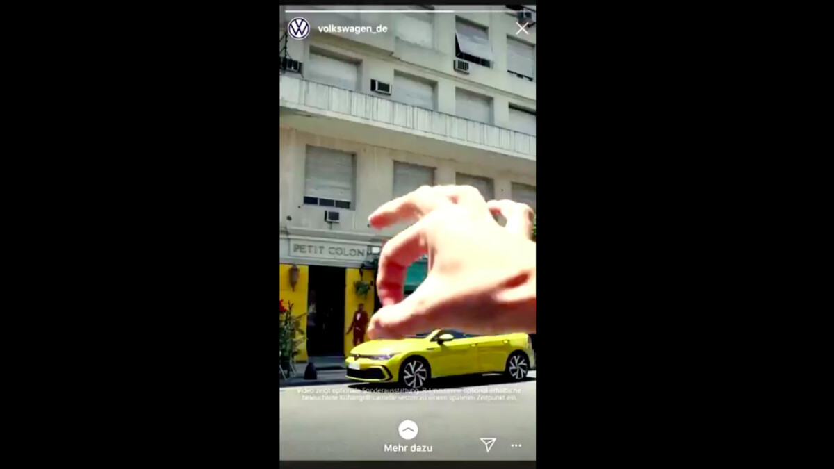
Volkswagen’s 10-second ad for new Golf was shared on Facebook and Instagram sparked outrage, with many pointing to its racist implications. Where a large white hand pushes a dark-skinned man off a city street and onto a sidewalk in this advertisement. Another massive hand snatches his hair and drags him toward a doorway, where he is hurled inside. Jurgen Stackmann realizes the outrage that this has sparked in the public. On Volkswagen’s Instagram account, they shared a racist advertisement video. Also, this ad was taken off by the automaker. He was embarrassed by it and had no idea how it happened.
The second Advertisement:
This advertisement created by Critical race theory has become a cornerstone of the push to outlaw its teaching, thanks to viral videos of outraged parents criticizing it at school board hearings. In one video, a woman claims that critical race theory was a method used by Hitler and the Ku Klux Klan. A woman in another group calls CRT the American version of the Chinese cultural revolution. A third mother claims to have proof that her community’s school board is educating our kids to go out and murder cops.
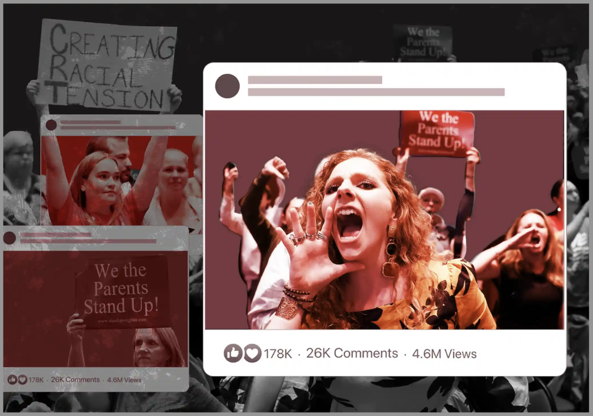
From viral videos to Fox News: how rightwing media fueled the critical race theory panic
The third Advertisement:
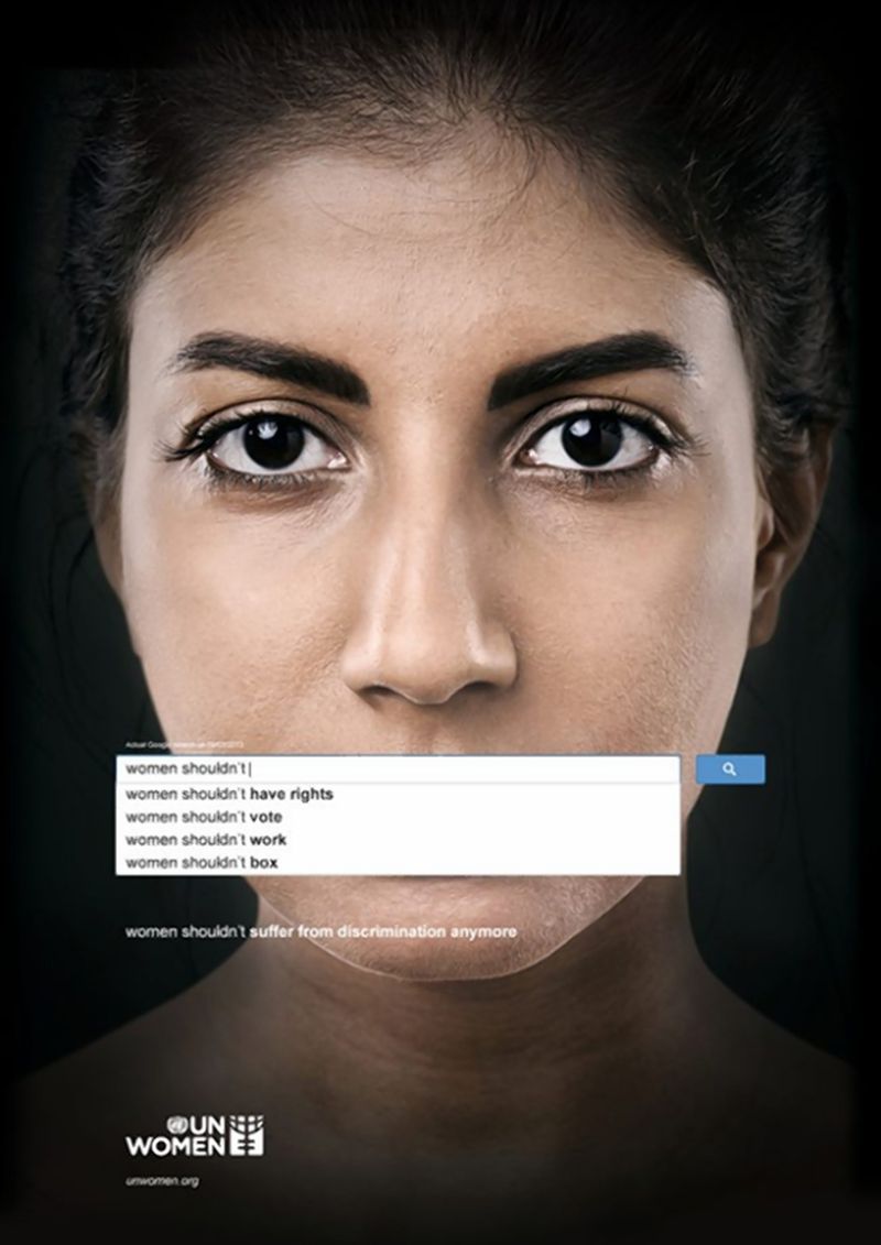
UN launched an advertisement to highlight the misogynistic attitudes of people towards women around the world by using the Google search bar. Four images show search results relevant to women’s rights that include statements regarding women should not have rights, women should not have anything to do and women should never have rights. There’s a saying that says women shouldn’t have rights, women cannot have rights, and women need to be put in their place. The ad is based on Google autocomplete searches, show women with Google’s suggestions covering their lips as if to silence them. This advertisement has a variety of knowledge about what has happened in the United States in the last two years in terms of black lives.
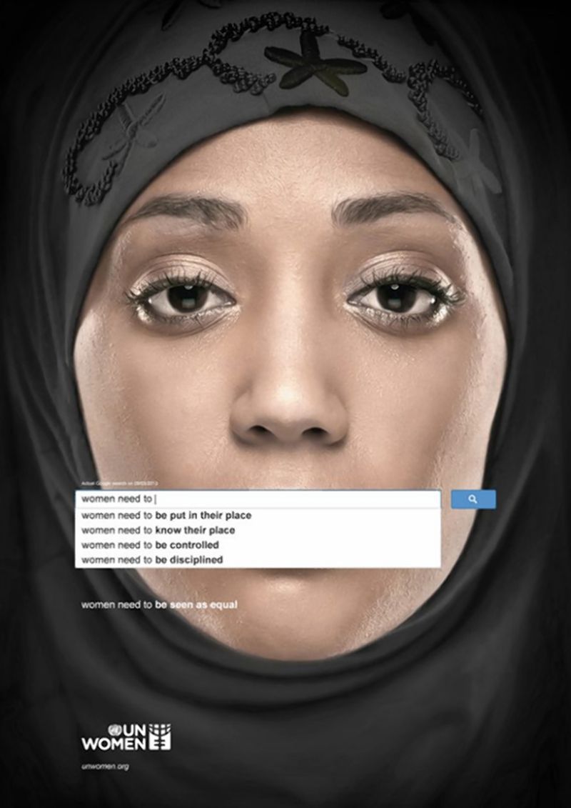
Powerful UN ad campaign uses Google searches to show gender inequality
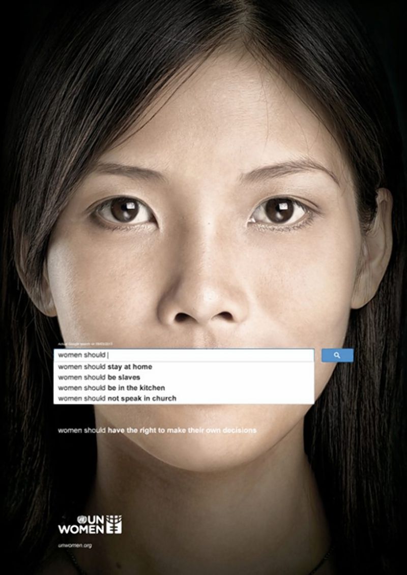
Powerful UN ad campaign uses Google searches to show gender inequality
Powerful UN ad campaign uses Google searches to show gender inequality
Sources:
https://www.nytimes.com/2020/05/21/business/volkswagen-ad.htmlhttps://www.nydailynews.com/life-style/campaign-google-searches-show-sexism-article-1.1494436


Recent Comments