https://vimeo.com/manage/videos/707662158
password: Final Research Project
COMD3504 - Section OL69 - Spring 2022
https://vimeo.com/manage/videos/707662158
password: Final Research Project
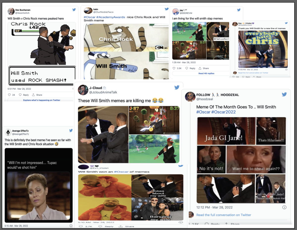
check out these video memes:
Check out the site below for more memes.
The Best Will Smith Oscars Memes
The underground mainsTream was an excellent topic for this week’s reading. It was fascinating to hear about Steven Heller, who is the world’s most successful designer, writer, and producer. In his essay, “The Underground Mainstream,” Steven Heller clarifies the relationship between underground and mainstream ideas. It seems to Steven that mainstream commercials and advertisements are always influenced by underground ideas. They simply steal the original idea and tweak it slightly to make it more mainstream. This is an excellent point. In the reading, Steven Heller took part. Underground musicians were at the forefront of a commercial frenzy. To gain market share, they were given record contracts by labels owned by large businesses. The artists were then advertised and packaged by record labels using the same codes that indicated “alternative” to the growing adolescent market. Advertising and commercials have largely taken elements from the underground mainstream and used them to create groundbreaking ideas. These include taking ideas from the underground mainstream and making slight tweaks to create a new idea or trend.
After reading about the mainstream vs. underground, I think there are some points from the reading which can be connected to the story of Kay Big Knife. As such, the designers’ works can be considered as part of broader themes such as self-representation or cultural exchange. Chippewa Cree is a graphic designer and digital illustrator who specializes in Native American culture. She integrates the Rocky Boy Indian Reservation scenery throughout her digital art. She uses Adobe Illustrator and Photoshop to produce her pieces, where she can use her distinctive bold, precise linework and colorful palettes. Her other artistic style is a mix of Japanese anime, manga, and American comic art. With her visual technique, she brings Indigenous characters to life in imaginary settings such as superheroes, fantasy, and horror. As a result, she frequently questions national and worldwide pop culture’s misrepresentations of Indigenous characters. Her creative forms and themes inspire self-acceptance, hope, humor, and Indigenous ways of knowing by giving her a sense of community. It was fascinating to learn about her life and find her page. She is a fantastic designer who generously shares her talent with us. “
Cree language” by alphabets and orthography from the article Eskimo-Aleut languages. The Eskimo-Aleut languages are a group of languages spoken by the Eskimo and Aleut peoples in Greenland, Canada, Alaska (United States), and eastern Siberia (Russia). Aleut is a single language with two dialects that have survived. Yupik, a language found in Siberia and southwestern Alaska, and Inuit, a language spoken in northern Alaska, Canada, and Greenland, are the two divisions of the Eskimo. There are various dialects in each division.
Anime is a prominent animation style in Japanese cinema. Early anime films were largely aimed at the Japanese market, and as a result, many cultural references specific to Japan were used. The huge eyes of anime characters, for example, are widely regarded in Japan as multidimensional “windows to the soul.” Although anime is primarily aimed at children, adult themes and subject matter can occasionally be found in anime films. The founding of Mushi Productions by Osamu Tezuka, a prominent character in modern manga, the dense, novelistic Japanese comic book form that contributed substantially to the aesthetic of anime, began in 1956 and reached enduring popularity in 1961.
Native American art, also known as American Indian art, is the visual art of the Americas’ indigenous peoples, often known as American Indians. One of the most fundamental contrasts between European or Continental and American Indian conceptions is the use of the word “art.” Because, unlike the West, few American Indian cultures allowed art to become an important way of life, and many Native American languages lack a word for “art” or “artist.”If you wanted to talk about a lovely basket or a well-carved sculpture, you had to use words like “well-done,” “effective,” or even “powerful” in the magical sense.
Source:
3. https://school-eb-com.citytech.ezproxy.cuny.edu/levels/high/article/Native-American-art/437992
This week’s readings were fantastic for learning new stuff about advertisements. It greatly assists me in comprehending images. It was fantastic to understand all of these crucial terms. I found this reading to be very informative and it helped me understand more about ads image and how they are used. I like reading about the messages, especially where he discusses them. learning about polysemy, that all images are polysemous, beneath the surface of any signifier, the reader can choose and ignore a free association of signifiers. The image sends out a linguistic first message right away, which is backed up by the supplementary text and labeling, which are integrated into the spontaneous layout. Implied messages have different signifiers that imply the distinctive viewpoints of a promotion. Apprehension and worry over the meaning of things or behaviors are linked to images. Learning about linguistic messages There are three types of symbolic messages: linguistic communications, coded symbolic messages, and uncoded symbolic messages. Linguistic communications can easily be distinguished from the other two. This is a great example provided by the author, who states that currently at the level of mass communication, it appears that the linguistic message is indeed present in every image, such as a title caption, supporting press articles, film dialogue, and comic strip balloon. The denoted message is The coding of the literal prepares and aids communication since it creates a difference in the image right away the implementation of a painting creates a connotation in and of itself. My favorite part is when the author explains his points using examples. We have discovered that the separation of literal and symbolic signals in photography works. At least in ads, literal images don’t look perfect. Even if a completely naive image is achieved, it is complemented by a third symbolic message and completed with naive signs. as learning about the last term. Concerning the connotated message, it prevents the image or concept from proliferating excessively into one or more areas, thereby, preventing dysphoria from setting in. I think the messages are the messages that can be caught on through all the components of a picture.
The advertisement I chose is the SHAYNE advertisement. The SHAYNE advertisement caught my attention when it was posted. This advertisement portrays women of color in a favorable light. In every race, there are different kinds of women, and the characteristics of each race make each. I agree with SHAYNE about Magazines such as this illustrating the fact that beauty exists on a racial basis. Even though this magazine focuses on one race and one idea of beauty, it crosses boundaries. Beauty does not only relate to one color or gender, rather it exists across all races. In this magazine, I found that the images drew attention to racism. Races have different kinds of women, and they each differ based on several factors. Furthermore, after reading more about this magazine, I will learn why it failed. Despite its intriguing concept and models, the cover features poor photography and styling. Nevertheless, they failed to bring out the personalities of these women. On that cover, you cannot feel the enchanting personality of these women. Thank you SHAYNE for sharing this advertisement. I learned a lot.

© 2024 Communication Design Theory
Theme by Anders Noren — Up ↑
The OpenLab is an open-source, digital platform designed to support teaching and learning at City Tech (New York City College of Technology), and to promote student and faculty engagement in the intellectual and social life of the college community.


Recent Comments