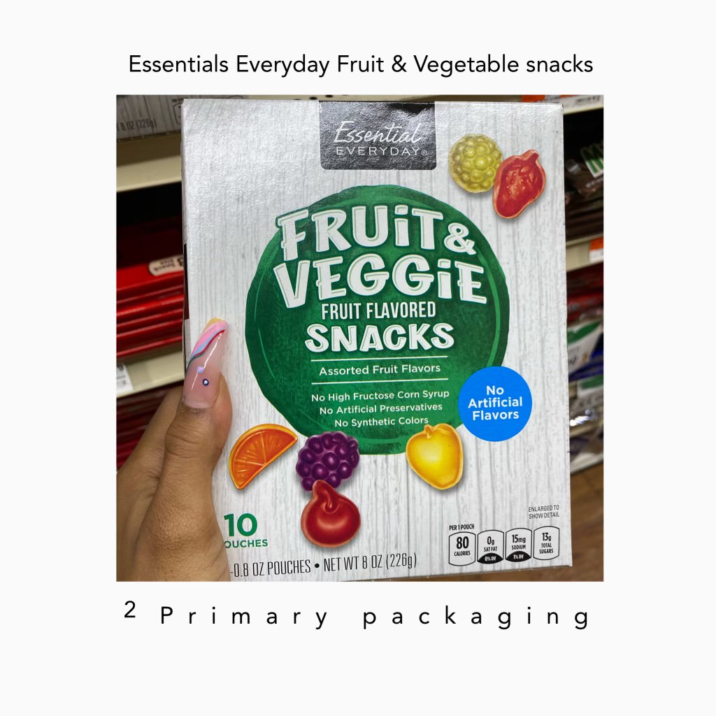
for my first choice of primary packaging is Nesquik’s Double Chocolate Milk. First looking at it, I never questioned the color scheme and the shaping of the bottle. Now looking at it, I started to sit and question as to why the main color scheme of Nesquik was yellow. So I did research, Nesquik uses their mascot/character, a very happy bunny who is active and happy and feels refreshed from drinking the chocolate milk. The symbolism of yellow also meaning it is a start of a fresh day. I understood that part, I guess but the association of putting purple or using solid colors to match the flavors threw it off. Purple wrapping would lead or mistake it as another flavor. Such as the vanilla one. The blue wrapping but creme colored milk inside. The association of color with milk and the yellow scheme does not mix well.My Seonc choice is Essientials Everyday Fruit and Veggie Snacks. I selected this box because it was above many other infamous branding. Twix, kit kat, Welches. The shelves were organized by popular demand choices as I looked to the sides and there was ACT II butter popcorn on top, Hersheys, and etc. This box was right beside it. INstantly I picked it up because I never heard of a vegetable FRUIT snack. Analyzing it more, I realized that there were no veggies on the packaging at all. There were no veggie fruit snack inside the packs either. It was all regular fruit snacks. I just questioned how this beat Welches and those other infamous brands of snacks. Nothing resembled fruit snack when I picked up the box.Lastly, I have chosen Brooklyn’s Owned organic granolas cinnamon raisin. I scouted this in the SEASONING section. I was super surprised by seeing this and looked at what surrounded it, which was grits, and goya. Looking at it, I thought it was brown sugar , like raw brown sugar which probably confused the workers and others when it came to organizing the shelves. There was no slogan. No motto. The company Brooklyn owned had no logo as well and no color scheme so it felt empty. I understood by kind of making it simplistic and minimal but it’s misleading.