My target audience choice will be for environmentalists. Environmentalists are people who care for the environment. As everybody, including myself should know. They love caring about well..everything surrounding us humans. That’s their personality and style, and what they care about the most. The age range should be 18 to 39 year olds. Another part which contributes to the characteristics of an environmentalist is being agreeable and conscientious. They are agreeable in terms of like finding people’s statements valid and factual. Conscientious people like these types of individuals just do what is right and smart. They are also honest and humble. That means they will tell the truth when they need to. Followed by them being submissive and not arguing to anyone else working with them and their outside habitat. They wouldn’t even disrespect their territory like that. As far as i know.
For example: this fake person’s name is brian, he’s an environmentalist. He is 22 years old. He’s skinny, 6″3. He works at a company called Global care, monday to friday every week. When he’s not working, he plays baseball, football, basketball and hockey. Most of the time he’s good at each of those sports. Sometimes he’s not too great and a because of the job he works out. He’s agreeable and pretty respectful every time when he’s with his parents and 3 siblings. AKA well..his family. He’s even conscientious about his environment because he loves hiking. He still does it. Brian has loved to hike ever since he was a little kid. His personality is kind, caring. His favorite place to have a vacation is in Minnesota. He loves wearing clothes from old navy, hot topic, sears and some other stores like that. He also loves getting clothes, that are designed based on nature.
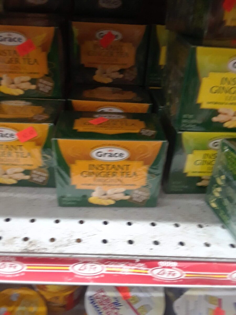
The shelf impact shown here in this imageThe 2nd shelf impact image shown here
So basically, the shelf impact i’d say was good. There were definitely some other tea products. With it and surrounding it. As shown on the two photos. But all i gotta say is that, it’s still pretty good. Based on my belief about it. I can’t think of anything that doesn’t work right here. It seems to me that everything is where it needs to be. In that way its just straight up organized.
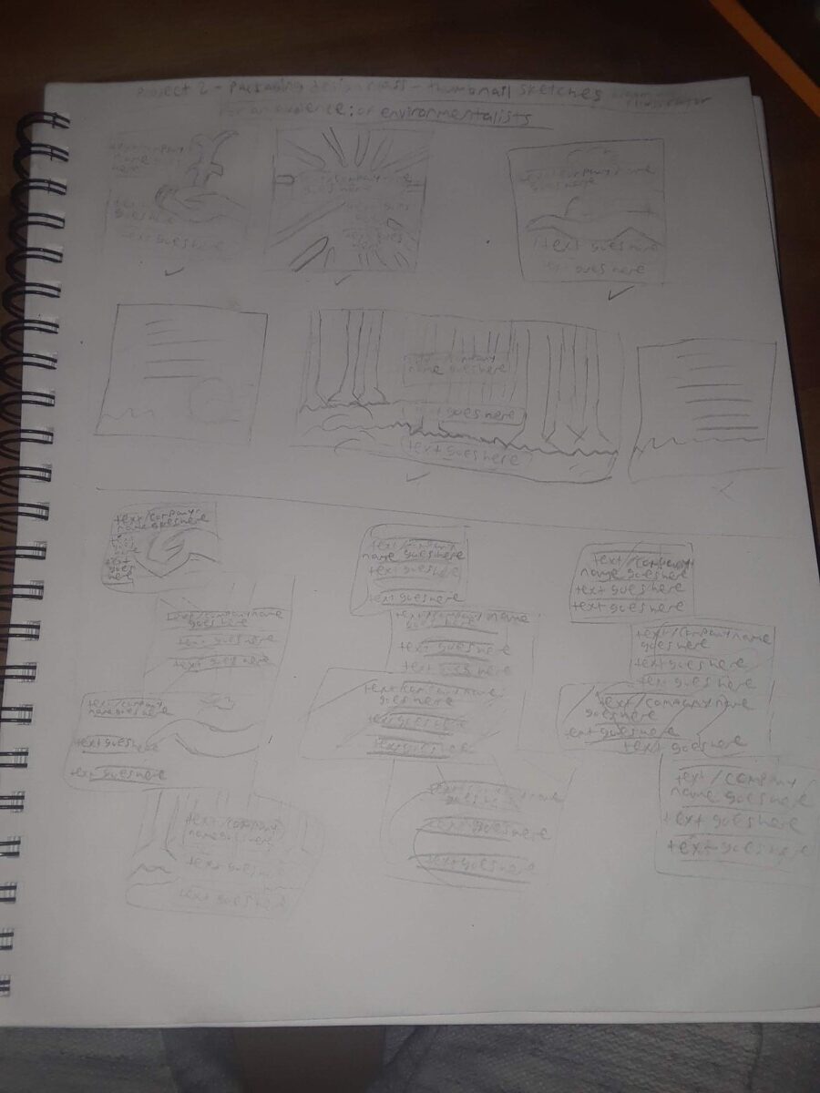
Note/Disclaimer: these choices are my attempts, mainly because it’s for the professor to accept it. I hope she does But my point is still the same.
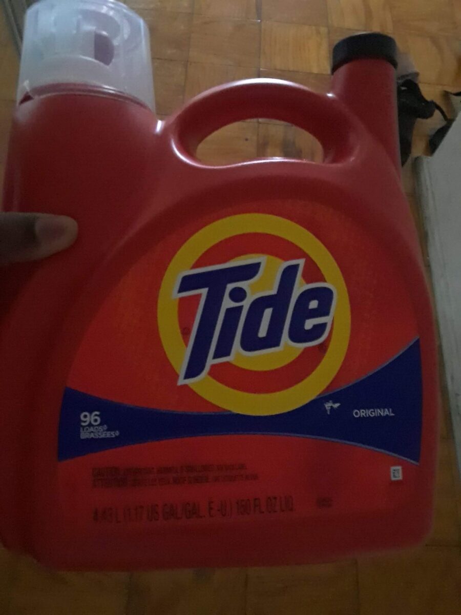
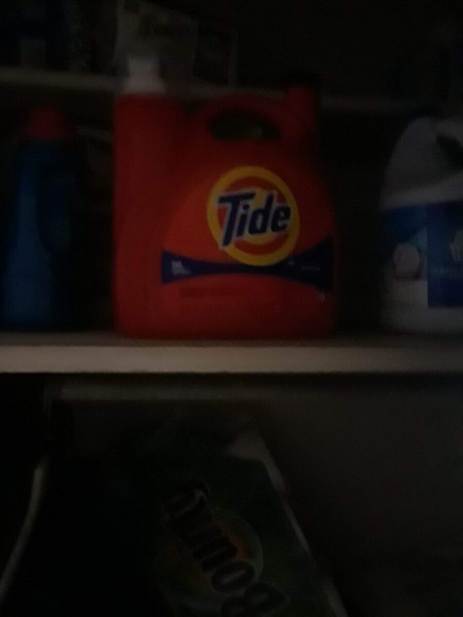
MyFirst Product Choice: Tide(picture shown below)
Target audience: mostly for mid teens and adults. Most likely for anyone who is 15 to 65 years old. That would be my best bet.
People will think it’s affordable
The emotional benefits would be that people can use this product, to clean their clothes so much, that it can lead to their satisfaction.
Consumer trends: people using this item to clean clothes so they always smell fresh and ready to wear until you want to wear them. Which is what many consumers would always like. Many individuals wouldn’t want a detergent that would still leave you’re clothes dirty. God forbid that ever exists. That’s why i bet everyone, including myself uses tide as one of the better choices to make any of our clothes look stunning.
For any new developments in materials and technology issues for this item: P&G (the parent company of tide) keeps finding new ways to improve its methods of cleaning components into each of their tide products. Which is a good development in materials and technology.
The consumer use of this object was good
The interaction with the packages, size handling and consumer friendliness was pretty great as well
The shelf impact for this product, was basically how i could see the tide as the first thing, in my eyes. (see the shelf impact image, for this item below, to probably see what i mean)
The products packaging materials and finish is just very smooth for this object.
The hierarchy in the tide detergent has the logo as the main thing, that your eye would focus on. With the shape below that has the text on it. Then three other pieces of information below that.
It doesn’t have any color coding of psychological, social and cultural aspects
The roles of the UPC codes the manufacturer logos. contact info, legal and copy info were done with intent and for pretty good and smart purposes.
the tide detergent image, shown above
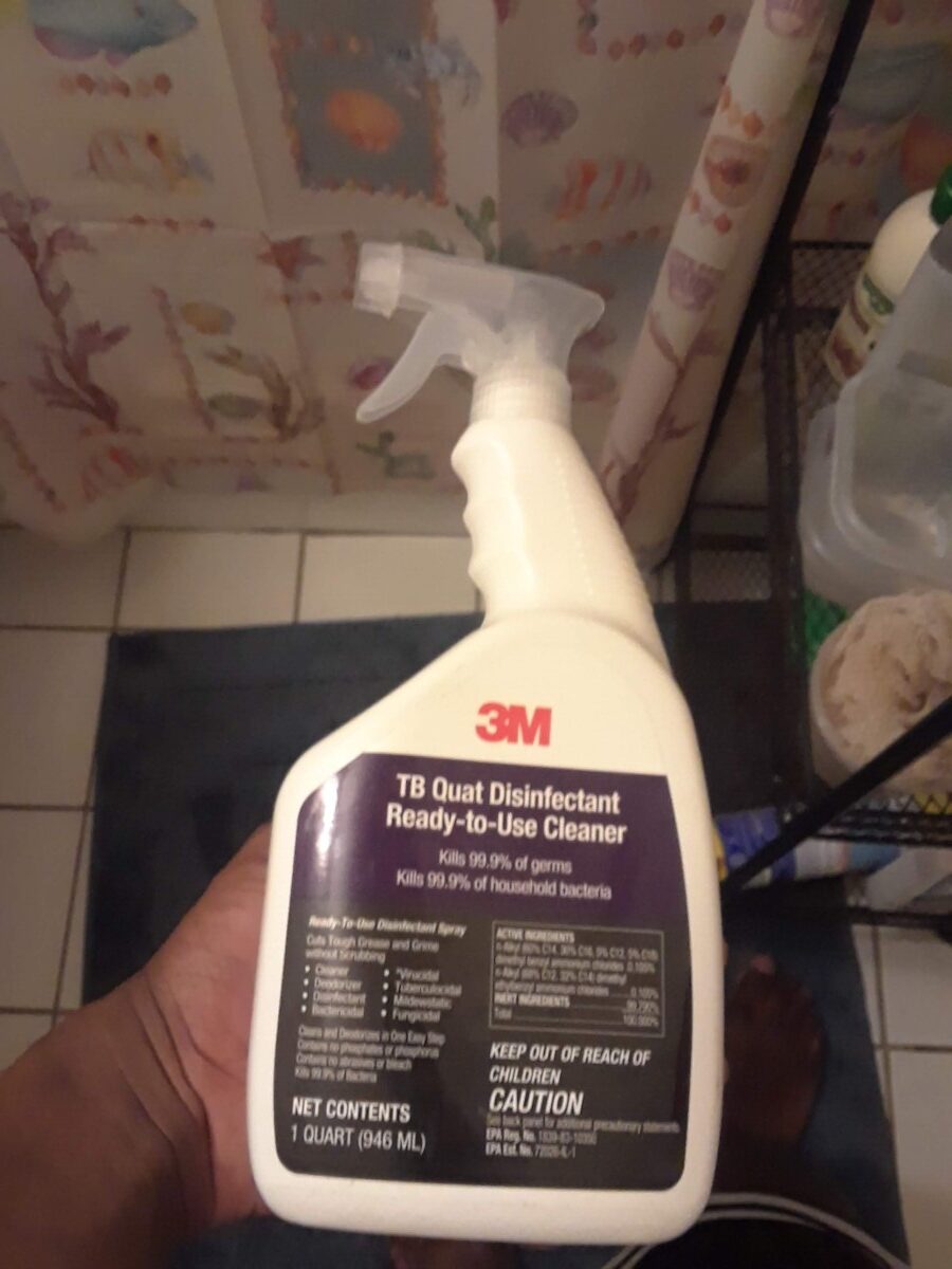
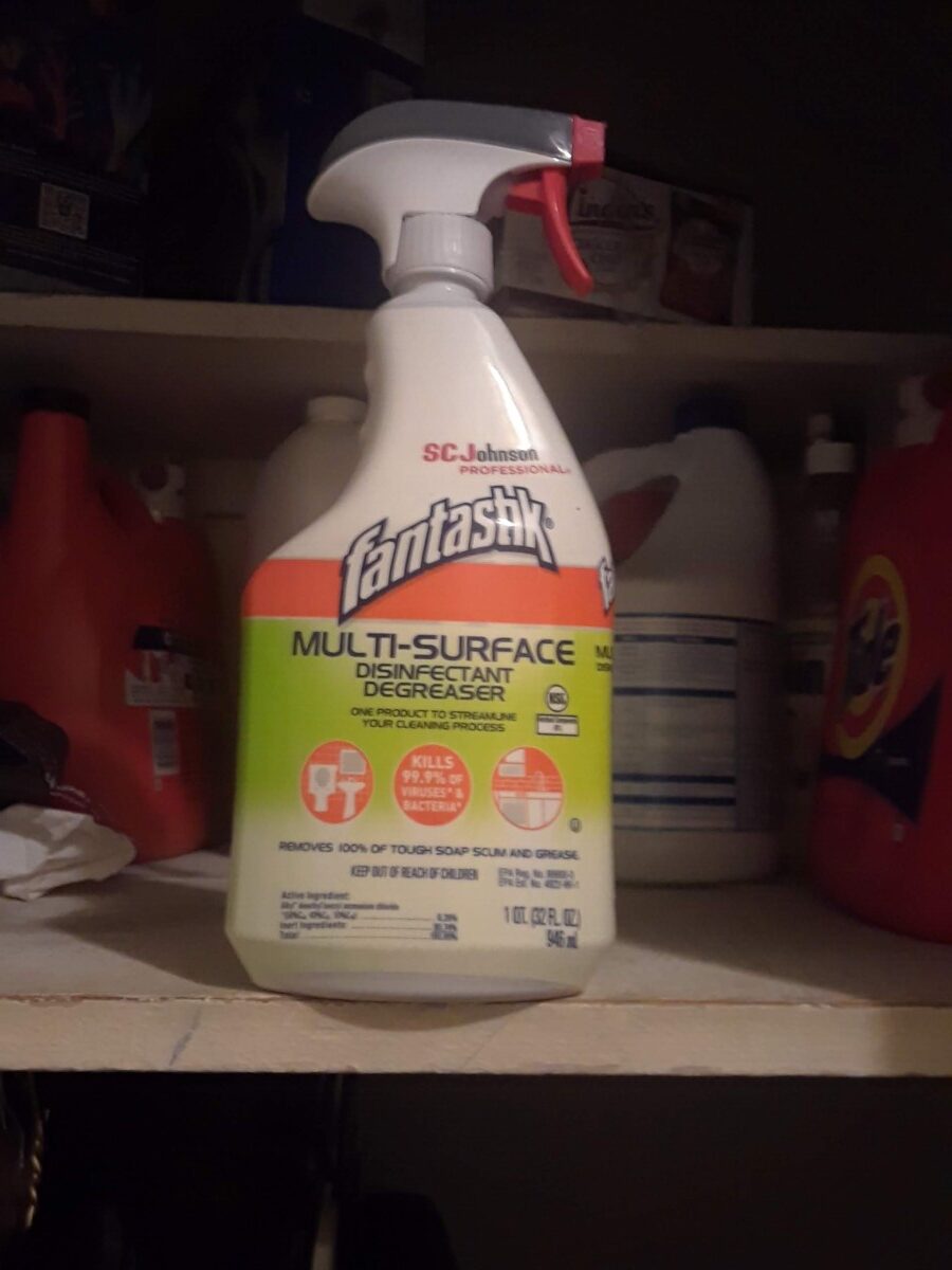
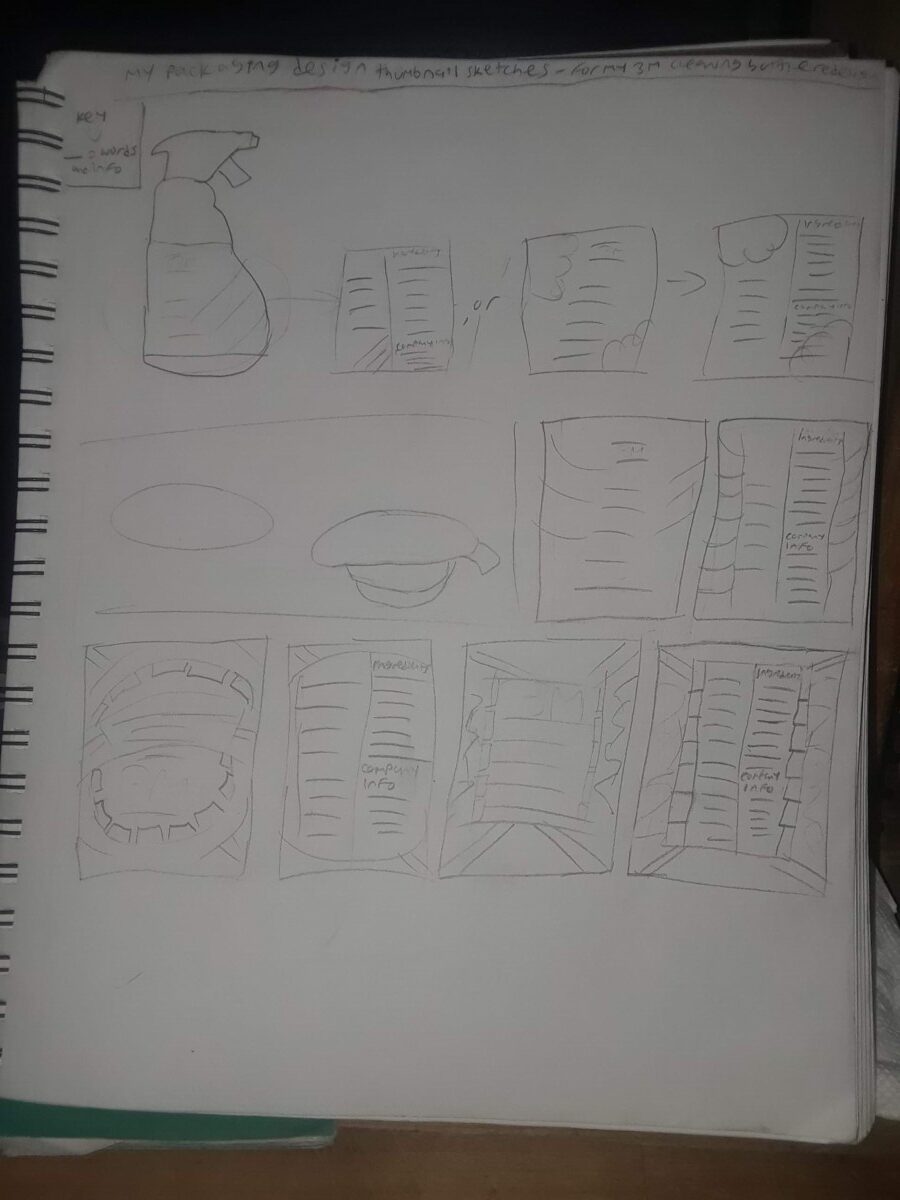
My second product choice: The 3M cleaning bottle/disinfectant cleaner(picture shown below)
Target audience: mostly for mid teens and adults. Most likely for anyone who is 15 to 65 years old. That would be my best bet.
People will probably think it’s affordable or something
The emotional benefits would be that people can use this product, to clean their bathroom surfaces so much, that it can lead to their satisfaction.
For new developments in materials and technology issues for this item: 3M is continuing to strive to find new ways to find ingredients, to make new liquids and chemicals to put those in their cleaning bottles. It kills 99.9% of germs or any other bacteria in your house, so almost everyone’s family won’t get sick or possibly die from all of that, depending on how serious any sickness can be. But even with that, it won’t matter because it will destroy those disgusting particles.
Consumer trends: People use this item to clean bathroom surfaces so they always stay clean until they’re dirty again. Which is what many consumers would always like. Many individuals wouldn’t want a disinfectant that would still leave any surface in your house looking filthy. God forbid that ever exists. That’s why i bet everyone, including myself uses the 3M disinfectant cleaner as one of the better choices to make any of our home surfaces look stunning. Which is what many consumers would always like.
The consumer use of this object was good
The interaction with the packages, size handling and consumer friendliness was pretty great well
The shelf impact for this product, was basically how i could see the 3M cleaning bottle as the first thing, in my eyes. (see the shelf impact image, for this item below, to probably see what i mean)
The products packaging materials and finish is just very smooth for this object.
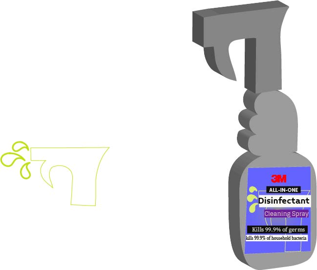
The hierarchy in the 3M cleaning bottle has the logo as the main thing, that your eye would focus on. With other information in a dark purple shape and a black shape making it seem bland. Mainly for this item, i’m leaning towards redesigning this one, because it still looks kinda sorta boring, from what i think. If you look at it too, you would probably see what i’m talking about, as well.
It doesn’t have color coding of psychological, social and cultural aspects. But I still believe it can be redone. In my own style.
The roles of the UPC codes the manufacturer logos. contact info, legal and copy info were done with intent and for pretty good and smart purposes.
the 3m cleaning bottle image, shown above
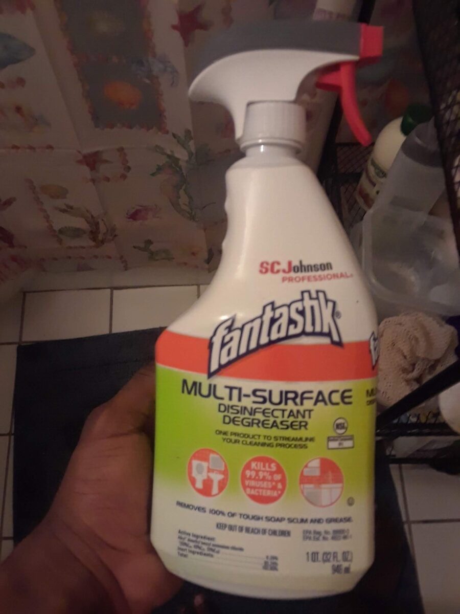
My third and final choice: the fantastik cleaning bottle
Target audience: mostly for mid teens and adults. Most likely for anyone who is 15 to 65 years old. That would be my best bet.
People will think it’s affordable
The emotional benefits would be that people can use this product, to clean their bathroom surfaces so much, that it can lead to their satisfaction.
I couldn’t find any new developments in materials and technology issues for this item
For new developments in materials and technology issues for this item: SC Johnson is continuing to strive to find new ways to find ingredients, to make new liquids and chemicals to put those in their cleaning bottles. It kills 99.9% of germs or any other bacteria in your house, so almost everyone’s family won’t get sick or possibly die from all of that, depending on how serious any sickness can be. But even with that, it won’t matter because it will destroy those disgusting particles.
Consumer trends: People use this item to clean bathroom surfaces so they always stay clean until they’re dirty again. Which is what many consumers would always like. Many individuals wouldn’t want a disinfectant that would still leave any surface in your house looking disgusting. God forbid that ever exists. That’s why i bet everyone, including myself would use the fantastik disinfectant cleaner as one of the better choices to make any of our home surfaces look gorgeous. Which is what many consumers would always like.
The consumer use of this object was good
The interaction with the packages, size handling and consumer friendliness was pretty great as well
The shelf impact for this product, was basically how i could see the 3M cleaning bottle as the first thing, in my eyes. (see the shelf impact image, for this item below, to probably see what i mean)
The products packaging materials and finish is just very smooth for this object.
The hierarchy in the Fantastik cleaning bottle has the logo as the main thing, that your eye would possibly focus on. The reason being is because the logo is going a little bit away from the orange stripe below it. With other information in a light green gradient. Below it are 3 white icons in their own orange circles. Then below that is more information.
It doesn’t have any color coding of psychological, social and cultural aspects.
The roles of the UPC codes the manufacturer logos. contact info, legal and copy info were done with intent and for pretty good and smart purposes.


