Typography: Kinda hard to read
Shelf Impact: i’d say was pretty good
Photography: no photography or imagery whatsoever
Target audience: anyone who is 18 to 65 years old
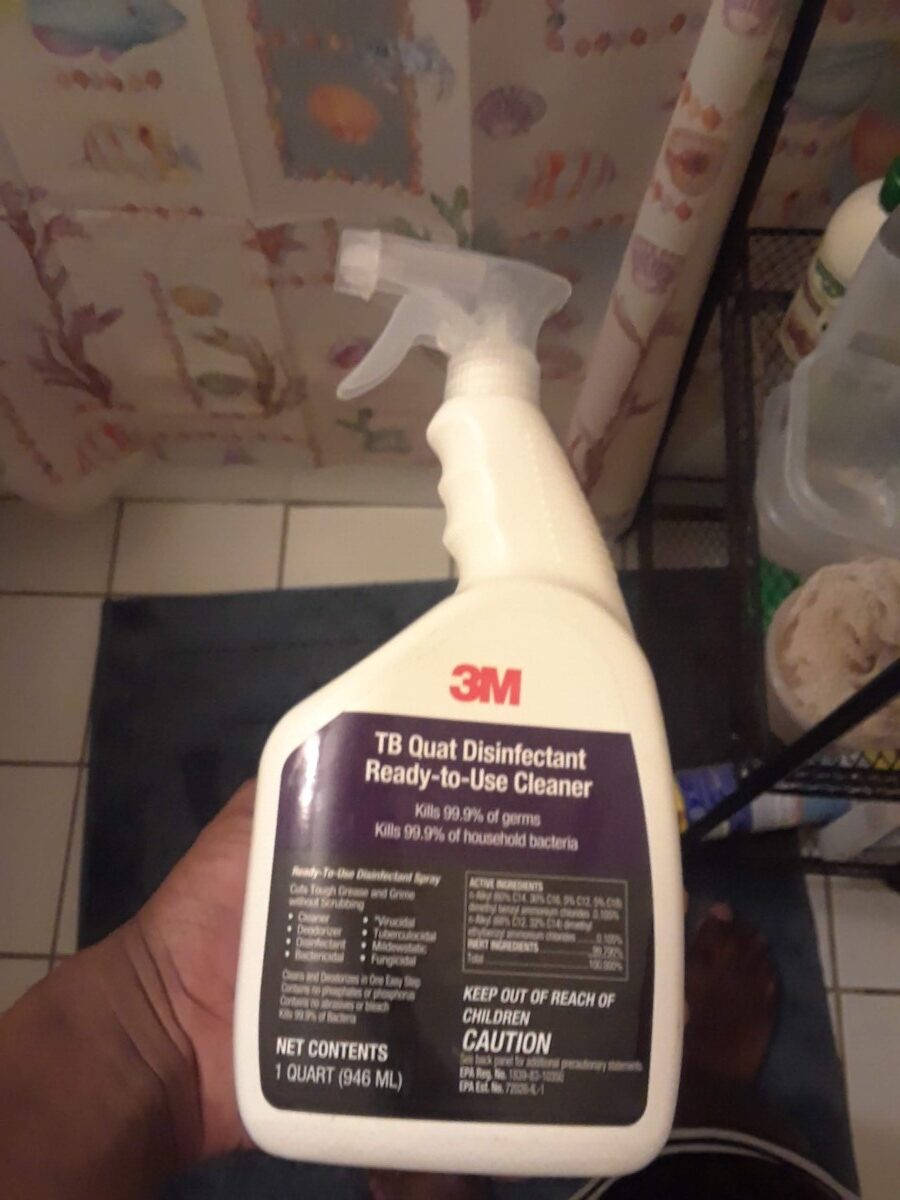
Packaging: gray spray top, white bottle. With the 3m logo. The words “TB quat disinfectant ready to use cleaner, on the purple space.” Two sentences also on the same purple area. Followed by miscellaneous information in a black space.
Analysis with new design conclusion(in simple words): People want a new look. They want one that they can try to understand. With of course, one that has all the information, that you would ever want in a spray bottle. They would probably love the shape of the spray bottle, keeping the original 3m logo, with also keeping all the other necessary info on the label design itself. That’s what i plan to do.

