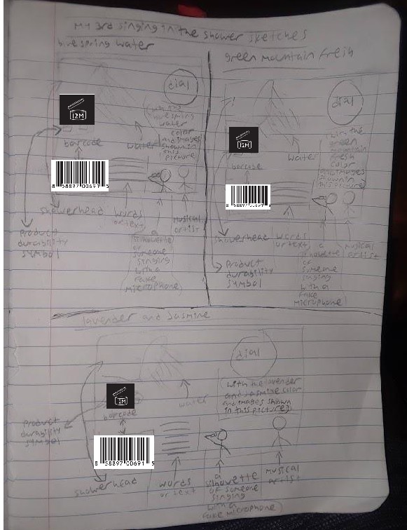

Just so you know, my sketches shown above, have everything shown here. That i can then use to put into illustrator just to show to the class, and to show my “client”(which is dial soap).
In each of the design sketches i drew the showerhead, the barcode, the product durability symbol, the water, the dial logo, the lines resembling the words or text.
I was going to have silhouettes of people singing with their (fake) microphones, but now i’m not goona have that, because i actually want the design to look simple and straight to the point, not wild and confusing.
I also was going to have a showerhead with raindrops. But i’m not goona have that either because i didn’t wanna make it too literal. That’s how design is supposed to be. So you can ignore those parts. Especially if you see that in my sketches.
With the blue spring water, green mountain fresh and the lavender and jasmine “flavors” shown in this picture. I put that there, in the image for more info. That’s now given.


