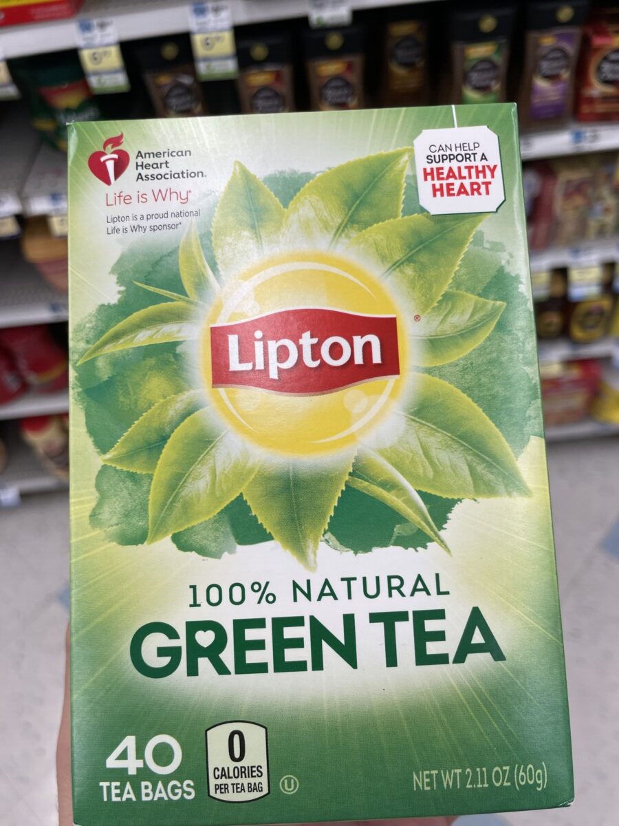
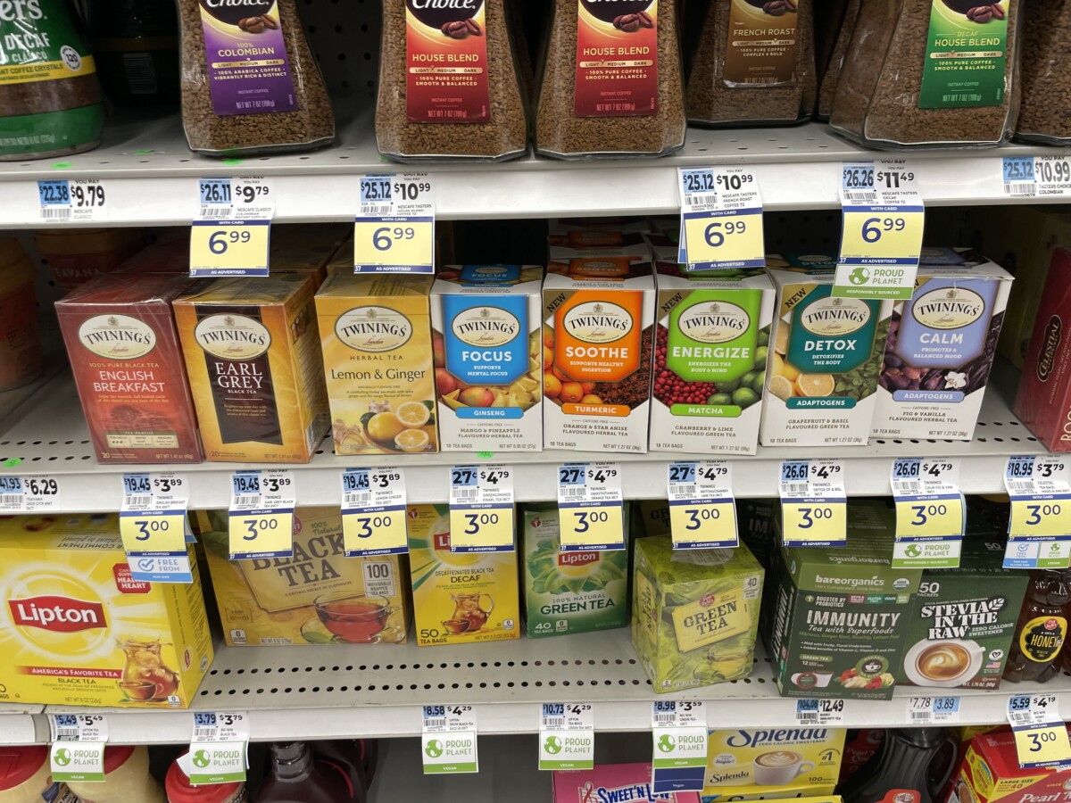
I picked the Brand Tipton to redesign.The placing Of the product was in an awkard position in the bottom. I thought it blended in with the rest of the coffe and tea. Most Tea brands look the same anyways, which was actually a finally thing i realized. They all go for this kind of overly photo used of images to get their products to be the main focus


very good observation from ya