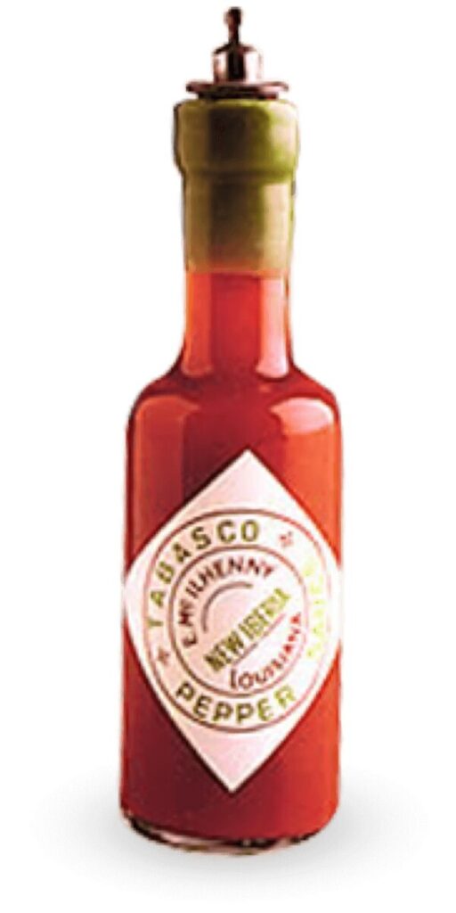
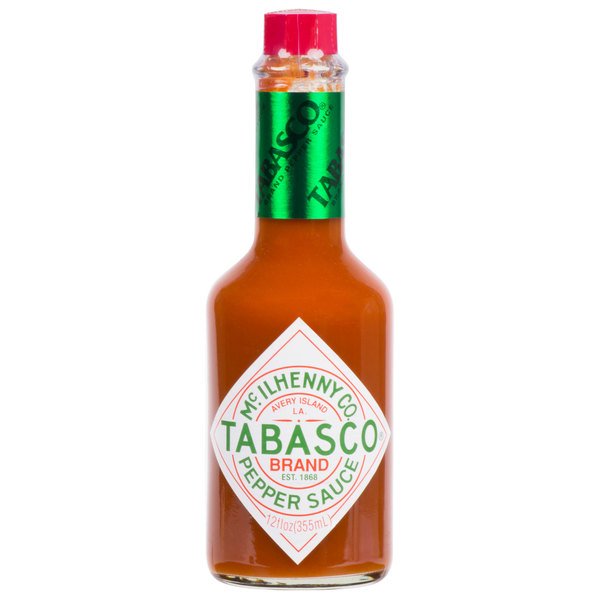
Tabasco Brand hot sauce was first created by Edmund McIlhenny in 1868 on Avery Island, Louisiana. The company is still family owned and though it has gone through very modest packaging changes, it has not deviated from the packaging it has enjoyed since 1927.
The brand can be seen in many restaurants all over the country, as well as in many parts of the world.
Typography
The typography is simple and the hierarchy is is easy to navigate
Photography, etc.
No photography. Design is exclusively type, no graphics (red, white, & green is the color palette). Since the bottle is ubiquitous, no extraneous design choices needed to be made. The label is low gloss.
Shelf Impact
In this particular store, the bottle was found on the shelf closest to the floor, which I thought was counterproductive (it was extremely missable).
Target Audience
Anyone who likes mid-level to higher end quality hot sauce (the bottle pictured is 12oz.). The audience who will buy this is the audience who always has purchased it – 40+. However, due to the ubiquitous nature of the product, consumption is also handed down through generations. It is these new generations that we will market to. We will re-boot Tabasco to make it relevant amongst a fresh, new, younger class of consumer (16 – 49).
Packaging
The packaging is bright orange (secondary), and the primary packaging is a see through bottle with sparse design and a proprietary octagonal red cap. Very easy to spot
Analysis
American producers often fall into the trap of putting so much energy marketing to Anglo Americans that they forget that America is packed (and flanked by) many other cultures and often leave them out of the marketing process. The packaging idea in mind would instill a sense of inclusivity to underserved cultures, and open up a brand new line of consumers for the product. “Cancel culture” is real. It is in every company’s interest to proactively promote inclusivity in their products as well as mission statements.


All of this looks pretty good, because it seems like you put some pretty decent info into this
another reason is because it serves as what we need to know for what were looking at within your info
Your info can be for something that you can also take to your future classes if possible and then your future graphic design workplace.