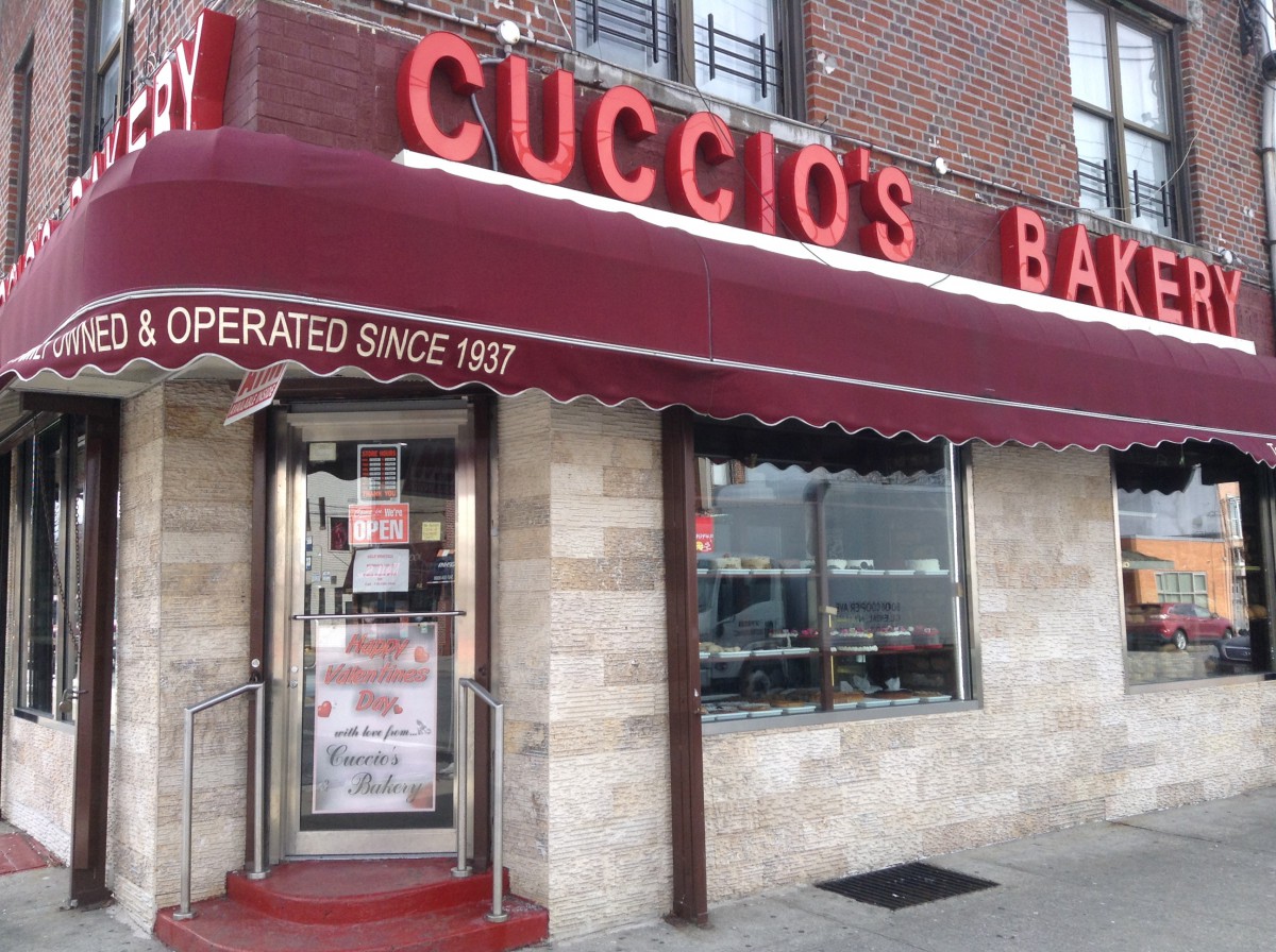
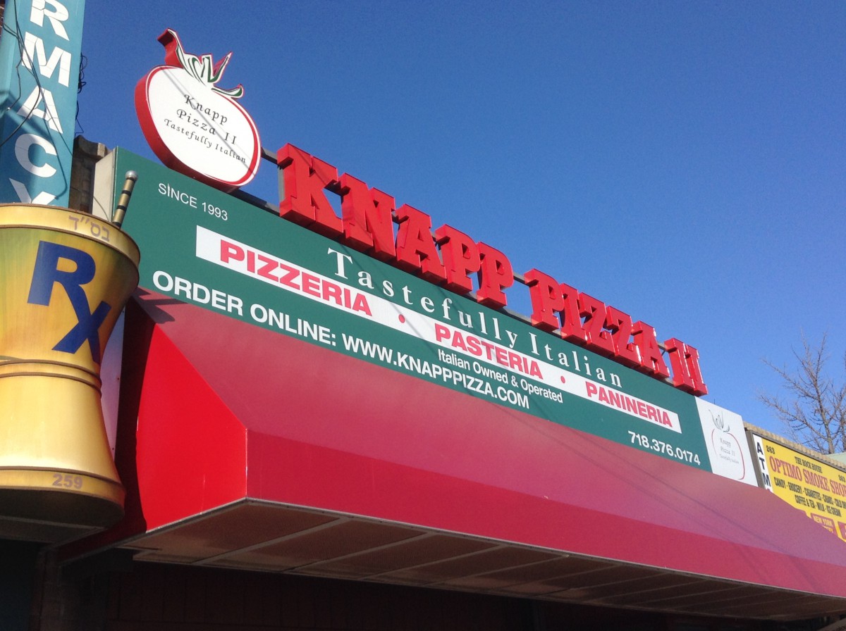
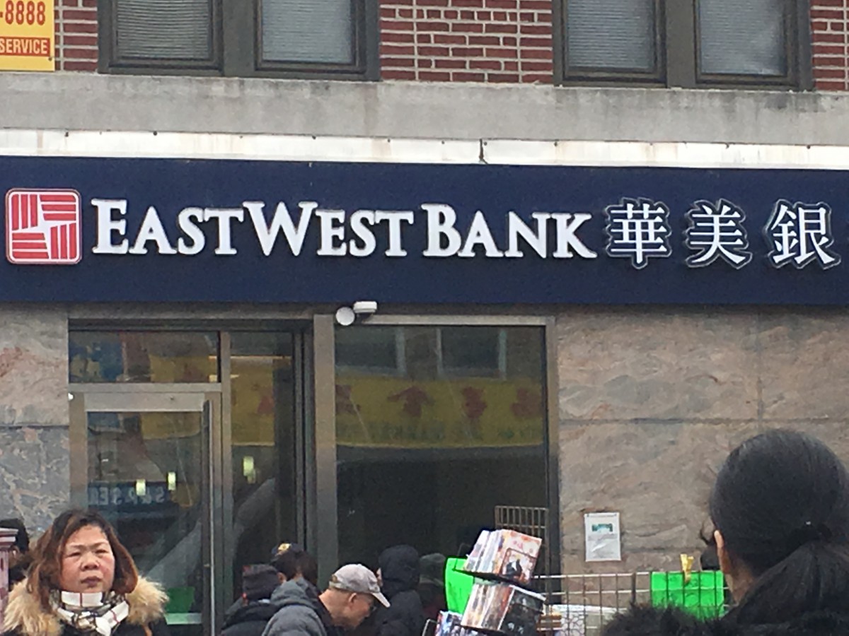
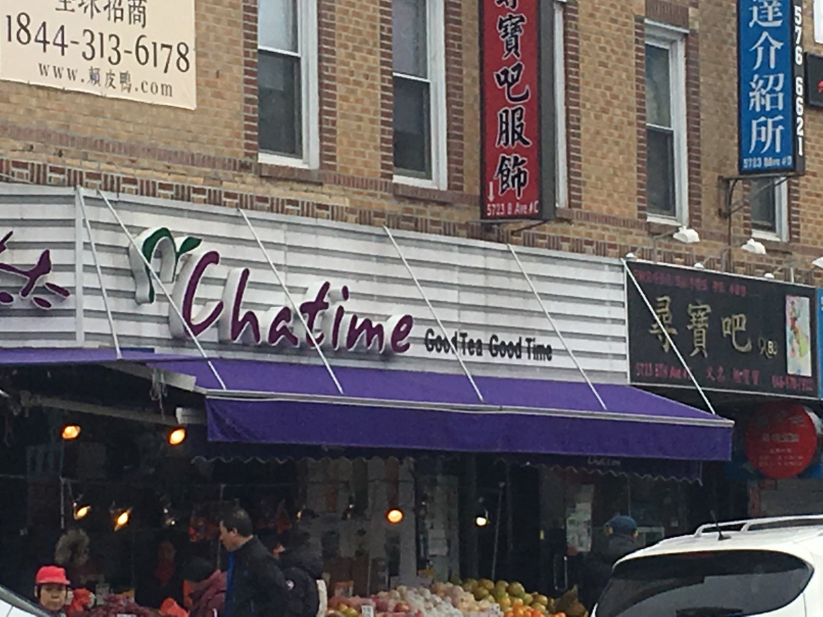
I’ve only lived in Gravesend for three and half years and one of the first things I’ve noticed about the typography being used is stores use a lot of sans serif. The stores have been here for a long time. The pizzeria seems to use three type families which seems a bit overkill. The bakery on the other hand uses sans serif for their signs. It’s interesting seeing newer type families on stores that have been here before I was born.
Day: February 14, 2017
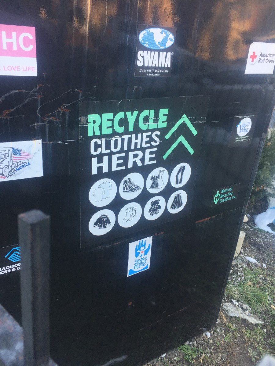
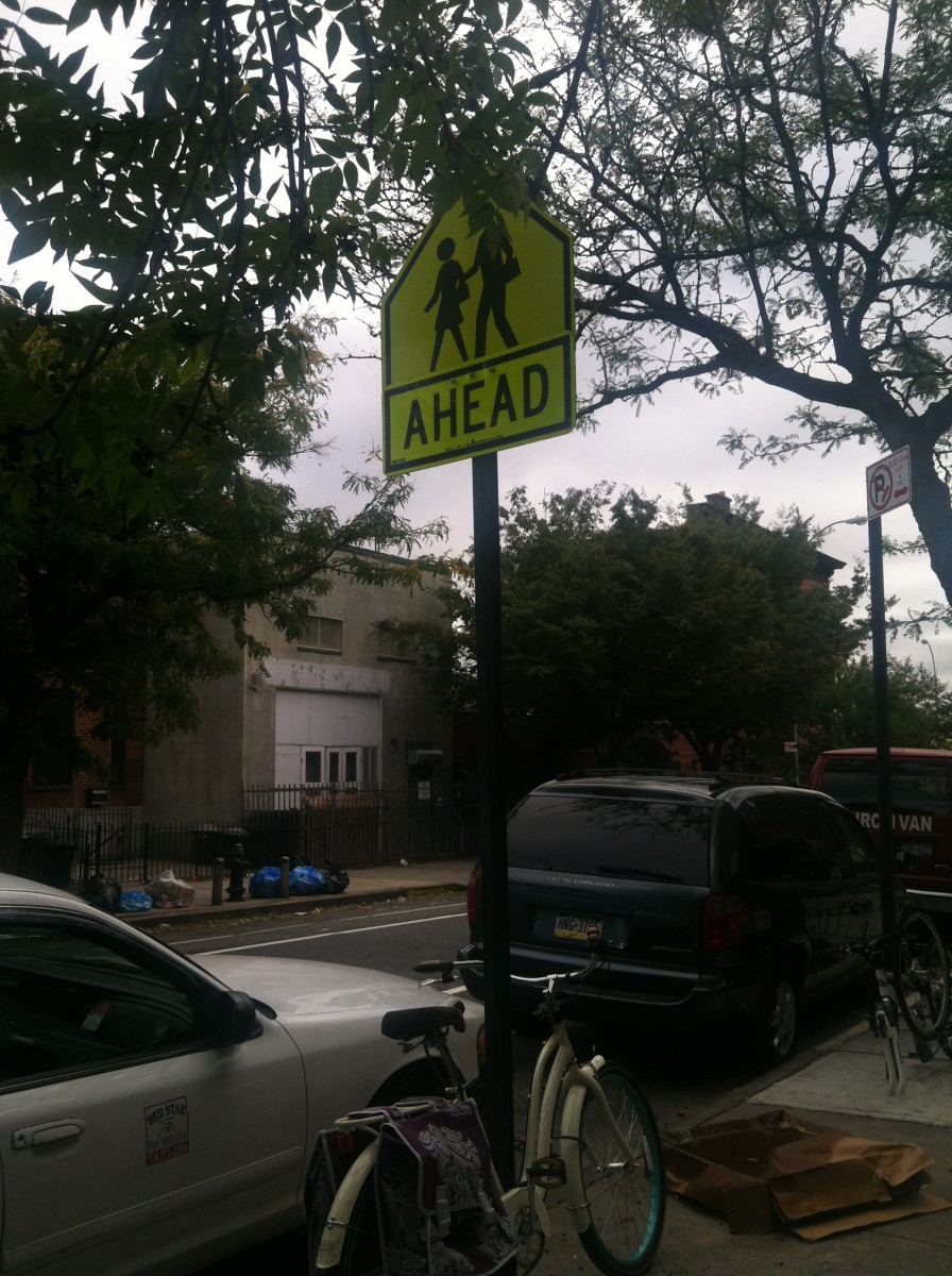
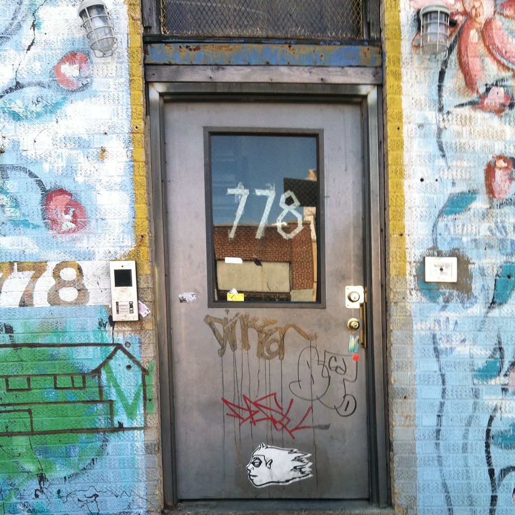
Before I get into depth about kerning in my neighborhood, some of the pictures here are from when I used to take a photography class in my last year of high school. Not once have I realized or notice the significance of kerning. Ever since I started taking this class i never realized how kerning and typography was all around me. Here are some photos from the neighborhoods i used to live in and the neighborhood i currently. In the first image about recycling clothes i never realized how perfectly spaced even the small words in the font of the text. The word “Recycle” itself took my attention the most, mostly because it’s written in caps and in my eyes its kerned better than all the other words written down below/ on top of it. The 2nd image is a common a sign that you can spot in multiple neighborhoods but i just like the fact that its in a yellow background that brings out the text/even better. The kerning of the text in this sign in my eyes i think is really important since the texts cant be too close nor to far mainly because if its too close it’ll be too difficult for anyone to read unless they are up close, and if its to spaced out the letters wouldn’t necessarily be comprehensible. With that being said i personally think kerning is a really important tool that can be used in pretty much anything in society. My last message is free writting words/graffiti that doesn’t necessarily have any kerning which proves to be difficult to understand. Not to mention that there isn’t any spacing between any of these multiple type faces. In conclusion Kerning is every where even the places we least expect as long as there is texts there. Kerning is important since it can bring out the depending how you space out the letters. Im personally grateful since because imagining not having kerning in our society everything would just be munched up together.
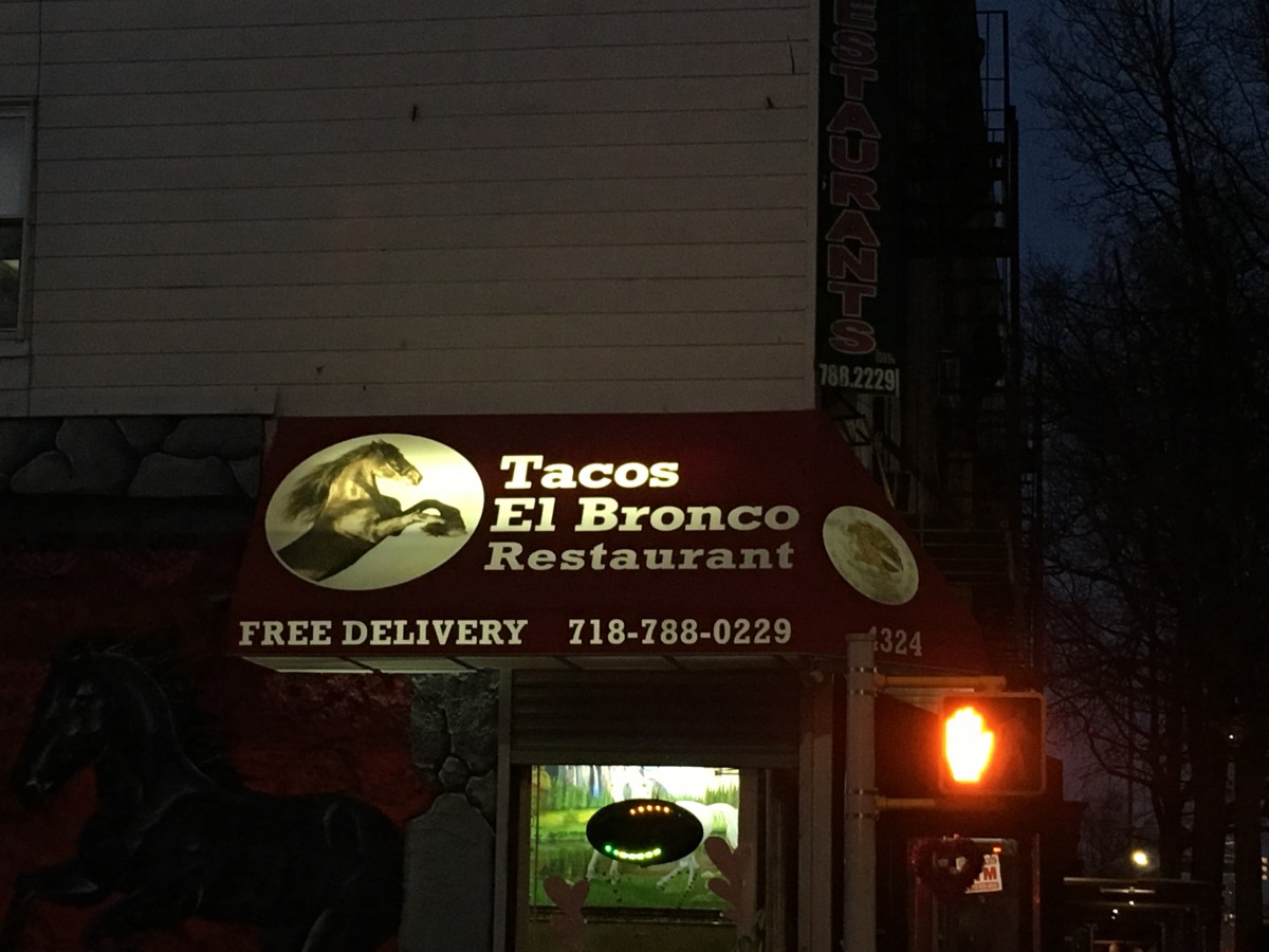
I live in Sunset Park and I have only been living here for a few months although I have lived here before. The typography in Sunset Park is mostly old style typefaces and have not changed much since I have left before. I have never paid attention to the specific lettering and spacing in the words and advertisements on the signage, but now that I get the chance to pay attention in detail, I see how much meaning it has to the neighborhood. I live in a predominately Hispanic neighborhood where there are many Mexican restaurants and traditional Spanish foods everywhere. The type displayed is more serif than sans serifs fonts. Many of the signs are Spanish signs which depict mostly serif fonts if you really pay close attention to all non-English signs. I enjoyed detailing the different typography all around me, I truly got to notice how much the fonts fit in so well with the neighborhood theme.
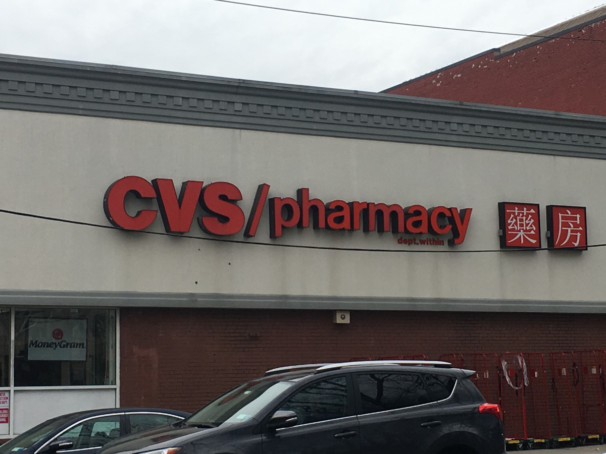
I have been living in my neighborhood for as long as I can remember. Usually when I walk around the area, I never thought about how typography is used to make my neighborhood the way it is. To me the letters on every single banners of the stores or buildings were literally just words that were there to inform me what the building is or what they sell. I never actually stopped to analyze the way each and every individual letter was presented or why this store decided to go with this particular font. Then I was given the assignment to go out and take pictures of how typography was involved in “My World.” I have come to realized that the use of different fonts and colors of the letters gives the word more meaning and characteristic of the building. From using fonts with serifs or san serifs, to using fonts that lean towards hand written calligraphy, it gives the reader an idea of what the company or store wants to portray to the world as them. Below are some pictures of stores that I’ve took around my neighborhood. I hope these pictures can allow you to see the characteristic of each letter as it did for me.
 Updates from Smash Magazine
- CSS min() All The ThingsVictor Ayomipo experiments with the CSS `min()` function, exploring its flexibility with different units to determine if it is the be-all, end-all for responsiveness. Discover the cautions he highlights against dogmatic approaches to web design based on his findings.
- It’s Here! How To Measure UX & Design Impact, With Vitaly FriedmanDesign decisions shouldn’t be a matter of personal preference. We can use reliable design KPIs and UX metrics to guide and shape our design work and measure its impact on business. Meet How To Measure UX and Design Impact, our new video course that helps with just that.
- Using Multimodal AI Models For Your Applications (Part 3)In this third part of the series, you are looking at two models that handle all three modalities — text, images or videos, and audio — without needing a second model for text-to-speech or speech recognition.
- Build A Static RSS Reader To Fight Your Inner FOMORSS is a classic technology that fetches content from websites and feeds it to anyone who subscribes to it with a URL. It’s based on XML, and we can use it to consume the feeds in our own apps. Karin Hendrikse demonstrates how to do exactly that with a static site you can use as […]
- How A Bottom-Up Design Approach Enhances Site AccessibilityYou can’t overstate the importance of accessible website design. By the same token, bottom-up philosophies are crucial in modern site-building. A detail-oriented approach makes it easier to serve a more diverse audience along several fronts. Making the most of this opportunity will both extend your reach to new niches and make the web a more […]
- Interview With Björn Ottosson, Creator Of The Oklab Color SpaceGo behind the scenes with Björn Ottosson, the Swedish engineer who created Oklab color space, and discover how he developed a simple yet effective model with good hue uniformity while also handling lightness and saturation well — and is “okay” to use.
How Design News
- An error has occurred, which probably means the feed is down. Try again later.


Recent Comments