COMD1127-D124 Type & Media, SP2019

This is a foundation course in typography with an emphasis on using type for a multiple of industry related applications ranging from print to interactive.

Farewell and Good Luck

We’ve finally come to the end and I hope each of you are looking forward to continuing your studies in Communication Design and here at City Tech. I also hope that this class created in you a love for type and design, and challenged you enough to explore on your own.

Final grades will be posted after Memorial Day and any outstanding projects should be submitted today. You have until mid-night to add any outstanding items to folder LATE OR RESUBMITTED ASSIGNMENTS.

Keep in touch. I like to see how my students progress. If you see me in the halls, say hello. If you ‘d like to keep up with me on social media, I can be on found on Twitter and Instagram.

Have a great summer and the best of luck in the rest of your studies.
Thanks to Our Guest Speakers

This semester we had the pleasure of two guest speakers. On May 10th, Shayne Alexander came to share his journey to becoming an art director at BBDO Worldwide. Shayne is a recent graduate of City Tech and a former photography student of mine. He shared some of the projects that he’s worked on, talked about the process and how taking advantage of opportunities helped him get where he is today.

shayne alexander


Then on May 17th Mike Rush, art director at Wine & Spirits Magazine stopped by. Mike is a from co-worker of mine from Black Enterprise Magazine. He shared about his journey from art student to art director at Arista Records and now at Wine & Spirits. Hopefully they gave you answers to some of your burning questions about work in the real world and designers, and their stories offered inspiration.

mike rush

Let’s Wrap it Up with a Poster

Now that we are at the end of the semester, it is time to show what you’ve learned by creating a poster that creatively describes the Type & Media course.

Here is the brief which will describe the assignment:

  • Using words, shapes and everything that we have covered this semester to create a poster that can be used to let others know what the Type & Media course is all about. Not only should your poster tell what the course covered, but it show what was covered. For example, you don’t want to only use the words like kerning, tracking, type on a path, but you want to show these things.
  • Size: 11″x17″
  • Full color can be used or you can do it entirely in black & white, but your design shouldn’t depend on color
  • You are allowed to use some geometric shapes, but this poster should be TYPE, not drawings. If you are not sure what this would look like, do a Google search for typography posters.
  • Use the accurate terminology covered in the course
  • Pay attention to spelling
  • The sample below were not selected because they were the best, just to give an idea of what other students did.
  • DUE: Wed, May 17th


 Samples:


Dates to Remember for May

We are winding down to the last few weeks of the semester, so it’s important that we stay on schedule. Here are the dates you need to mark on your calendar:

May 8 — We learn to add video and audio files to digital chap books

May 10 — Guest Speaker, Shayne Alexander (City Tech graduate and former student)

May 10 — Small group critiques of your digital chap books (everyone is required to participate)

May 15 —Class critiques of your digital chap book (everyone is required to participate)

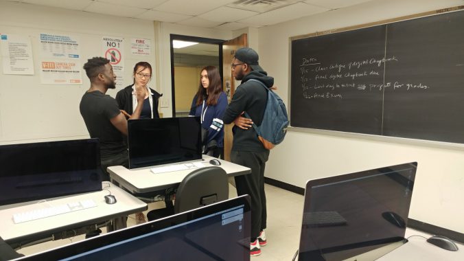
May 17 — Final Digital Chap Book Due

May 22 — Final Exam

May 30 — Final Grades Submission Deadline

Student Exhibit in the Grace Gallery

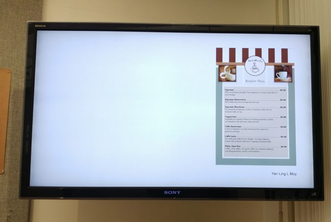
I just want to remind you to take a few minutes to stop by the Grace Gallery on the 11th floor to view the student exhibit. It’s exciting and beneficial to  see the work of other COMD students, and to also see your own work on display. Unfortunately I can only submit 9 selections to represent our class, but I encourage you to stop by and support your fellow classmates and possibly get to see your own work.  If you didn’t make it this round, there’s a good chance for next semester. Work from our class will appear on the monitors — the one closest to the door. The show is scheduled to change on May 2 at 5pm.

New Project: Chap Books Specs

Now that the Type Book is finished, we are ready to begin the next project. We already began this project in class by creating templates and master pages together, but here are the details so that you can make certain you stay on track.

  • Your Chap Book project will be a 12-page booklet. This includes the cover.
  • It can be  autobiographical or on a topic of your choice that you’re interested in. Please have your topic cleared by me. I want to make certain you have a plan for your content.
  • All of the content will be your own. You will do the writing and the photos or illustrations or graphic elements. Any content you find elsewhere must be properly created, otherwise that would be copyright infringement or plagiarism.
  • When you set up your pages in InDesign, the measurements are 5.5″x8.5″ (or 33picas x 51picas). This time your document will be set up as facing pages.
  • Remember to use a grid system to help you keep things organized and aligned. You will determine the number of columns for your grid system, but 4 columns is a good grid for pages this size.
  • We have begun to learn the anatomy of magazine pages, so you are expected to use what you’ve learned when creating your Chap Book design. If you missed that lecture, use this links for the information: Anatomy of a Magazine Layout, Elements of a Magazine Page
  • When the design is complete, you will assemble the layout for printing, then staple down the center of the spine to create saddle-stitching.
  • You may print in black and white to save money, but your design will be in color.
  • After the print version, you will recreate your design for interactive publishing (with video, audio, etc) so that it can be read in a web browser or on a tablet.


Homework Due – Wednesday, April 19, 2017

  • When we return to class after spring break, you should come in with your cover complete and ready to begin adding your interior content.
  • Begin your cover with 3 thumbnail sketches to help your come up with the best idea.
  • While creating your Chap Book you are responsible for good type usage. That means making good type choices, kerning, tracking, and styling your type to look its best.
  • You will have some class time to work on this project, and I will be looking to see that you are making good progress.

The Type Book: Putting it All Togther

Here are a few things to add some clarity on assembling your type books, which are due completed by Wednesday, April 5, 2017.

The Cover

Using the entire page, create a balanced and well-conceived cover with the following information:

  • You can title your book: The Typography Book of … (add your name)
  • Type & Media, COMD1167-D146
  • Professor Mary Brown

Other reminders

Once you are certain you have all the pages and they have been revised, then you can print them out. The page for Legibility: Type and Color should be printed in COLOR. You can have the printing done at Staples or FedEx if you don’t have access to a printer.

  • Print on one side only
  • 8.5″ x 11″ is the page size
  • If you have to print your files at Staples or FedEx, you will need to save your final files as PDF documents to print from.
  • Once all your pages are printed and assembled in the correct order, you have to get the binding done.
  • Get plastic/acetate for the cover (clear) and back (black).
  • Get coil binding
  • It may take more than 1 day to get your book bound, so don’t wait until the last minute.
  • You can refer to the previous post that includes the proper order of the pages. You can also download a copy of the handout.

The Type Book: How to Assemble and What to Include

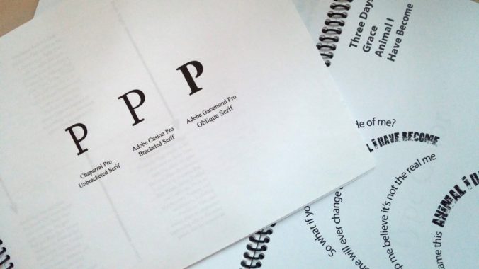
Every type book exercise is to be included. All of the exercises are listed below, including the very last one, which is a poster showing all that you’ve learned so far from this project. The titles are based on the assignment sheets. Some of those handouts included more than one exercise. Hopefully this list is clear. If you have questions, please ask for clarification. Use the handout as a guide for the number of pages included for each exercise

  • Front Cover
  • Anatomy
  • 5 Families (5 pages)
  • Variations (6 pages)
  • Alignment
  • Alignment 2
  • Leading (2 pages)
  • Tracking (2 pages)
  • Kerning
  • Type on a Path
  • Legibility (in color)
  • Type Color
  • Hierarchy
  • Grid (2 pages)
  • Pattern
  • Embellished Quote
  • Logotype
  • Putting it All Together Poster (a typography poster design that incorporates everything you have learned about typography. In the 5th column, the Title will be Putting it All Together. You will use columns 1-4 only for your design).  Use the name of your character.

These books will be printed out and bound along the short left edge, where we left space for such details. They should have a clear vinyl front cover and a black vinyl back cover with spiral binding along the left side. You can print the pages out in class, in lab or your own printer. The only page printed in color is the Legibility: Type Color page. The spiral binding is done at Staples or FedEx Kinkos. Don’t wait until the last minute to get this done because they may require that you pick it up the next day.

The finished books are to be submitted no later than Wednesday, April 5, 2017.  This is right before spring break. All projects submitted late will have lowered grades.

The mid-term exam is scheduled for Wednesday, March 29th. It will cover all that we’ve learned so far. Please take the time to review your notes, the reading assignments and the updates or videos that have been posted on this website.

You may also want to download this document, Adobe Type Primer, which contains a lot of the information about typography that we’ve covered.

« Older posts