Month: February 2017 (Page 1 of 2)
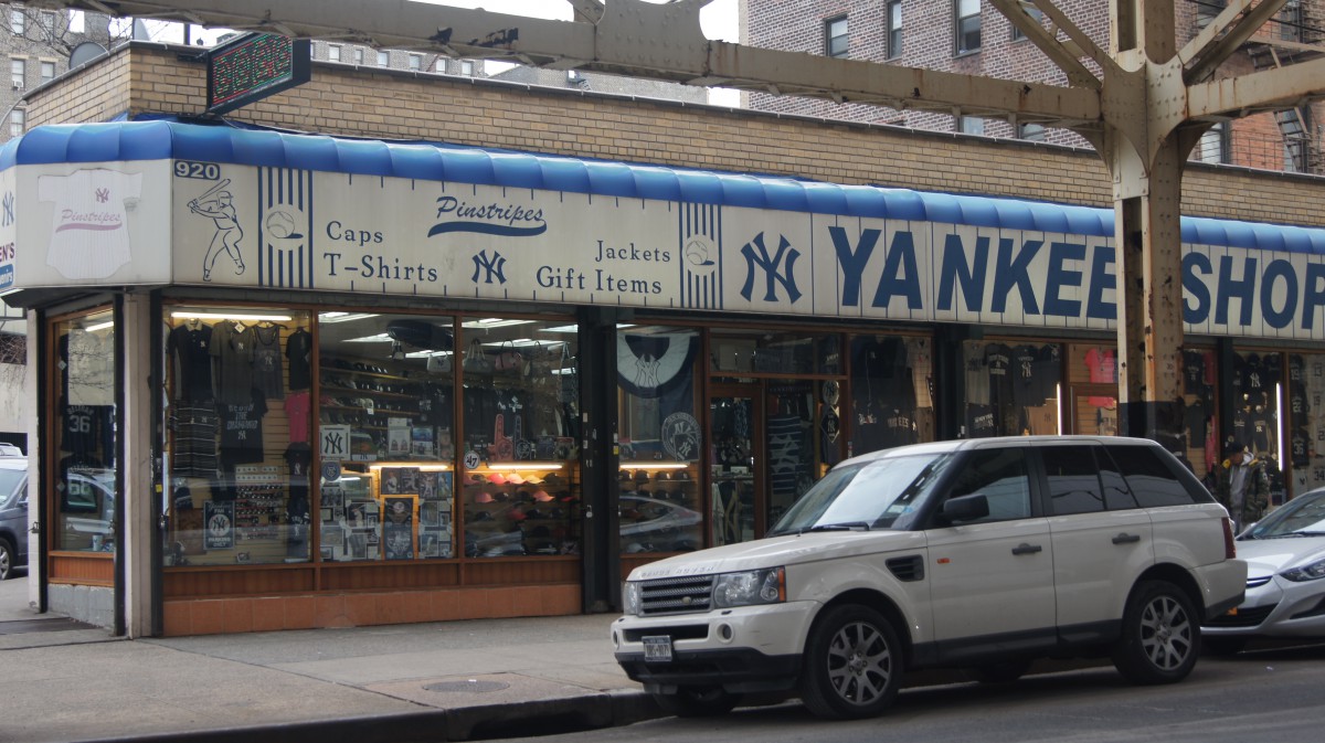
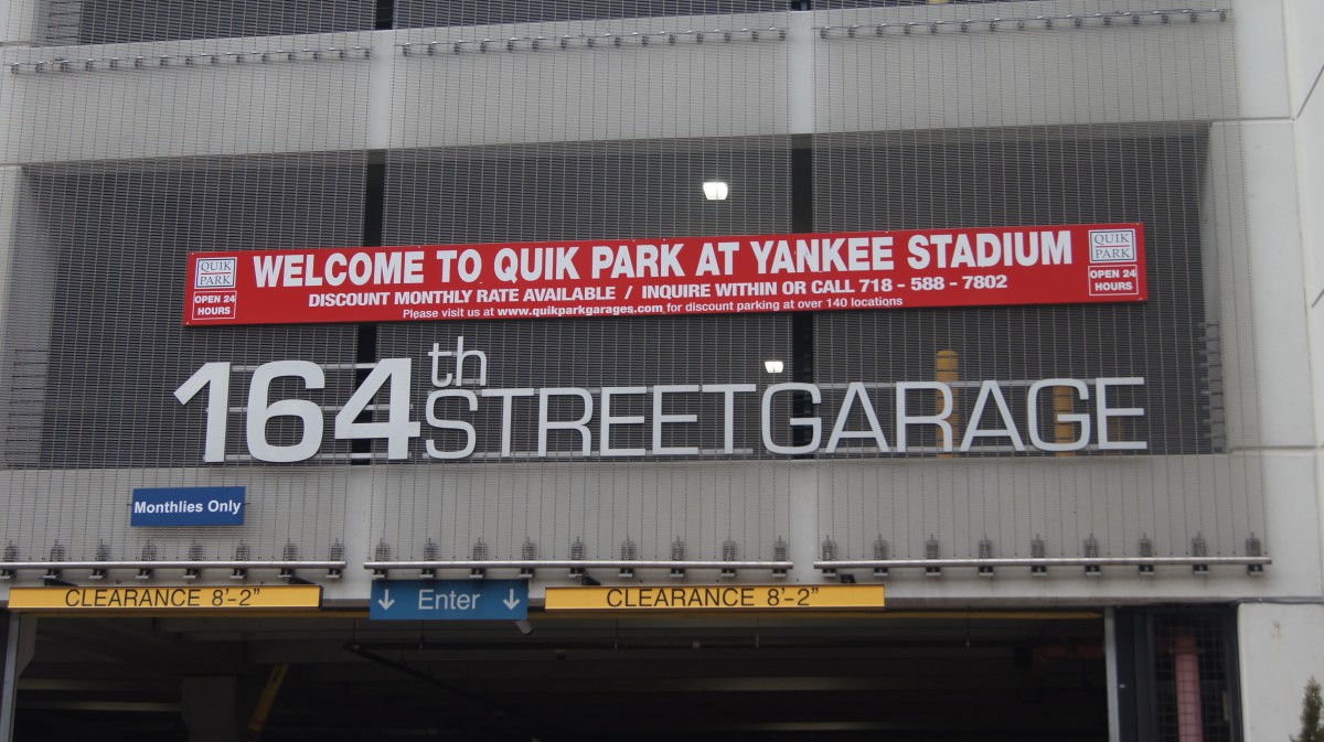
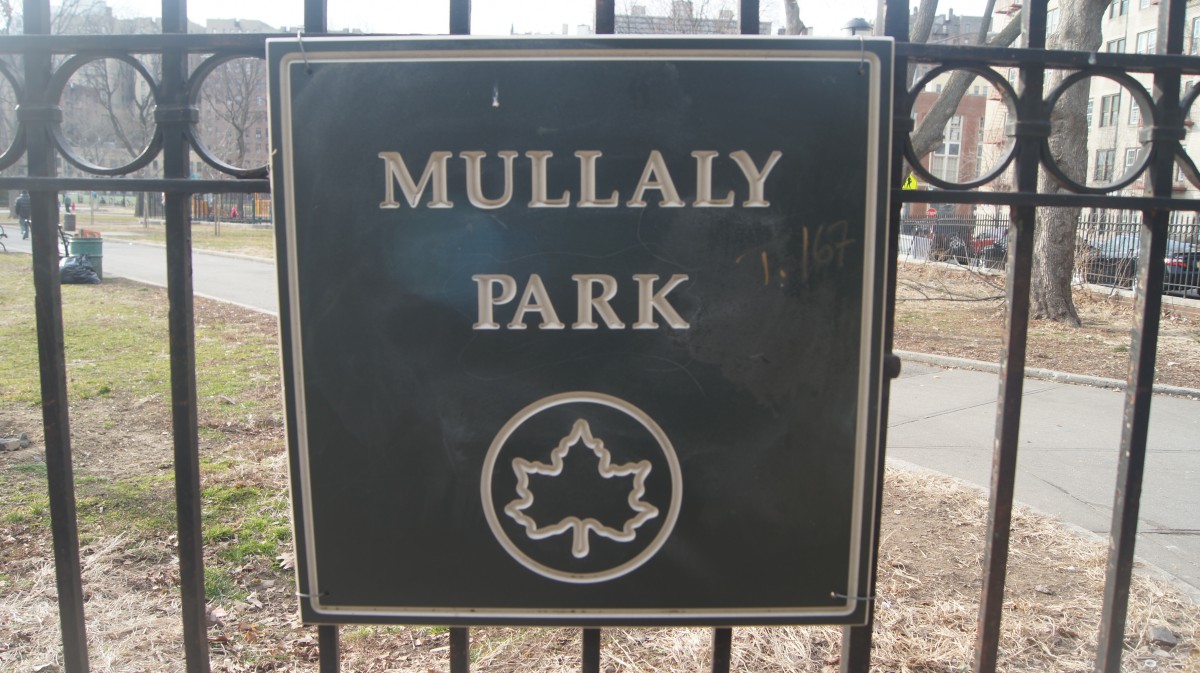
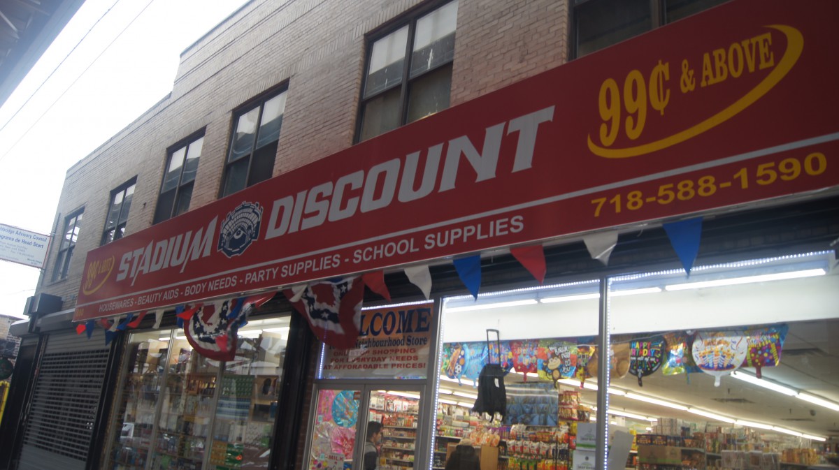
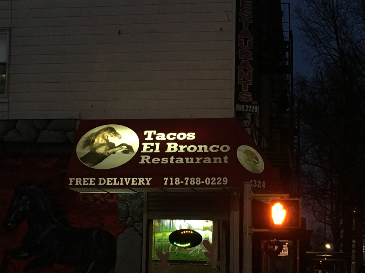
Even after living in another country for like 10 years I came back to the same place. I’ve been living in the Bronx since I can remember and even though I don’t really recall a lot of things, I can say that most of the typography around my neighborhood has changed a little. As I walked down the streets looking for some signs that I thought were interesting enough for my eyes I realized that most of the stores, park signs, parking places that were old had a different type of font on their signs than what the new stores have. Out of all the pictures that I took, I decided to use these ones because it kind of shows how the store signs have changed. The ones that are old have a much wider and bigger look also with a few serifs on their letters. The new ones have a much different type of font seeming as one of them has a much thinner look and the ones that are wider have serifs on them. It wasn’t until today that I realized that most of the banners had different type of letters and some had similar ones. I guess I never really took a second to actually appreciate the different types of typography around me and how they have been changing in order catch the attention of the people, just like they caught mine while I was walking.
Our first quiz is scheduled for Mon, Feb 27, 2017. It will cover what we have been studying so far from the first day of class. It shouldn’t take more than 30 minutes to complete.
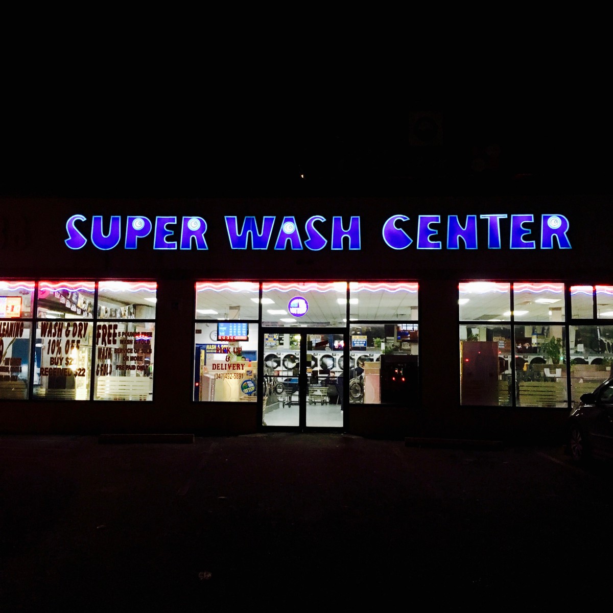
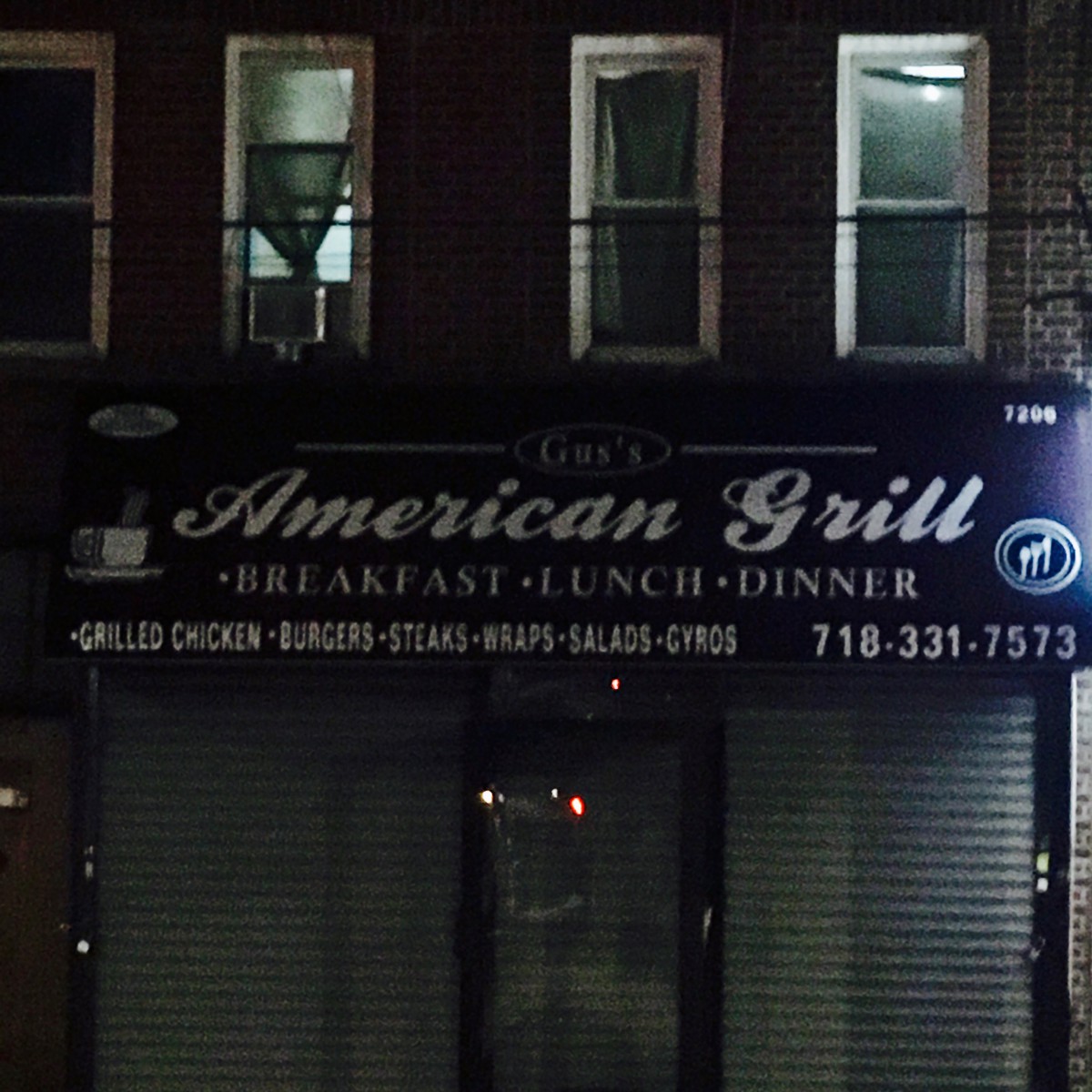
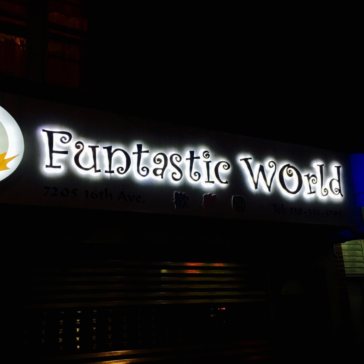
I live on 74th Street, near New Utrecht Avenue in Brooklyn. I moved there last year and I didn’t have a good feeling about this neighborhood at first. However, the more time I spent, the more satisfied I felt. This is a very peaceful neighborhood. I prefer to live in a quiet environment. Now I have a very great opportunity to show my neighborhood. I usually go outside and walk around in this neighborhood, because I like to see something interesting that will inspire my “art” life. When I look at the signs of different kinds of businesses, I see colorful typefaces based on the owner’s cultural background. For example, the Chinese restaurant uses more neat and warm color font, while the Jewish liquor store uses the Hebrew style font to enrich the beauty of Jewish art. I think that different kinds of typefaces can enhance our understanding of different cultures, and this is one of the great connotations in typography. I took some pictures in my neighborhood at night. I hope you can enjoy the beauty of typography in a different culture. 🙂
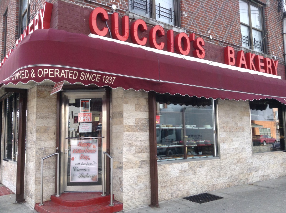
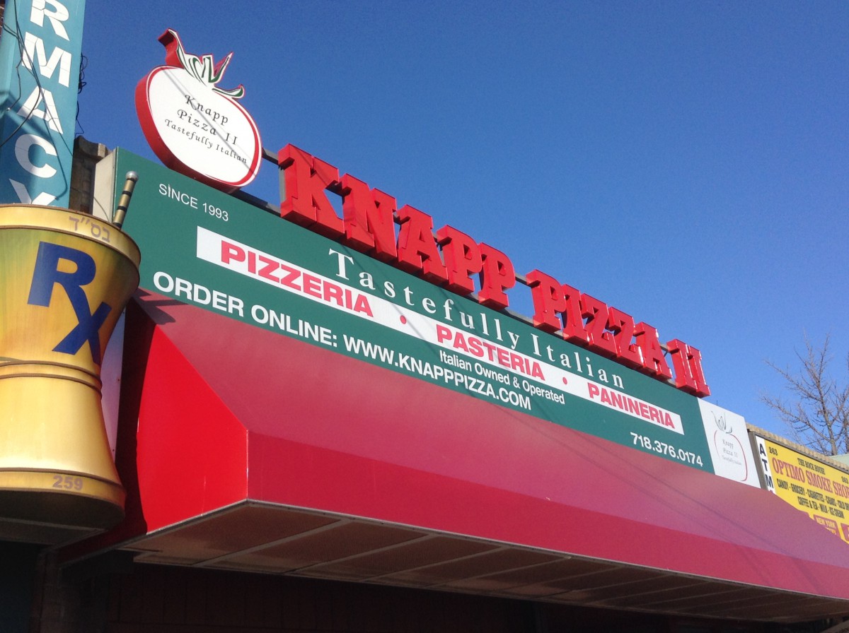
I’ve only lived in Gravesend for three and half years and one of the first things I’ve noticed about the typography being used is stores use a lot of sans serif. The stores have been here for a long time. The pizzeria seems to use three type families which seems a bit overkill. The bakery on the other hand uses sans serif for their signs. It’s interesting seeing newer type families on stores that have been here before I was born.
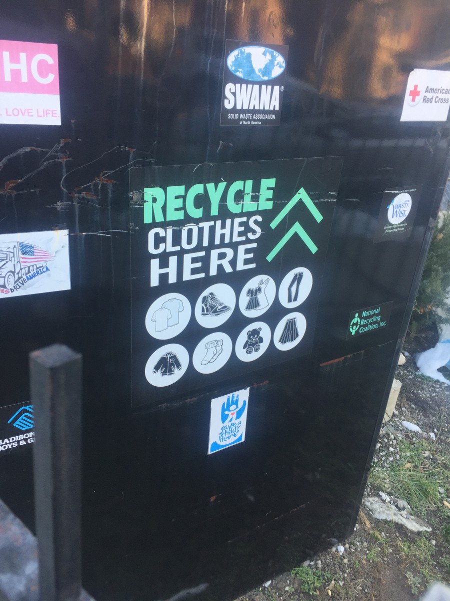
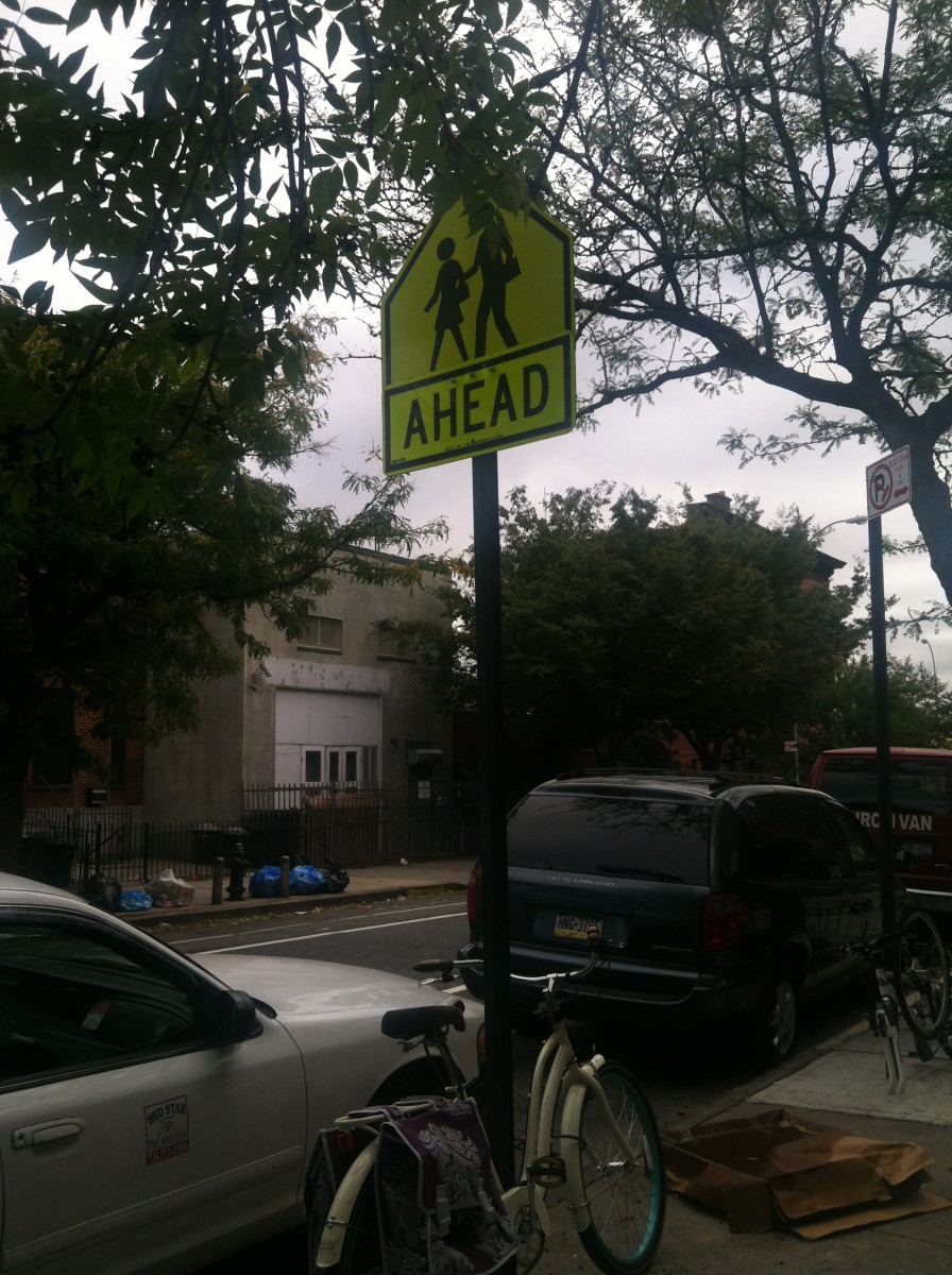
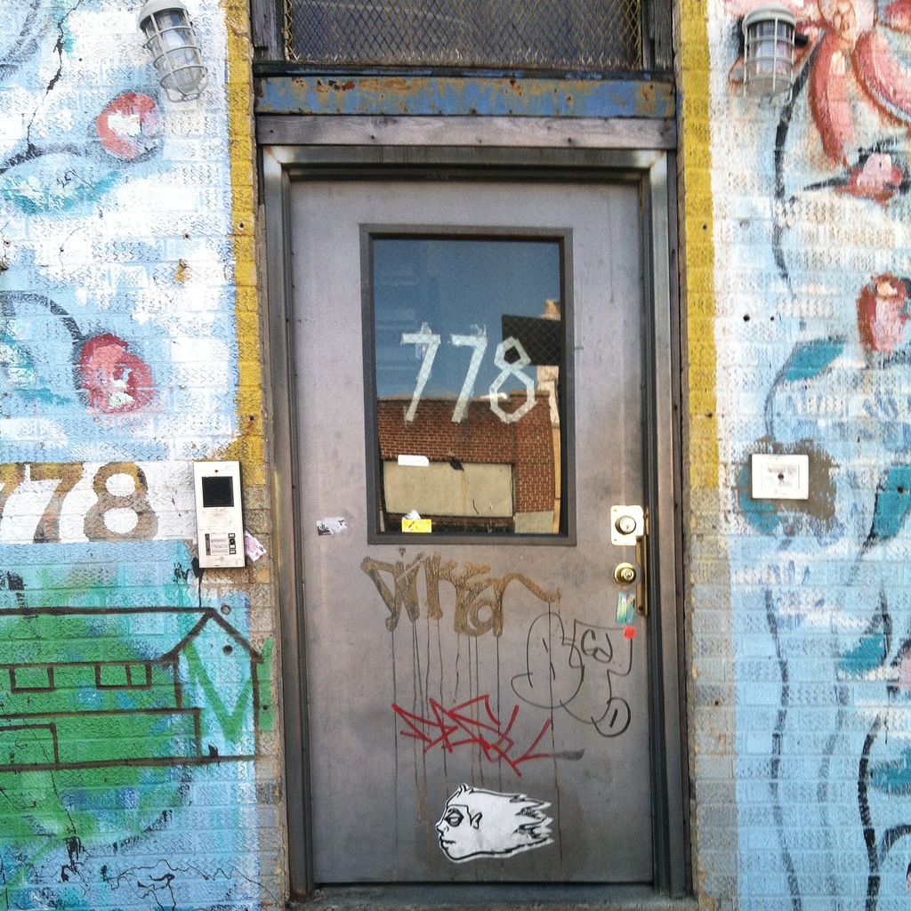
Before I get into depth about kerning in my neighborhood, some of the pictures here are from when I used to take a photography class in my last year of high school. Not once have I realized or notice the significance of kerning. Ever since I started taking this class i never realized how kerning and typography was all around me. Here are some photos from the neighborhoods i used to live in and the neighborhood i currently. In the first image about recycling clothes i never realized how perfectly spaced even the small words in the font of the text. The word “Recycle” itself took my attention the most, mostly because it’s written in caps and in my eyes its kerned better than all the other words written down below/ on top of it. The 2nd image is a common a sign that you can spot in multiple neighborhoods but i just like the fact that its in a yellow background that brings out the text/even better. The kerning of the text in this sign in my eyes i think is really important since the texts cant be too close nor to far mainly because if its too close it’ll be too difficult for anyone to read unless they are up close, and if its to spaced out the letters wouldn’t necessarily be comprehensible. With that being said i personally think kerning is a really important tool that can be used in pretty much anything in society. My last message is free writting words/graffiti that doesn’t necessarily have any kerning which proves to be difficult to understand. Not to mention that there isn’t any spacing between any of these multiple type faces. In conclusion Kerning is every where even the places we least expect as long as there is texts there. Kerning is important since it can bring out the depending how you space out the letters. Im personally grateful since because imagining not having kerning in our society everything would just be munched up together.
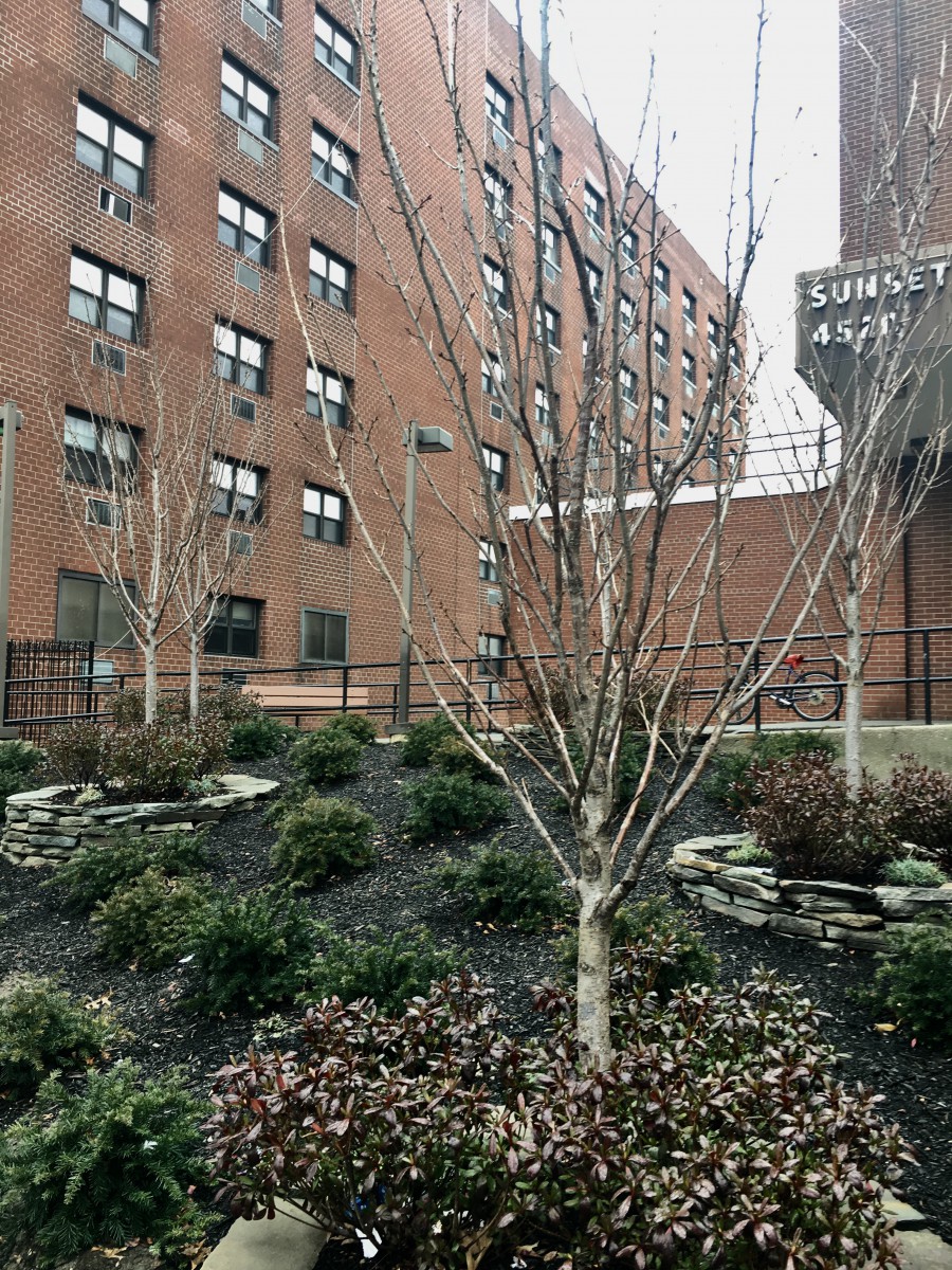
I live in Sunset Park and I have only been living here for a few months although I have lived here before. The typography in Sunset Park is mostly old style typefaces and have not changed much since I have left before. I have never paid attention to the specific lettering and spacing in the words and advertisements on the signage, but now that I get the chance to pay attention in detail, I see how much meaning it has to the neighborhood. I live in a predominately Hispanic neighborhood where there are many Mexican restaurants and traditional Spanish foods everywhere. The type displayed is more serif than sans serifs fonts. Many of the signs are Spanish signs which depict mostly serif fonts if you really pay close attention to all non-English signs. I enjoyed detailing the different typography all around me, I truly got to notice how much the fonts fit in so well with the neighborhood theme.
 Updates from Smash Magazine
- Using AI For Neurodiversity And Building Inclusive ToolsThis article illustrates how AI can be leveraged to build tools that can be inclusive with a little bit of an additional effort.
- F-Shape Pattern And How Users ReadScrolling, scanning, skipping: How do users consume content online? Here’s what you need to know about reading behavior and design strategies to prevent harmful scanning patterns. An upcoming part of Smart Interface Design Patterns.
- How To Work With GraphQL In WordPress In 2024What options do we have for integrating GraphQL with WordPress in 2024? Leonardo Losoviz describes the developments that have taken place in this space over the last three years.
- Converting Plain Text To Encoded HTML With Vanilla JavaScriptWhat do you do when you need to convert plain text into formatted HTML? Perhaps you reach for Markdown or manually write in the element tags yourself. Or maybe you have one or two of the dozens of online tools that will do it for you. In this tutorial, Alexis Kypridemos picks those tools apart […]
- How To Monitor And Optimize Google Core Web VitalsThe three Core Web Vitals metrics don’t only tell you how visitors experience your website but also impact your Google search result rankings. In this article, we’ll look at what Core Web Vitals are, how they are measured, and how you can use DebugBear to monitor them continuously.
- Sliding 3D Image Frames In CSSCreating 3D effects in CSS isn’t an entirely new concept, but typical approaches use additional elements in the markup and pseudo-elements in the styles to pull it off. Temani Afif applies 3D effects and sliding transitions to a single `` using clever CSS techniques that demonstrate advanced, modern styling practices.
How Design News
- An error has occurred, which probably means the feed is down. Try again later.


Recent Comments