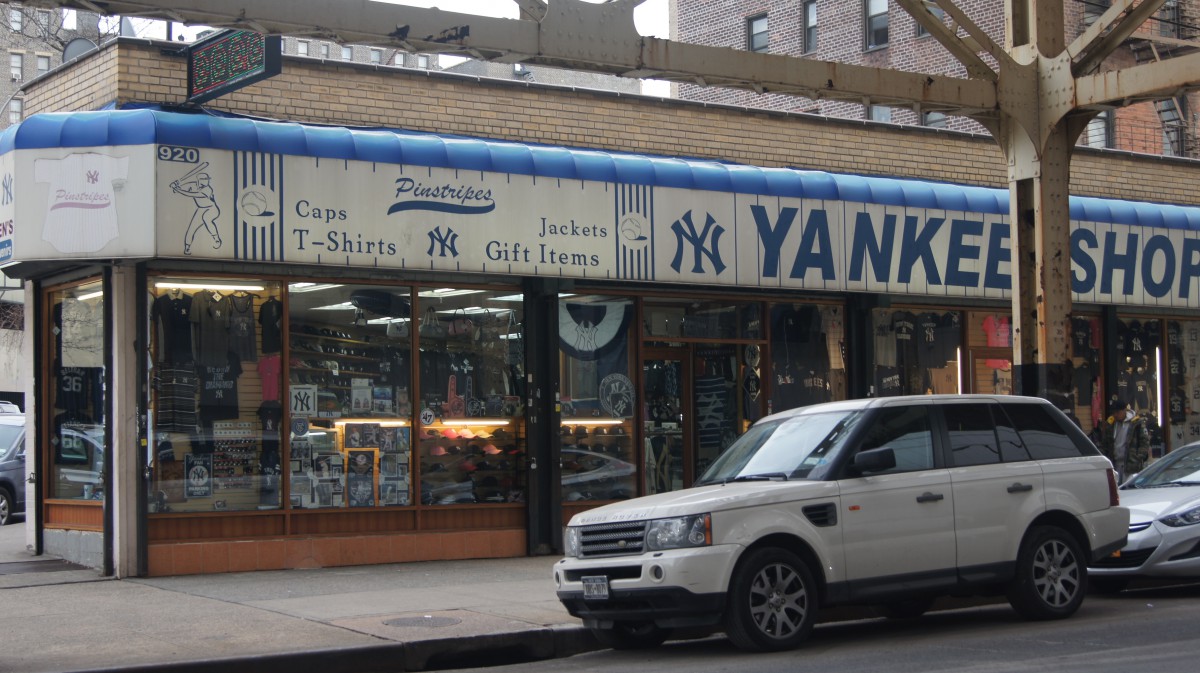
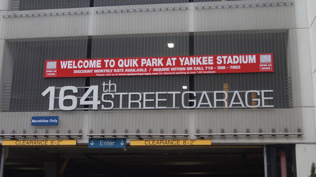
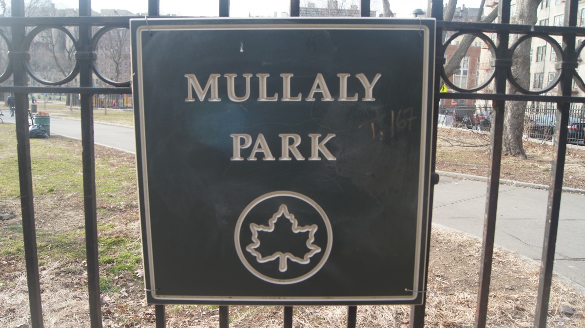
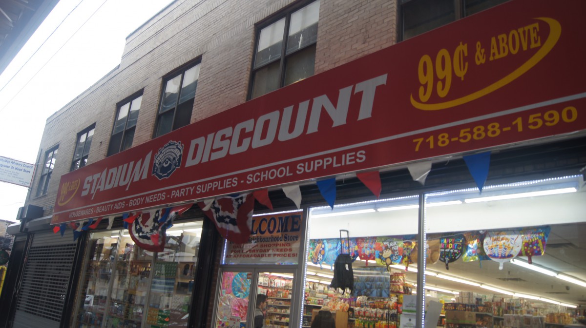
Even after living in another country for like 10 years I came back to the same place. I’ve been living in the Bronx since I can remember and even though I don’t really recall a lot of things, I can say that most of the typography around my neighborhood has changed a little. As I walked down the streets looking for some signs that I thought were interesting enough for my eyes I realized that most of the stores, park signs, parking places that were old had a different type of font on their signs than what the new stores have. Out of all the pictures that I took, I decided to use these ones because it kind of shows how the store signs have changed. The ones that are old have a much wider and bigger look also with a few serifs on their letters. The new ones have a much different type of font seeming as one of them has a much thinner look and the ones that are wider have serifs on them. It wasn’t until today that I realized that most of the banners had different type of letters and some had similar ones. I guess I never really took a second to actually appreciate the different types of typography around me and how they have been changing in order catch the attention of the people, just like they caught mine while I was walking.


Recent Comments