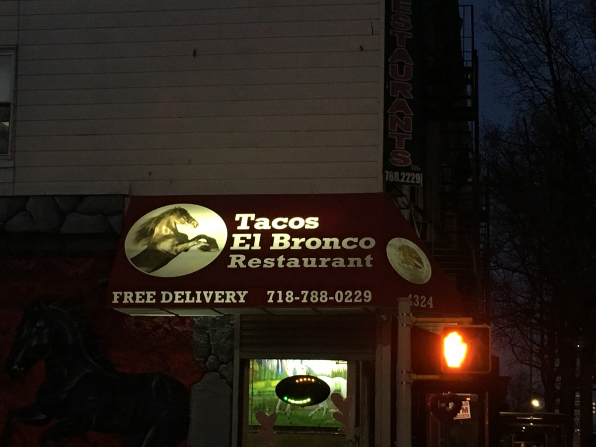
I live in Sunset Park and I have only been living here for a few months although I have lived here before. The typography in Sunset Park is mostly old style typefaces and have not changed much since I have left before. I have never paid attention to the specific lettering and spacing in the words and advertisements on the signage, but now that I get the chance to pay attention in detail, I see how much meaning it has to the neighborhood. I live in a predominately Hispanic neighborhood where there are many Mexican restaurants and traditional Spanish foods everywhere. The type displayed is more serif than sans serifs fonts. Many of the signs are Spanish signs which depict mostly serif fonts if you really pay close attention to all non-English signs. I enjoyed detailing the different typography all around me, I truly got to notice how much the fonts fit in so well with the neighborhood theme.


Recent Comments